
It is possible to create a multi-category chart in Excel (as shown below).
The trick is to arrange the data in a certain way, that makes Excel interpret as having multiple categories.
Suppose I have the data for the monthly expenses I make on the food items (as listed below). The idea to create a chart for these items, and also categorize these as Fruits, Vegetables, and Packaged Food.
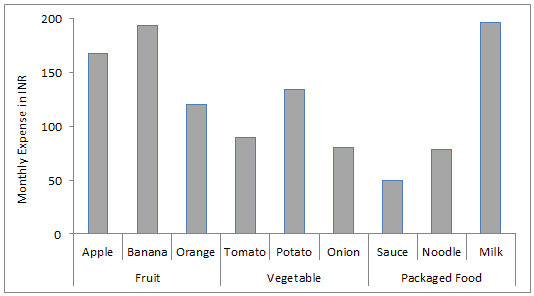
This is no rocket science. All you need is to arrange your data as shown below. Note that I have just added the overall category name (such as Fruit, Vegetable..) in a column on the left of the category name (apple, banana, orange..)

If you have the data arranged, as shown above, here are the steps to make this chart:
- Select the entire data set.
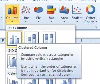
- Go to Insert –> Column –> 2-D Column –> Clustered Column.
- You can also use the keyboard shortcut Alt + F1 to create a column chart from data.
- That’s it!! You will have your chart. Format it the way you want.
Related Tutorials:


How do I add another series in the muti-category chart?
Tomato is a fruit, not a vegetable. haha
There’s culinary taxonomy and botanical taxonomy. Please don’t put a tomato in my fruit salad.
great info I have a chart I might need help with…kathy@kathytoth.com 6 sales people competing for the end goal – tacking each month goal and then annual got for all 6 agents – like a hore race to see who is leading the pack