

If you want to summarize a big dataset in Excel, like getting total sales by region or finding your top customers, a Pivot Table can do it in a few clicks, and you don’t need a single formula.
It’s one of the most powerful features in Excel (no kidding).
And the best part is that even if you don’t know much Excel, you can still do pretty awesome things with a very basic understanding of it.
In this tutorial, I’ll show you how to create a Pivot Table step by step, use it to answer real questions from your data, and turn it into a Pivot Chart.
Follow along with the example file
Create a Pivot Table in Excel.xlsx
What is a Pivot Table and Why Should You Care?
A Pivot Table is a tool in Microsoft Excel that allows you to quickly summarize huge datasets (with a few clicks).
Even if you’re absolutely new to the world of Excel, you can easily use a Pivot Table. It’s as easy as dragging and dropping rows/columns headers to create reports.
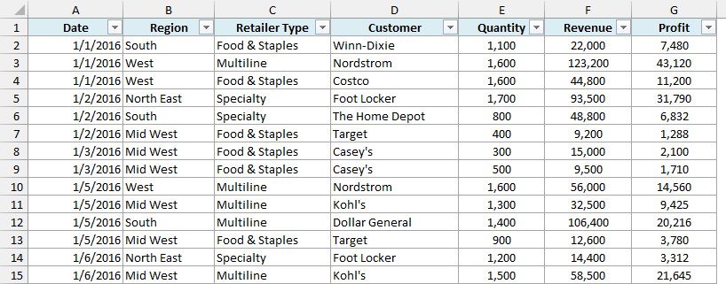
Suppose you have a dataset as shown below:
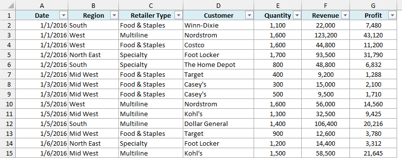
This is sales data that consists of 1,000 rows, one for each order placed in 2016.
It has the sales data by region, retailer type, and customer, along with the quantity, revenue, and profit for each order.
Now your boss may want to know a few things from this data:
- What were the total sales in the South region in 2016?
- What are the top five retailers by sales?
- How did The Home Depot’s performance compare against other retailers in the South?
You can go ahead and use Excel functions to give you the answers to these questions, but what if suddenly your boss comes up with a list of five more questions.
You’ll have to go back to the data and create new formulas every time there is a change.
This is where Excel Pivot Tables come in really handy.
Within seconds, a Pivot Table will answer all these questions (as you’ll learn below).
But the real benefit is that it can keep up with your boss’s follow-up questions and answer them immediately.
It’s so simple, you may as well take a few minutes and show your boss how to do it themselves.
Hopefully, now you have an idea of why Pivot Tables are so awesome. Before we create one, let’s quickly make sure the data is in the right shape.
Get Your Data Ready for a Pivot Table
Before you create a Pivot Table, it helps to check that your data is set up properly. You don’t need to do much here, but a few things matter.
Here is the same sales dataset again:
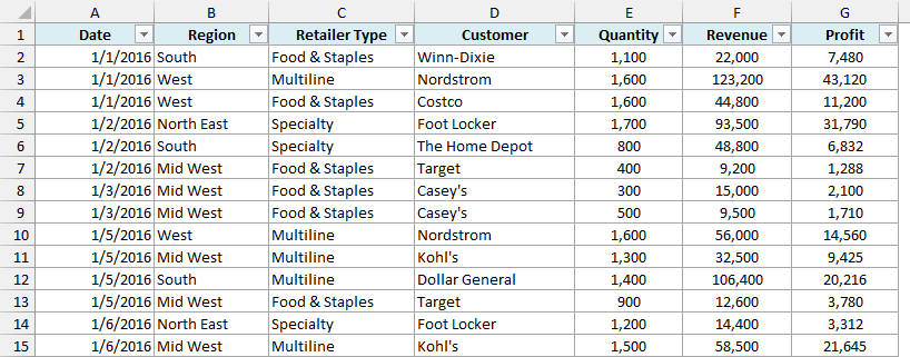
Make sure your data has:
- One header row, with a unique name for each column (Date, Region, Customer, and so on).
- One type of data in each column. For example, the Revenue column should only have numbers.
- No blank rows or blank columns in the middle of the data.
If there are blank rows or columns, Excel may pick only part of your data when you create the Pivot Table. You can fix the range manually, but it’s easier to keep the data clean.
I also recommend converting your data into an Excel Table before you create the Pivot Table. In the example file, the data is already an Excel Table named SalesData.
The benefit is that when you add new rows to the Table and refresh the Pivot Table, the new rows are included automatically.
With a regular range, you’d have to update the source range yourself.
Pro Tip: To convert your data into an Excel Table, select any cell in the data and press Control + T, then click OK.
If your data has bigger issues (like merged cells or data spread across columns by month), check out this guide on preparing source data for a Pivot Table.
How to Create a Pivot Table in Excel
Now let’s create a Pivot Table using the sales data. Below is the dataset we’ll use:
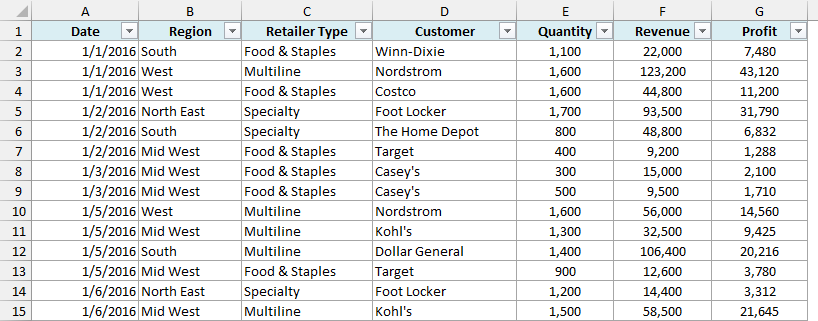
Here are the steps to create a Pivot Table using the data shown above:
- Click anywhere in the dataset.
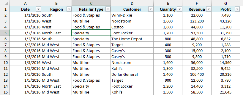
- Click the Insert tab in the ribbon, and then click on PivotTable (in the Tables group).
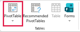
- In the ‘PivotTable from table or range’ dialog box, check the Table/Range and choose where you want the Pivot Table placed.
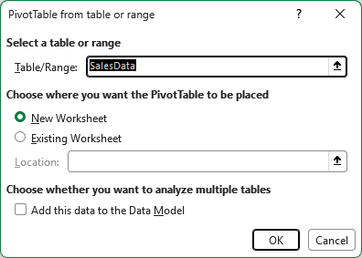
In older versions of Excel, this dialog box is called Create PivotTable. The default options in it work fine in most cases. Here are a couple of things to check in it:
- Table/Range: It’s filled in by default based on your dataset. If your data is a regular range with no blank rows/columns, Excel would automatically identify the correct range. Since our data is an Excel Table, it shows the Table name (SalesData). You can manually change this if needed.
- Location: New Worksheet is selected by default, so Excel creates the Pivot Table in a new sheet. If you want it in a specific location, select Existing Worksheet and specify the cell. You can also move the Pivot Table later.
You’ll also see an option called ‘Add this data to the Data Model’. Leave it unchecked for now.
It’s useful when you want to combine data from multiple tables, or when you want to count distinct values in a Pivot Table.
- Click OK.
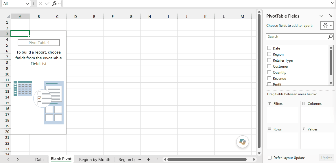
As soon as you click OK, a new worksheet is created with the Pivot Table in it.
While the Pivot Table has been created, you’d see no data in it. All you’d see is the Pivot Table name and a single line instruction on the left, and the PivotTable Fields pane on the right.
Pro Tip: You can also open this dialog box with the keyboard. Select any cell in your data, press ALT + N + V + T (one key after the other), and then press Enter.
Also read: 10 Excel Pivot Table Keyboard Shortcuts
Create a Pivot Table Using Recommended PivotTables
If you’re not sure how you want to lay out your Pivot Table, you can let Excel suggest a few options for you. This is a quick way to get started, especially if you’re new to Pivot Tables.
Below is the same sales dataset:
Here are the steps to create a Pivot Table using Recommended PivotTables:
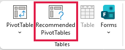
- Click anywhere in the dataset, go to the Insert tab, and click on Recommended PivotTables.
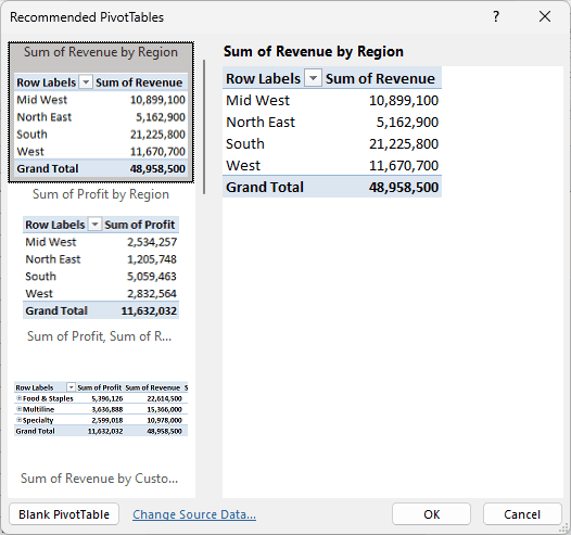
- In the Recommended PivotTables dialog box, click on the layout you like in the list on the left (the preview shows on the right).
- Click OK.
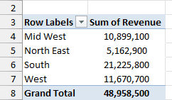
Excel creates the Pivot Table in a new worksheet, with the fields already placed.
The suggestions are based on your data, so they won’t always match the exact question you have.
That’s fine. You can still change the fields afterward, the same way as any other Pivot Table.
The Nuts & Bolts of an Excel Pivot Table
To use a Pivot Table efficiently, it’s important to know the components that create a pivot table.
In this section, you’ll learn about:
- Pivot Cache
- Values Area
- Rows Area
- Columns Area
- Filters Area
For this section, I’ll use a Pivot Table built from the same sales data.
It shows the total revenue by region in each month of 2016, with Region in Rows, Date in Columns, Revenue in Values, and Retailer Type in Filters.

Pivot Cache
As soon as you create a Pivot Table using the data, something happens in the backend. Excel takes a snapshot of the data and stores it in its memory. This snapshot is called the Pivot Cache.
When you create different views using a Pivot Table, Excel does not go back to the data source. Rather, it uses the Pivot Cache to quickly analyze the data and give you the summary/results.
The reason a pivot cache gets generated is to optimize the pivot table functioning. Even when you have thousands of rows of data, a pivot table is super fast in summarizing the data.
You can drag and drop items in the rows/columns/values/filters boxes and it will instantly update the results.
Note: One downside of pivot cache is that it increases the size of your workbook.
Since it’s a replica of the source data, when you create a pivot table, a copy of that data gets stored in the Pivot Cache.
Important: A Pivot Table reads from the Pivot Cache, so it doesn’t update on its own when you change the source data. Right-click in the Pivot Table and click Refresh.
You can learn more about this in these guides on how to refresh a Pivot Table and what is Pivot Cache and how to best use it.
Values Area
The Values Area is what holds the calculations/values.
Based on the dataset shown at the beginning of the tutorial, if you quickly want to calculate total sales by region in each month, you can get a pivot table as shown below.
The highlighted area is the Values Area.

In this Pivot Table example, it has the total sales in each month for the four regions.
Rows Area
The headings to the left of the Values area make the Rows area.
In the example below, the Rows area contains the regions (highlighted):

Columns Area
The headings at the top of the Values area make the Columns area.
In the example below, the Columns area contains the months (highlighted):

Here, the dates from the Date column are grouped by month. You can learn how to do this in this guide on how to group dates in Pivot Tables.
Filters Area
The Filters area is an optional filter that you can use to further drill down in the dataset.
For example, if you only want to see the sales for Multiline retailers, you can select that option from the Retailer Type drop-down (highlighted in the image below).
The Pivot Table would then update with the data for Multiline retailers only.

How to Use a Pivot Table to Analyze Data
Now, let’s try and answer the questions by using the Pivot Table we have created.
Follow along with the example file
Create a Pivot Table in Excel.xlsx
To analyze data using a Pivot Table, you need to decide how you want the data summary to look in the final result.
For example, you may want all the regions on the left and the total sales right next to it.
Once you have this clarity in mind, you can simply drag and drop the relevant fields in the Pivot Table.
In the PivotTable Fields pane, you have the fields and the areas (as highlighted below):
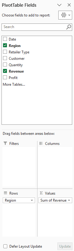
The Fields are created based on the backend data used for the Pivot Table.
The Areas section is where you place the fields, and according to where a field goes, your data is updated in the Pivot Table.
It’s a simple drag and drop mechanism, where you can simply drag a field and put it in one of the four areas. As soon as you do this, it will appear in the Pivot Table in the worksheet.
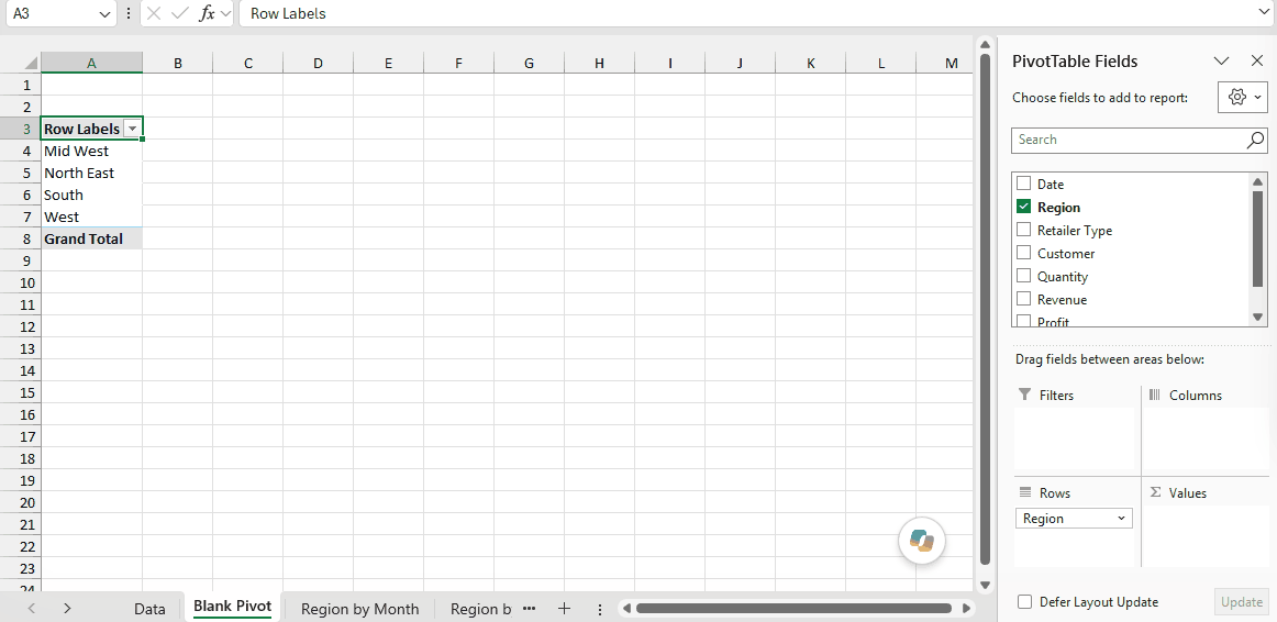
You can also check the box next to a field name instead of dragging it. Excel puts text fields in the Rows area and number fields in the Values area.
Now let’s try and answer the questions your manager had using this Pivot Table.
Question 1: What were the total sales in the South region?
Drag the Region field in the Rows area and the Revenue field in the Values area. It would automatically update the Pivot Table in the worksheet.
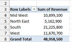
Note that as soon as you drop the Revenue field in the Values area, it becomes Sum of Revenue. By default, Excel sums all the values for a given region and shows the total.
If you want, you can change this to Count, Average, or other statistics metrics (right-click on any value and use the Summarize Values By option). In this case, the sum is what we needed.
Important: If a number column has text or blank cells in it, Excel may show Count instead of Sum when you add it to the Values area. Fix the source data, or change it to Sum manually.
The answer to this question would be 21,225,800. Since the data only covers 2016, this is the total for 2016.
Question 2: What are the top five retailers by sales?
Drag the Customer field in the Rows area and the Revenue field in the Values area.
In case there are any other fields in the area section and you want to remove them, simply select the field and drag it out of the area.
You’ll get a Pivot Table as shown below:
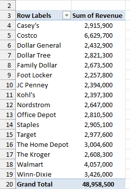
Note that by default, the items (in this case the customers) are sorted in alphabetical order.
To get the top five retailers, you can simply sort this list and use the top five customer names. Here are the steps to do this:
- Right-click on any cell in the Values area.
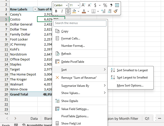
- Go to Sort and click on Sort Largest to Smallest.
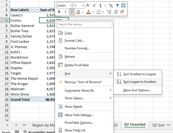
This will give you a sorted list based on total sales.
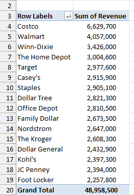
The top five retailers are Costco, Walmart, Winn-Dixie, The Home Depot, and Target.
Question 3: How did The Home Depot’s performance compare against other retailers in the South?
You can do a lot of analysis for this question, but here let’s just try and compare the sales.
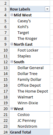
Drag the Region field in the Rows area. Now drag the Customer field in the Rows area below the Region field.
When you do this, Excel would understand that you want to categorize your data first by region and then by customers within the regions. You’ll have something as shown below:
Now drag the Revenue field in the Values area and you’ll have the sales for each customer (as well as the overall region).
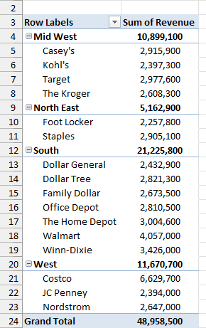
You can sort the retailers based on the sales figures by following the below steps:
- Right-click on a cell that has the sales value for any retailer.
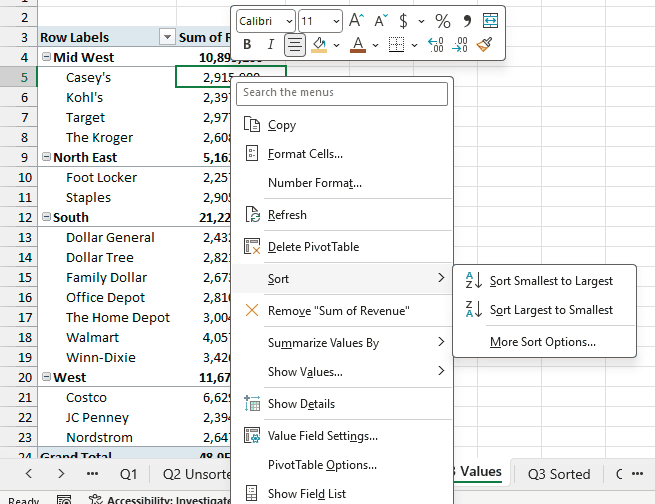
- Go to Sort and click on Sort Largest to Smallest.
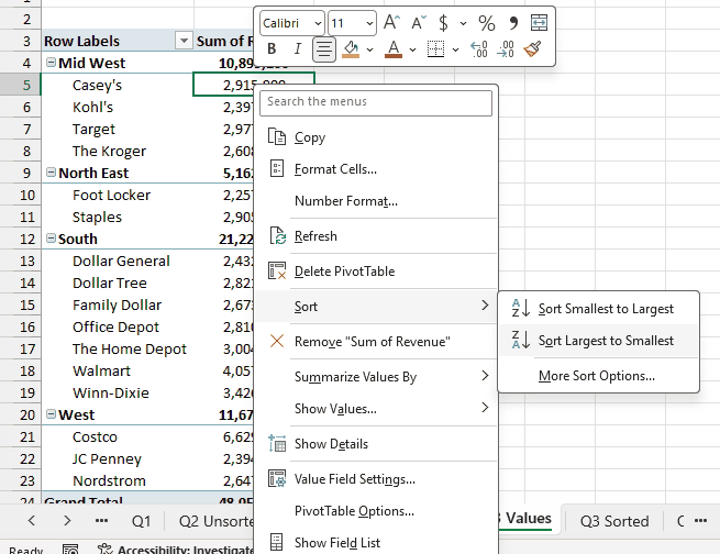
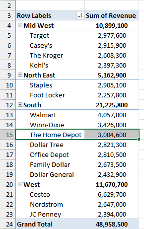
This would instantly sort all the retailers by the sales value within each region.
Now you can quickly scan through the South region and identify that The Home Depot sales were 3,004,600. It did better than four retailers in the South region.
Now there is more than one way to skin the cat. You can also put the Region in the Filters area and then only select the South region.
How to Create a Pivot Chart From a Pivot Table
Once you have your Pivot Table, you can turn it into a chart in a few clicks. This is called a Pivot Chart, and it stays connected to your Pivot Table.
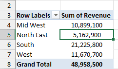
Below is the Pivot Table from Question 1, which shows the total sales by region:
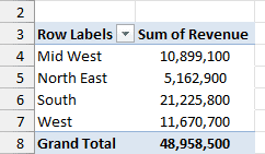
Here are the steps to create a Pivot Chart from this Pivot Table:
- Select any cell in the Pivot Table.
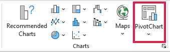
- Click the Insert tab and then click on PivotChart (in the Charts group).
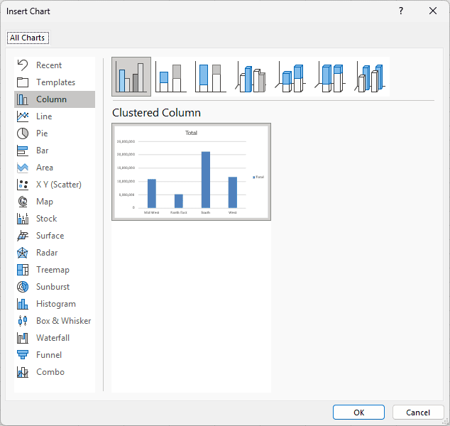
- In the Insert Chart dialog box, select the chart type you want (Clustered Column in this example) and click OK.
Excel inserts the Pivot Chart on the same sheet as the Pivot Table.
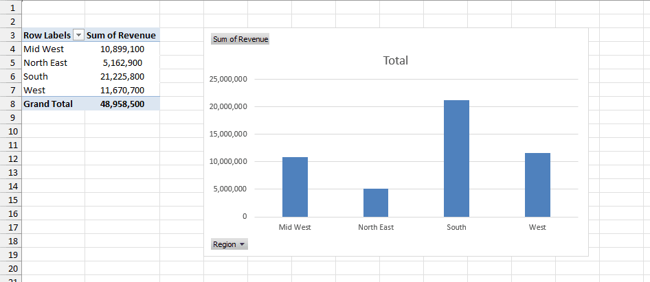
Since the chart is connected to the Pivot Table, any change you make in the Pivot Table also shows up in the chart. For example, if you filter the Pivot Table, the chart gets filtered too.
Note that not every chart type works as a Pivot Chart. For example, you can’t use scatter, bubble, or stock charts, or newer chart types like treemap and waterfall.
Pro Tip: To create a Pivot Chart even faster, select any cell in the Pivot Table and press ALT + F1. This inserts a Pivot Chart on the same sheet.
I hope this tutorial gives you a basic overview of Excel Pivot Tables and helps you in getting started with it.
When you’re ready for more, all my guides are on the Pivot Table tips and tutorials page.
Here are some more Pivot Table Tutorials you may like:
- Preparing Source Data For Pivot Table.
- How to Apply Conditional Formatting in a Pivot Table in Excel.
- How to Group Dates in Pivot Tables in Excel.
- How to Group Numbers in Pivot Table in Excel.
- How to Filter Data in a Pivot Table in Excel.
- Using Slicers in Excel Pivot Table.
- How to Replace Blank Cells with Zeros in Excel Pivot Tables.
- How to Add and Use an Excel Pivot Table Calculated Fields.
- How to Refresh Pivot Table in Excel
- Change Pivot Table to Tabular Form
- Pivot Table Limitations
- GETPIVOTDATA function

Thank you for sharing this tutorial session. It was well done and provided clear, easy‑to‑follow, step‑by‑step instructions for the Pivot Table lesson.
Best,
Khaled Ahmed
This is great but how do you update a pivot table with new information or colums
Thanks very much it’s been very helpfull
Thank you for this recap
thanks for sharing, i have taken good knowledge from this
This is excellent tutor for starting learners.
very nice initiative
You truly are MVP.
Your guides help me alot.
Really boost my career skills.
Thank you.
It is gratifying that one can learn one of the most, if not the most powerful tool not only in excel but in analytical field, in the comfort of one’s home and at own pace free. Very generous of you and your team. Highly appreciated and A very very Big Thank You.
may The LORD reward your good deeds in Jesus Christ Mighty Name – Amen
Good site for learning basic to intermdiate Excel. Keep it up
The lesson is so interesting while looking into it,it is so helpful and reliable to me. would love to have more in detail, that can ironize my carrier.
greatt tutorial. Very well explained. Thank
I am not getting the excel tips free ebook
Hi,
Just wanna say, thank you for sharing this it will help us, especially me as a beginner in this field.