An Excel Dashboard can be an amazing tool when it comes to tracking KPIs, comparing data points, and getting data-backed views that can help management make decisions.
In this tutorial, you will learn how to create an Excel dashboard, best practices to follow while creating one, features and tools you can use in Excel, things to avoid at all costs, and recommended training material.
What is an Excel Dashboard and how does it differ from a report?
Let’s first understand what is an Excel dashboard.
An Excel dashboard is one-pager (mostly, but not always necessary) that helps managers and business leaders in tracking key KPIs or metrics and take a decision based on it. It contains charts/tables/views that are backed by data.
A dashboard is often called a report, however, not all reports are dashboards.
Here is the difference:
- A report would only collect and show data in a single place. For example, if a manager wants to know how the sales have grown over the last period and which region were the most profitable, a report would not be able to answer it. It would simply report all the relevant sales data. These reports are then used to create dashboards (in Excel or PowerPoint) that will aid in decision making.
- A dashboard, on the other hand, would instantly answer important questions such which regions are performing better and which products should the management focus on. These dashboards could be static or interactive (where the user can make selections and change views and the data would dynamically update).
Now that we have an understanding of what a dashboard is, let’s dive in and learn how to create a dashboard in Excel.
Also read: Excel Skills (Basic, Intermediate, and Advanced)
How to Create an Excel Dashboard?
Creating an Excel Dashboard is a multi-step process and there are some key things you need to keep in mind when creating it.
Even before you launch Excel, you need to be clear about the objectives of the dashboard.
For example, if you’re creating a KPI dashboard to track financial KPIs of a company, your objective would be to show the comparison of the current period with the past period(s).
Similarly, if you’re creating a dashboard for Human Resources department to track the employee training, then the objective would be to show how many employees have been trained and how many needs to be trained to reach the target.
Things to Do Before You Even Start Creating an Excel Dashboard
A lot of people start working on the dashboard as soon as they get their hands on the data.
And in most cases, they bring upon them the misery of reworking on the dashboard as the client/stakeholder objectives are not met.
Below are some of the questions you must have answered before you start building an Excel Dashboard:
Q: What is the Purpose of the Dashboard?
The first thing to do as soon as you get the data (or even before getting the data), is to get clarity on what your stakeholder wants. Be clear on what purpose the dashboard needs to serve.
Is it to track KPIs just one time, or on a regular basis? Does it need to track the KPIs for the whole company or division-wise?. Asking the right questions would help you understand what data you need and how to design the dashboard.
Q: What are the data sources?
Always know where the data comes from and in what format. In one of my projects, the data was provided as PDF files in the Spanish language. This completely changed the scope and most of our time was sucked up in manually culling the data. Here are the questions you should ask: Who owns the data? In what format will you get the data? How frequently does the data update?
Q: Who will use this Excel Dashboard?
A manager would probably only be interested in the insights your dashboard provides, however, some data analysts in his team may need a more detailed view. Based on who uses your dashboard, you need to structure the data and the final output.
Q: How frequently does the Excel Dashboard need to be updated?
If your dashboards are to be updated weekly or monthly, you are better off creating a plug-and-play model (where you simply copy-paste the data and it would automatically update). If it’s a one-time exercise only, you can leave out some automation and do that manually.
Q: What version of Office does the client/stakeholder uses?
It’s better to not assume that the client/stakeholder has the latest version of MS Office. I once created a dashboard only to know that my stakeholder was using Excel 2003. This led to some rework as the IFERROR function doesn’t work in Excel 2003 version (which I had used extensively when creating the dashboard).
Getting the Data in Excel
Once you have a good idea of what you need to create, the next steps are to get your hands on the data and getting it in Excel.
Your life is easy when your client gives you Data in Excel, however, if that is not the case, you need to figure out an efficient way to get it in Excel.
If you’re supplied with CSV files or Text files, you can easily convert these in Excel. If you have access to a database that stores the data, you can create a connection and update it indirectly.
Once you have the data, you need to clean it and standardize it.
For example, you may need to get rid of leading, trailing, or double spaces, find and remove duplicates, remove blanks and errors, and so on.
In some cases, you may even need to restructure data (for example say you need to create a Pivot table).
These steps would depend on the project and how your data looks in Excel.
Outlining the Structure of the Dashboard
Once you have the data in Excel, you will know exactly what you can and can not use in your Excel dashboard.
At this stage, it’s a good idea to circle back with your stakeholders with an outline of the Excel dashboard.
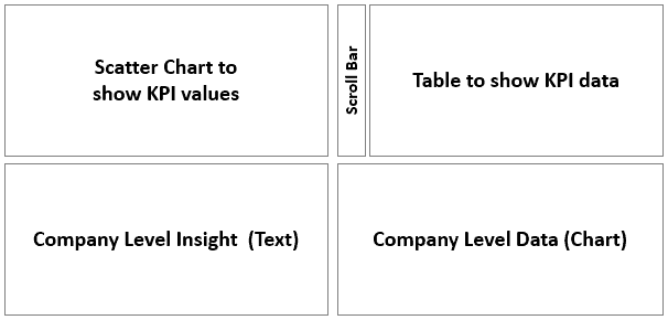
As a best practice, I create a simple outline in PowerPoint along with additional notes. The purpose of this step is to make sure your stakeholder understands what kind of dashboard he/she can expect with the available data.
It also helps as the stakeholder may suggest changes that would add more value to him.
Here is an example of a sample outline I created for one of the KPI dashboards:
Once you have the outline worked out, it’s time to start creating the Excel dashboard.
As a best practice, divide your Excel workbook into three parts (these are the worksheets that I create with the same name):
- Data – This could be one or more than one worksheet that contain the raw data.
- Calculations – This is where you do all the calculations. Again, you may have one or more than one sheet for calculations.
- Dashboard – This is the sheet that has the dashboard. In most of the cases, it is a single page view that shows analysis/insights backed by data.

Excel Table – The Secret Sauce of an Efficient Excel Dashboard
The first thing I do with the raw data is to convert it into an Excel Table.
Excel Table offers many advantages that are crucial while creating an Excel dashboard.
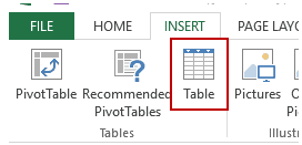
To convert tabular data into an Excel table, select the data and go to the Insert tab and click on the Table icon.
Here are the benefits of using an Excel Table for your dashboard:
- When you convert a tabular data set into an Excel table, you don’t need to worry about data getting changed at a later stage. Even if you get additional data, you can simply add it to the table without worrying about the formulas getting screwed up. This is really helpful when I create plug-and-play dashboards.
- With an Excel Table, you can use the names of the columns instead of the reference. For example, instead is C2:C1000, you can use ‘Sales’.
Important Excel Functions for Dashboards
You can create a lot of good interactive Excel dashboards by just using Excel formulas.
When you make a selection from a drop-down list, or use a scroll bar or select a checkbox, there are formulas that update based on the results and give you the updated data/view in the dashboard.
Here are my top five Excel functions for Excel Dashboards:
- SUMPRODUCT Function: It’s my favorite function while creating an interactive Excel dashboard. It allows me to do complex calculations when there are many variables. For example, suppose I have a sales dashboard and I want to know what were the sales done by the rep Bob in the third quarter in the East region. I can simply create a SUMPRODUCT formula for this.
- INDEX/MATCH Function: I am a big proponent of using the combination of INDEX and MATCH formula for looking up data in Excel Dashboards. You can also use the VLOOKUP function, but I find INDEX/MATCH to be a better choice.
- IFERROR Function: When doing calculations on the raw data, you’ll often end up with errors. I use IFERROR extensively to hide errors in the dashboard (and many times in the raw data as well).
- TEXT Function: If you want to create dynamic headlines or titles, you need to use the TEXT function for it.
- ROWS/COLUMNS Function: I use these often when I have to copy a formula and one of the arguments needs to increment as we go down/right of the cell.
Things to keep in mind when working with formulas in an Excel Dashboard:
- Avoid using volatile formulas (such as OFFSET, NOW, TODAY, and so on..). These will slow down your workbook.
- Remove unnecessary formulas. If you have some additional formulas in the calculation sheet, remove these while finalizing the dashboard.
- Use helper columns as it may help you avoid long array formulas.
Interactive Tools to Make Your Excel Dashboard Awesome
There are many interactive tools that you can use to make your Excel dashboard dynamic and user-friendly.
Here are some of these I use regularly:
- Scroll Bars: Use scroll bars to save your workbook real estate. For example, if you have 100 rows of data, you can use a scrollbar with only 10 rows in the dashboard. A user can use the scroll bar if he/she wished to have a look at the entire data set.
- Check Boxes: CheckBoxes allow you to make selections and update the dashboard. For example, suppose I have a training dashboard and I am the company’s CEO, I would want to look at the overall company dashboard. But if I am the sales head, I would only want to look at the performance of my department. In such a case, you can create a dashboard with checkboxes for different divisions of the company.
- Drop Down List: A drop-down list allows a user to make an exclusive selection. You can use these drop-down selections to update the dashboard. For example, if you are showing data by department, you can have the department names in the drop-down.
Using Excel Charts to Visualize Data in an Excel Dashboard
Charts not only make your Excel dashboard visually appealing but also make it easy to consume and interpret.
Here are some tips while using charts in an Excel Dashboard:
- Select the right Chart: Excel gives you a lot of charting options and you need to use the right chart. For example, if you have to show a trend, you need to use a line chart, but if you want to highlight the actual values, a bar/column chart could be the right choice. While a lot of experts advise against using a pie chart, I would suggest you use your discretion. If your audience is used to seeing pie charts, you may as well use these.
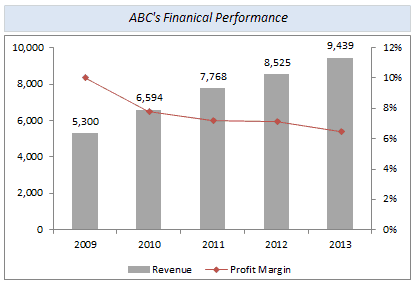
- Use combination charts: I highly recommend using combination charts as these allow the user to compare values and draw meaning insights. For example, you can show the sales figure as a column chart and growth as a line chart.
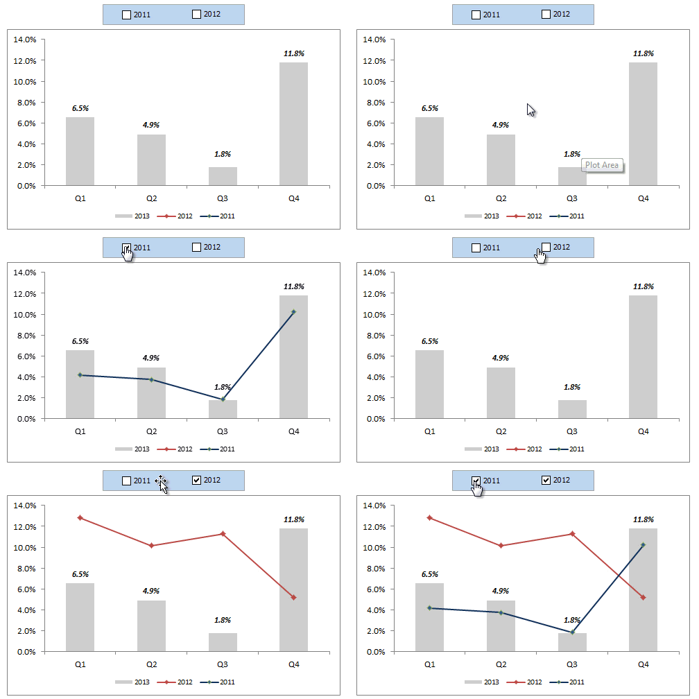
- Use dynamic charts: If you want to allow the user to make selections and want the chart to update with it, use dynamic charts. Now a dynamic chart is nothing but a regular chart whose data updates in the back-end when you make selections.
- Use Sparklines to make your data more meaningful: If you have a lot of data in your dashboard/report, you can consider using Sparklines to make it visual. A sparkline is a tiny chart that resides in a cell and can be created using a data set. These are useful when you want to show a trend over time and at the same time save space on your dashboard. You can learn more about Excel Sparklines here.
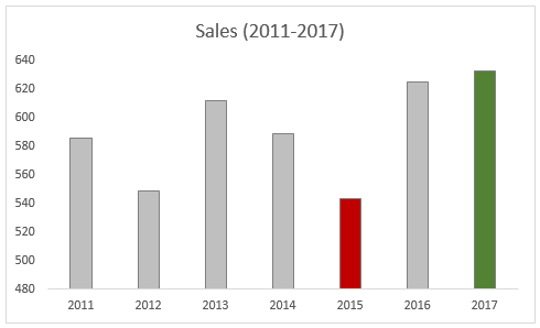
- Use contrasting colors to highlight data: This is a generic charting tip where you should highlight data in a chart so it’s easy to understand. For example, if you have sales data, you can highlight the year with a lowest sales value in red.
You can browse through some of my charting tutorials here.
Also, if you want to get more advanced in Excel charting, I recommend you visit the blog by Excel charting expert Jon Peltier.
Excel Dashboards Do’s and Don’ts
Let’s first start with the Dont’s!
Here are some of the things I recommend you avoid while creating an Excel dashboard. Again these would vary based on your project and stakeholder but are valid in most of the cases.
- Don’t Clutter Your Dashboards: Just because you have data and charts doesn’t mean it should go in your dashboard. Remember the objective of the dashboard is to help identify a problem or aid in taking decisions. So keep it relevant and remove everything that doesn’t belong there. I often ask myself if something is just good to have to absolutely must-have. Then I go ahead and remove all the good-to-haves.
- Don’t use volatile formulas: As it will slow down the calculations.
- Don’t keep extra data in your workbook: If you need that data, create a copy of the dashboard and keep it as the backup.
Now let’s have a look at some Do’s (or best practices)
- Numbering your Charts/Section: Your dashboard is not just a random set of charts and data points. Instead, it’s a story where one thing leads to the other. You need to make sure your audience follows the steps in the right order, and therefore it’s best to number these. While you may be able to guide them when you’re presenting live, it’s a great help when someone uses your dashboard at a later stage or takes a print out of it.
- Restrict Movement in the dashboard area: Hide all rows/columns to make sure the user doesn’t accidentally scroll away.
- Freeze Important rows/column: Use freeze panes when you want some rows/columns to be always visible on the dashboard.
- Make Shapes/Charts Stick: Make sure your shapes/charts or interactive controls don’t hide or resize when someone hides/resizes the cells. You can also use the Excel Camera tool to take a snapshot of charts/tables and place it in the Excel dashboard (these images are dynamic and update when the back-end chart/table updates).
- Provide a User Guide: If you have a complex dashboard, it’s a good idea to create a separate worksheet and highlight the steps. It will help people use your dashboard even when you’re not there.
- Save Space with Combination Charts: Use combination charts (such as bullet charts, thermometer charts, and actual vs target charts) to save your worksheet space.
- Use Symbols & Conditional Formatting: Use symbols (such as up/down arrows or check-mark/cross-mark) and conditional formatting to add a layer of analysis to your dashboard (but don’t overdo it either).
Want to create professional dashboards in Excel? Check out the Online Excel Dashboard course where I show you everything about creating a world-class Excel Dashboard.
Dashboard Examples
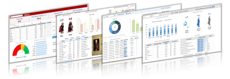
Here are some cool Excel dashboard examples that you can download and play with.
Excel KPI Dashboard
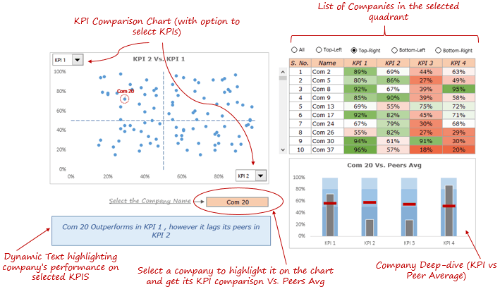
You can use this dashboard to track KPIs of various companies and then use bullet charts to deep dive into the individual company’s performance.
Click here to download this KPI Dashboard.
If you’re interested in learning how to create this KPI dashboard – click here.
Call Center Performance Dashboard
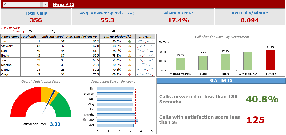
You can use this dashboard to track key KPIs of a call center. From this dashboard, you can learn how to create combination charts, how to highlight specific data points in charts, how to sort using radio buttons, etc.
Click here to download the dashboard.
You can read more about this dashboard here.
EPL Season visualized in an Excel Dashboard
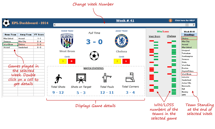
In this dashboard, you will learn how to use VBA in Excel dashboards. In this dashboard, the details of the games update when you double click on the cells on the left. It also uses VBA to show a help menu to guide the user in using this dashboard.
Click here to download the EPL dashboard.
You can read more about this dashboard here.
Recommended Dashboard Training
If you want to learn how to create world-class professional dashboards in Excel, check out my FREE Online Excel Dashboard Course.
Other articles you may also like:


