
Excel has a variety of in-built charts that can be used to visualize data. And creating these charts in Excel only takes a few clicks.
Among all these Excel chart types, there has been one that has been a subject of a lot of debate over time.
…the PIE chart (no points for guessing).
Pie charts may not have got as much love as it’s peers, but it definitely has a place. And if I go by what I see in management meetings or in newspapers/magazines, it’s probably way ahead of its peers.
In this tutorial, I will show you how to create a Pie chart in Excel.
But this tutorial is not just about creating the Pie chart. I will also cover the pros & cons of using Pie charts and some advanced variations of it.
Note: Often, a Pie chart is not the best chart to visualize your data. I recommend you use it only when you have a few data points and a compelling reason to use it (such as your manager’s/client’s penchant for Pie charts). In many cases, you can easily replace it with a column or bar chart.
Let’s start from the basics and understand what is a Pie Chart.
In case you find some sections of this tutorial too basic or not relevant, click on the link in the table of contents and jump to the relevant section.
What is a Pie Chart?
I will not spend a lot of time on this, assuming you already know what it is.
And no.. it has nothing to do with food (although you can definitely slice it up into pieces).
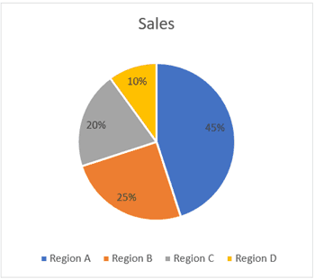
A pie chart (or a circle chart) is a circular chart, which is divided into slices. Each part (slice) represents a percentage of the whole. The length of the pie arc is proportional to the quantity it represents.
Or to put it simply, it’s something as shown below.

The entire pie chart represents the total value (which is 100% in this case) and each slice represents a part of that value (which are 45%, 25%, 20%, and 10%).
Note that I have chosen 100% as the total value. You can have any value as the total value of the chart (which becomes 100%) and all the slices will represent a percentage of the total value.
Let me first cover how to create a Pie chart in Excel (assuming that’s what you’re here for).
But I do recommend that you go on and read all the things covered later in this article as well (most importantly the Pros and Cons section).
Creating a Pie Chart in Excel
To create a Pie chart in Excel, you need to have your data structured as shown below.

The description of the pie slices should be in the left column and the data for each slice should be in the right column.
Once you have the data in place, below are the steps to create a Pie chart in Excel:
- Select the entire dataset
- Click the Insert tab.

- In the Charts group, click on the ‘Insert Pie or Doughnut Chart’ icon.
- Click on the Pie icon (within 2-D Pie icons).
The above steps would instantly add a Pie chart on your worksheet (as shown below).

While you can figure out the approximate value of each slice in the chart by looking at its size, it’s always better to add the actual values to each slice of the chart.
These are called the Data Labels
To add the data labels on each slice, right-click on any of the slices and click on ‘Add Data Labels’.

This will instantly add the values to each slice.
You can also easily format these data labels to look better on the chart (covered later in this tutorial).
Formatting the Pie Chart in Excel
There are a lot of customizations you can do with a Pie chart in Excel. Almost every element of it can be modified/formatted.
Pro Tip: It’s best to keep your Pie Charts simple. While you can use a lot of colors, keep it to a minimum (even different shades of the same color is fine). Also, if your charts are printed in black and white, you need to make sure the difference in slice colors is noticeable.
Let’s see a few of the things that you can change to make your charts better.
Changing the Style and Color
Excel already has some neat pre-made styles and color combinations that you can use to instantly format your Pie charts.
When you select the chart, it will show you the two contextual tabs – Design and Format.

These tabs only appear when you select the chart
Within the ‘Design’ tab, you can change the Pie chart style by clicking on any of the pre-made styles. As soon as you select the style that you want, it will be applied to the chart.

You can also hover your cursor over these styles and it will show you a live preview of how your Pie chart would look when that style is applied.
You can also change the color combination of the chart by clicking on the ‘Change Colors’ option and then selecting the one you want. Again, as you hover the cursor over these color combinations, it will show a live preview of the chart.

Pro Tip: Unless you want your chart to be really colorful, opt for the monochromatic options. These have shades of the same color and are relatively easy to read. Also, in case you want to highlight one specific slice, you can keep all the other slices in dull color (such as grey or light blue) and highlight that slice with a different color (preferably bright colors such as red or orange or green).
Related tutorial: How to Copy Chart (Graph) Format in Excel
Formatting the Data Labels
Adding the data labels to a Pie chart is super easy.
Right-click on any of the slices and then click on Add Data Labels.

As soon as you do this. data labels would be added to each slice of the Pie chart.
And once you have added the data labels, there is a lot of customization you can do with it.
Quick Data Label Formatting from the Design Tab
A quick level of customization of the data labels is available in the Design tab, which becomes available when you select the chart.
Here are the steps to format the data label from the Design tab:
- Select the chart. This will make the Design tab available in the ribbon.
- In the Design tab, click on the Add Chart Element (it’s in the Chart Layouts group).

- Hover the cursor on the Data Labels option.
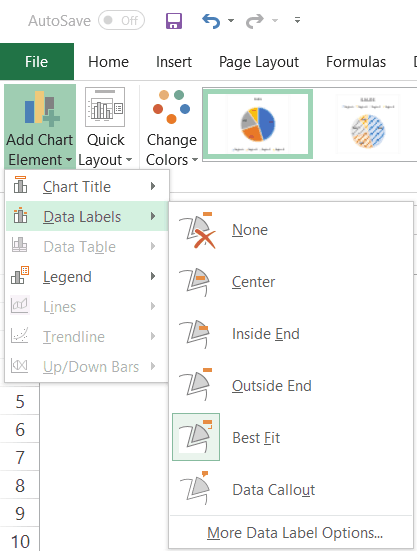
- Select any formatting option from the list.
One of the options that I want to highlight is the ‘Data Callout’ option. It quickly turns your data labels into callouts as shown below.

More data label formatting options become available when you right-click on any of the data labels and click on ‘Format Data Labels.

This will open a ‘Format Data Labels’ pane on the side (or a dialog box if you’re using an older version of Excel).
In the Format Data Labels pane, there are two sets of options – Label Options and Text Options

Formatting the Label Options
You can do the following type of formatting with the label options:
- Give a border to the label(s) or fill the label(s) box with a color.
- Give effects such as Shadow, Glow, Soft Edges, and 3-D Format.
- Change the size and alignment of the data label
- Format the label values using the Label options.

I recommend keeping the default data label settings. In some cases, you may want to change the color or the font size of these labels. But in most cases, the default settings are fine.
You can, however, make some decent formatting changes using the label options.
For example, you can change the placement of the data label (which is ‘best fit’ by default) or you can add the percentage value for each slice (which shows how much percentage of the total does each slice represents).
Formatting the Text Options
Text Options formatting allows you to change the following:
- Text Fill and outline
- Text Effects
- Text box

In most cases, the default settings are good enough.
The one setting you may want to change is the data label text color. It’s best to keep a contrasting text color so it’s easy to read. For example, in the below example, while the default data label text color was black, I changed it to white to make it readable.

Also, you can change the font color and style by using the options in the ribbon. Just select the data label(s) you want to format and use the formatting options in the ribbon.
Formatting the Series Options
Again, while the default settings are enough in most cases, there are few things you can do with ‘Series Options’ formatting that can make your Pie charts better.
To format the series, right-click on any of the slices of the Pie chart and click on ‘Format Data Series’.

This will open a pane (or a dialog box) with all the series formatting options.
The following formatting options are available:
- Fill & Line
- Effects
- Series Options

Now let me show you some minor formatting that you can do to make your Pie chart look better and more useful for the reader.
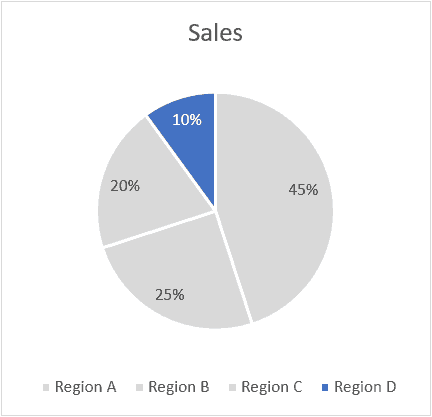
- Highlight one slice in the Pie Chart: To do this, uncheck the ‘Vary colors by slice’ option. This will make all the slices of the same color (you can also change the color if you want). Now you can select one of the slices (the one that you want to highlight) and give it a different color (preferably a contrasting color, as shown below)
- Separate a slice to highlight/analyze: In case you have a slice that you want to highlight and analyze, you can use the ‘Point Explosion’ option in the Series option tab. To separate a slice, simply select it (make sure only the slice that you want to separate from the remaining pie is selected) and increase the ‘Point Explosion’ value. It will pull the slice slightly from the rest of the Pie Chart.

Formatting the Legend
Just like any other chart in Excel, you can also format the legend of a Pie chart.
To format the legend, right-click on the legend and click in Format Legend. This will open the Format Legend pane (or a dialog box)

Within the Format Legend options, you have the following options:
- Legend Options: This will allow you to change the formatting such as fill color and line color, apply effects, and change the position of the legend (which allows you to place the legend at the top, bottom, left, right and top right).
- Text Options: These options allow you to change the text color and outline, text effects, and the text box.
In most cases, you don’t need to change any of these settings. The only time I use this is when I want to change the position of the legend (place it on the right instead of the bottom).
Pie Chart Pros and Cons
Although Pie charts are used a lot in Excel and PowerPoint, there are some drawbacks about it that you should know.
You should consider using it only when you think it allows you to represent the data in an easy to understand format and adds value for the reader/user/management.
Let’s go through the Pros and Cons of using Pie charts in Excel.
Let’s start with the good things first.
What’s Good about Pie Charts
- Easy to create: While most of the charts in Excel are easy to create, pie charts are even easier. You don’t need to worry a lot about customization as most of the times, the default settings are good enough. And if you need to customize it, there are many formatting options available.
- Easy to read: If you only have a few data points, Pie charts can be very easy to read. As soon as someone looks at a Pie chart, they can figure out what it means. Note that this works only if you have a few data points. When you have a lot of data points, the slices get smaller and become hard to figure out
- Management loves Pie Charts: In my many years of corporate career as a financial analyst, I have seen the love managers/clients have for Pie charts (which is probably only trumped by their love for coffee and PowerPoint). There have been instances, where I have been asked to convert bar/column charts into Pie charts (as people find it more intuitive).
If you’re interested, you can also read this article by Excel charting expert Jon Peltier on why we love pie charts (disclaimer: he doesn’t)
What’s Not so Good About Pie Charts
- Useful Only with fewer data points: Pie charts can become quite complex (and useless to be honest) when you have more data points. The best use of a Pie chart would be to show how one or two slices are doing as a part of the overall pie. For example, if you have a company with five divisions, you can use a Pie chart to show the revenue percent of each division. But if you have 20 divisions, it may not be the right choice. Instead, a column/bar chart would be better suited.
- Can’t show a trend: Pie charts are meant to show you the snapshot of the data in a given point in time. If you want to show a trend, better use a line chart.
- Can’t show multiple types of data points: One of the things I love about Column charts is that you can combine it with a line and create combination charts. A single combination chart packs a lot more information than a plain Pie chart. Also, you can create actual vs target charts which are a lot more useful when you want to compare data in different time periods. When it comes to a Pie chart, you can easily replace it with a line chart without losing out on any information.
- Difficult to comprehend when the difference in slices is less: It’s easier to visually see the difference in a column/bar chart as compared with a Pie chart (especially when there are a lot of data points). In some cases, you may want to avoid these as they may be a bit misleading.
- Takes more space and gives less information: If you’re using Pie charts in reports or dashboards (or in PowerPoint slides) and want to show more information in less space, you may want to replace it with other chart types such as combination charts or bullet chart.
Bottom line – Use a pie chart when you want to keep things simple and have to show data for a specific point in time (such as year-end sales or profit). In all other cases, it’s better to use other charts.
Advanced Pie Charts (Pie of Pie & Bar of Pie)
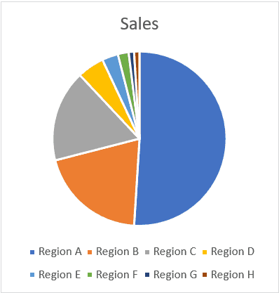
One of the major drawbacks of a Pie chart is that when you have a lot of slices (especially really small ones), it’s hard to read and analyze those (such as the ones shown below):
In the above chart, it might make sense to create a Pie of Pie chart or a Bar of Pie chart to present the lower values (the one shown with small slices) as a separate pie chart.
For example, if I want to specifically focus on the three lowest values, I can create a Pie of Pie chart as shown below.
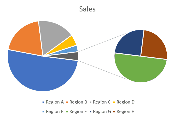
In the above chart, the three smallest slices get clubbed into one gray slice, and then the gray slice is shown as another Pie chart on the right. So instead of analyzing three small tiny slices, you get a zoomed-in version of it in the second pie. While I think this is useful, I have never used it for any corporate presentation (but I have seen these being used). And I would agree that these allow you to tell a better story by making the visualization easy.
So let’s quickly see how to create these charts in Excel.
Creating a Pie of Pie Chart in Excel
Suppose you have a data set as shown below:

If you create a single Pie chart using this data, there would be a couple of small slices in it.
Instead, you can use the Pie of Pie chart to zoom into these small slices and show these as a separate Pie (you can also think of it as a multiple level Pie chart).
Note: By default, Excel picks up up the last three data points to plot in a separate Pie chart. In case the data is not sorted in ascending order, these last three data points may not be the smallest one. You can easily correct this by sorting the data
Here are the steps to create a Pie of Pie chart:
- Select the entire data set.
- Click the Insert tab.
- In the Charts group, click on the ‘Insert Pie or Doughnut Chart’ icon.
- Click on the ‘Pie of Pie’ chart icon (within 2-D Pie icons)

The above steps would insert the Pie of Pie chart as shown below.
The above chart automatically combines a few of the smaller slices and shows a breakup of these slices in the Pie on the right.
This chart also gives you the flexibility to adjust and show a specific number of slices in the Pie chart on the right. For example, if you want the chart on the right to show a breakup of five smallest slices, you can adjust the chart to show that.
Here is how you can adjust the number of slices to be shown in the Pie chart on the right:
- Right-click on any of the slices in the chart
- Click on Format Data Series. This will open the Format Data Series pane on the right.
- In the Series options tab, within the Split Series by options, select Position (this may be the default setting already)
- In the ‘Values in second plot’, change the number to 5.

The above steps would combine the 5 smallest slices and combine these in the first Pie chart and show a breakup of it in the second Pie chart on the right (as shown below).
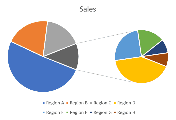
In the above chart, I have specified that the five smallest slices be combined as one and be shown in a separate Pie chart on the right.
You can also use the following criteria (which can be selected from the ‘Split Series by’ drop-down):

- Value: With this option, you can specify to club all the slices that are less than the specified value. For example, in this case, if I use 0.2 as the value, it will combine all the slices where the value in less than 20% and show these in the second Pie chart.
- Percentage Value: With this option, you can specify to club all the slices that are below the specified percentage value. For example, if I specify 10% as the value here, it will combine all the slices where the value is less than 10% of the overall Pie chart and show these in the second Pie chart.
- Custom: With this option, you can move the slices in case you want some slices in the second Pie chart to be excluded or some in the first Pie chart to be included. To remove a slice from the second Pie chart (the one of the right), click on the slice which you want to remove and then select ‘First Plot’ in the ‘Point Belongs to’ drop-down. This will remove that slice from the second plot while keeping all the other slices still there. This option is useful when you want to plot all the slices that are small or below a certain percentage in the second chart, but still, want to manually remove a couple of the slices from it. Using the custom option allows you to do this.
Formatting the ‘Pie of Pie’ Chart in Excel
Apart from all the regular formatting of a Pie chart, there are a few additional formatting things you can do with the Pie of Pie chart.
Point Explosion
You can use this option to separate the combined slice in the first Pie chart, which is shown with a break up in the second chart (on the right).

To do this, right-click on any slice of the Pie chart and change the Point Explosion value in the ‘Format Data Point’ pane. The higher the value, the more distance would be between the slice and the rest of the pie chart.
Gap Width
You can use this option to increase/decrease the gap between the two Pie charts.
Just change the Gap width value in the ‘Format Data Point’ pane.
Size of the Second Pie Chart (the one of the right)
By default, the second Pie chart is smaller in size (as compared with the main chart on the left).
You can change the size of the second Pie chart by changing the ‘Second Plot Size’ value in the ‘Format Data Point’ pane. The higher the number, the larger is the size of the second chart.
Creating a Bar of Pie Chart in Excel
Just like the Pie of Pie chart, you can also create a Bar of Pie chart.
In this type, the only difference is that instead of the second Pie chart, there is a bar chart.
Here are the steps to create a Pie of Pie chart:
- Select the entire data set.
- Click the Insert tab.
- In the Charts group, click on the ‘Insert Pie or Doughnut Chart’ icon.
- Click on the ‘Bar of Pie’ chart icon (within 2-D Pie icons)
The above steps would insert a Bar of Pie chart as shown below.
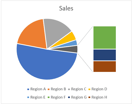
The above chart automatically combines a few of the smaller slices and shows a breakup of these slices in a Bar chart on the right.
This chart also gives you the flexibility to adjust this chart and show a specific number of slices in the Pie chart on the right in the bar chart. For example, if you want the chart on the right to show a breakup of five smallest slices in the Pie chart, you can adjust the chart to show that.
The formatting and settings of this Pie of bar chart can be done the same way we did for Pie of Pie charts.
Should You be using Pie of Pie or Bar of Pie charts?
While I am not a fan, I will not go as far as forbidding you to use these charts.
I have seen these charts being used in management meetings and one reason these are still being used is that it helps in letting you tell the story.
If you’re presenting this chart live to an audience, you can command their attention and take them through the different slices. Since you’re doing all the presentation, you also have the control to make sure things are understood the way it’s supposed to be, and there is no confusion.
For example, if you look at the chart below, someone may misunderstand that the green slice is bigger than the gray slice. In reality, the entire Pie chart on the right is equal to the gray slice only.
Adding data labels definitely helps, but the visual aspect always leaves some room for confusion.
So, if I am using this chart with a live presentation, I can still guide the attention and avoid confusion, but I wouldn’t use these in a report or dashboard where I am not there to explain it.
In such a case, I would rather use a simple bar/column chart and eliminate any chance of confusion.
3-D Pie Charts – Don’t Use these… Ever
While I am quite liberal when it comes to using different chart types, when it comes to 3-D Pie charts, it’s a complete NO.
There is no good reason for you to use a 3-D Pie chart (or any 3-D chart for that matter).
On the contrary, in some cases, these charts can cause confusions.
For example, in the below chart, can you tell me how much is the blue slice as a proportion of the overall chart.
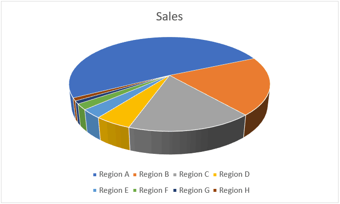
Looks like ~40%.. right?
Wrong!
It’s 51% – which means it’s more than half of the chart.
But if you look at the above chart, you can easily get tricked into thinking that it’s somewhere around 40%. This is because the rest of the part of the chart is facing towards you, and thanks to the 3-D effect of it, looks bigger.
And this is not an exception. With 3-D charts, there are tons of cases where the real value is not what it looks like. To avoid any confusion better stick to the 2-D charts only.
You can create a 3-D chart just like you create a regular 2-D chart (by selecting the 3-D chart option instead of the 2-D option).
My recommendation – avoid any kind of 3-D chart in Excel.
You May Also Like the Following Excel Charting Tutorials:


It was easy to understand
i understand easily
it is very easy to learn
super
Clear explanation
Easy to understand and quick to apply
Will wait for more lectures/tips especially on vlookup etc
Thanks a lot for today’s lessons, it was great!!! Excellent!
Excellent tutorial. I use Pie Charts quite often but agree that they have their limitations. Couldn’t agree more regarding your comments wrt 3-D Pie Charts – they are horrible!