
A histogram is a common data analysis tool in the business world. It’s a column chart that shows the frequency of the occurrence of a variable in the specified range.
According to Investopedia, a Histogram is a graphical representation, similar to a bar chart in structure, that organizes a group of data points into user-specified ranges. The histogram condenses a data series into an easily interpreted visual by taking many data points and grouping them into logical ranges or bins.
A simple example of a histogram is the distribution of marks scored in a subject. You can easily create a histogram and see how many students scored less than 35, how many were between 35-50, how many between 50-60 and so on.
There are different ways you can create a histogram in Excel:
- If you’re using Excel 2016, there is an in-built histogram chart option that you can use.
- If you’re using Excel 2013, 2010 or prior versions (and even in Excel 2016), you can create a histogram using Data Analysis Toolpack or by using the FREQUENCY function (covered later in this tutorial)
Let’s see how to make a Histogram in Excel.
Creating a Histogram in Excel 2016
Excel 2016 got a new addition in the charts section where a histogram chart was added as an inbuilt chart.
In case you’re using Excel 2013 or prior versions, check out the next two sections (on creating histograms using Data Analysis Toopack or Frequency formula).
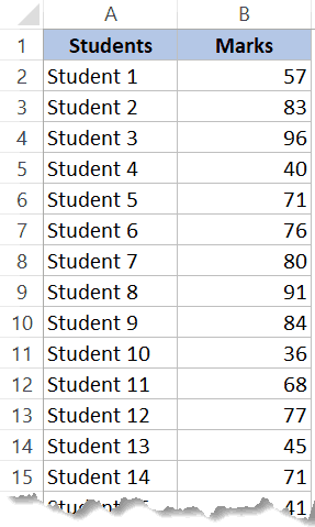
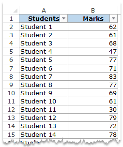
Suppose you have a dataset as shown below. It has the marks (out of 100) of 40 students in a subject.
Here are the steps to create a Histogram chart in Excel 2016:
- Select the entire dataset.
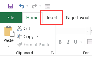
- Click the Insert tab.
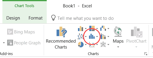
- In the Charts group, click on the ‘Insert Static Chart’ option.
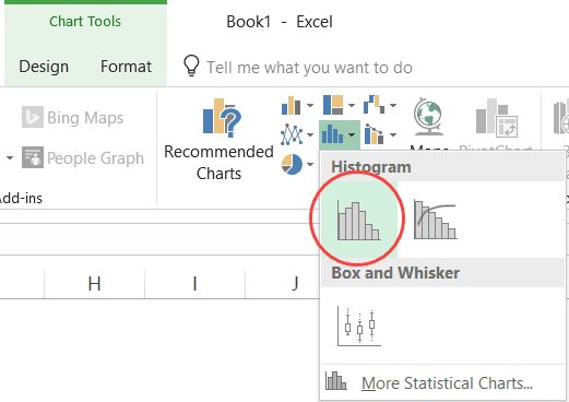
- In the HIstogram group, click on the Histogram chart icon.
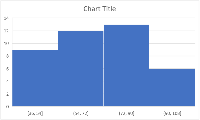
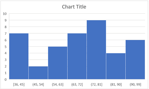
The above steps would insert a histogram chart based on your data set (as shown below).
Now you can customize this chart by right-clicking on the vertical axis and selecting Format Axis.
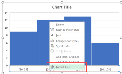
This will open a pane on the right with all the relevant axis options.
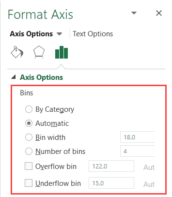
Here are some of the things you can do to customize this histogram chart:
- By Category: This option is used when you have text categories. This could be useful when you have repetitions in categories and you want to know the sum or count of the categories. For example, if you have sales data for items such as Printer, Laptop, Mouse, and Scanner, and you want to know the total sales of each of these items, you can use the By Category option. It isn’t helpful in our example as all our categories are different (Student 1, Student 2, Student3, and so on.)
- Automatic: This option automatically decides what bins to create in the Histogram. For example, in our chart, it decided that there should be four bins. You can change this by using the ‘Bin Width/Number of Bins’ options (covered below).
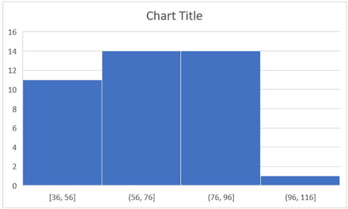
- Bin Width: Here you can define how big the bin should be. If I enter 20 here, it will create bins such as 36-56, 56-76, 76-96, 96-116.
- Number of Bins: Here you can specify how many bins you want. It will automatically create a chart with that many bins. For example, if I specify 7 here, it will create a chart as shown below. At a given point, you can either specify Bin Width or Number of Bins (not both).
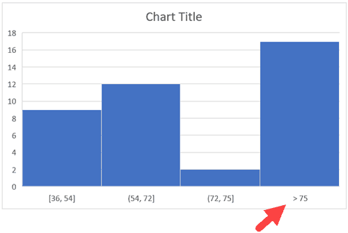
- Overflow Bin: Use this bin if you want all the values above a certain value clubbed together in the Histogram chart. For example, if I want to know the number of students that have scored more than 75, I can enter 75 as the Overflow Bin value. It will show me something as shown below.
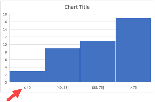
- Underflow Bin: Similar to Overflow Bin, if I want to know the number of students that have scored less than 40, I can enter 4o as the value and show a chart as shown below.
Once you have specified all the settings and have the histogram chart you want, you can further customize it (changing the title, removing gridlines, changing colors, etc.)
Also read: How to Calculate Percentile in Excel
Creating a Histogram Using Data Analysis Tool pack
The method covered in this section will also work for all the versions of Excel (including 2016). However, if you’re using Excel 2016, I recommend you use the inbuilt histogram chart (as covered below)
To create a histogram using Data Analysis tool pack, you first need to install the Analysis Toolpak add-in.
This add-in enables you to quickly create the histogram by taking the data and data range (bins) as inputs.
Installing the Data Analysis Tool Pack
To install the Data Analysis Toolpak add-in:
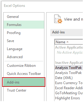
- Click the File tab and then select ‘Options’.
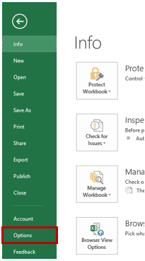
- In the Excel Options dialog box, select Add-ins in the navigation pane.
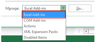
- In the Manage drop-down, select Excel Add-ins and click Go.
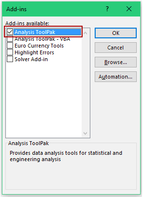
- In the Add-ins dialog box, select Analysis Toolpak and click OK.
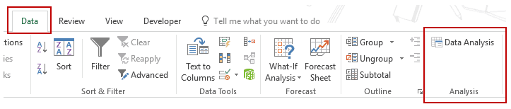
This would install the Analysis Toolpak and you can access it in the Data tab in the Analysis group.
Creating a Histogram using Data Analysis Toolpak
Once you have the Analysis Toolpak enabled, you can use it to create a histogram in Excel.
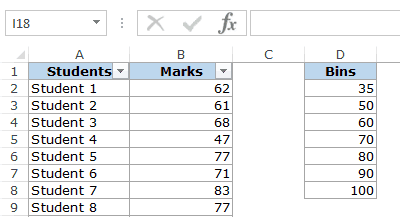
Suppose you have a dataset as shown below. It has the marks (out of 100) of 40 students in a subject.
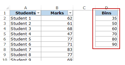
To create a histogram using this data, we need to create the data intervals in which we want to find the data frequency. These are called bins.
With the above dataset, the bins would be the marks intervals.
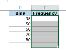
You need to specify these bins separately in an additional column as shown below:
Now that we have all the data in place, let’s see how to create a histogram using this data:
- Click the Data tab.
- In the Analysis group, click on Data Analysis.
- In the ‘Data Analysis’ dialog box, select Histogram from the list.
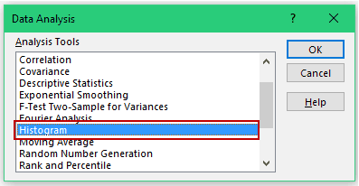
- Click OK.
- In the Histogram dialog box:
- Select the Input Range (all the marks in our example)
- Select the Bin Range (cells D2:D7)
- Leave the Labels checkbox unchecked (you need to check it if you included labels in the data selection).
- Specify the Output Range if you want to get the Histogram in the same worksheet. Else, choose New Worksheet/Workbook option to get it in a separate worksheet/workbook.
- Select Chart Output.
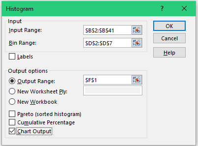
- Click OK.
This would insert the frequency distribution table and the chart in the specified location.
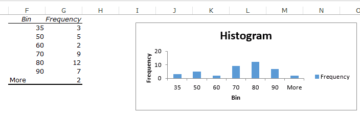
Now there are some things you need to know about the histogram created using the Analysis Toolpak:
- The first bin includes all the values below it. In this case, 35 shows 3 values indicating that there are three students who scored less than 35.
- The last specified bin is 90, however, Excel automatically adds another bin – More. This bin would include any data point which lies after the last specified bin. In this example, it means that there are 2 students who have scored more than 90.
- Note that even if I add the last bin as 100, this additional bin would still be created.
- This creates a static histogram chart. Since Excel creates and pastes the frequency distribution as values, the chart would not update when you change the underlying data. To refresh it, you’ll have to create the histogram again.
- The default chart is not always in the best format. You can change the formatting like any other regular chart.
- Once created, you can not use Control + Z to revert it. You’ll have to manually delete the table and the chart.
If you create a histogram without specifying the bins (i.e., you leave the Bin Range empty), it would still create the histogram. It would automatically create six equally spaced bins and used this data to create the histogram.
Creating a Histogram using FREQUENCY Function
If you want to create a histogram that is dynamic (i.e., updates when you change the data), you need to resort to formulas.
In this section, you’ll learn how to use the FREQUENCY function to create a dynamic histogram in Excel.
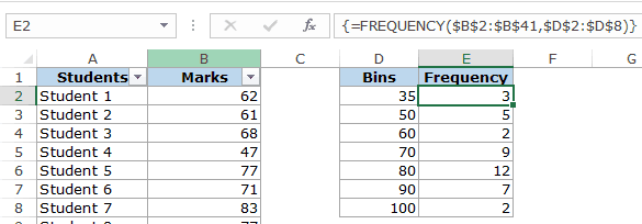
Again, taking the student’s marks data, you need to create the data intervals (bins) in which you want to show the frequency.
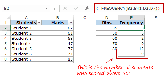
Here is the function that will calculate the frequency for each interval:
=FREQUENCY(B2:B41,D2:D8)
Since this is an array formula, you need to use Control + Shift + Enter, instead of just Enter.
Here are the steps to make sure you get the correct result:
- Select all cells adjacent to the bins. In this case, these are E2:E8.
- Press F2 to get into the edit mode for cell E2.
- Enter the frequency formula: =FREQUENCY(B2:B41,D2:D8)
- Hit Control + Shift + Enter.
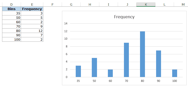
With the result that you get, you can now create a histogram (which is nothing but a simple column chart).
Here are some important things you need to know when using the FREQUENCY function:
- The result is an array and you can not delete a part of the array. If you need to, delete all the cells that have the frequency function.
- When a bin is 35, the frequency function would return a result that includes 35. So 35 means score up to 35, and 50 would mean score more than 35 and up to 50.
Also, let’s say you want to have the specified data intervals till 80, and you want to group all the result above 80 together, you can do that using the FREQUENCY function. In that case, select one more cell than the number of bins. For example, if you have 5 bins, then select 6 cells as shown below:
FREQUENCY function would automatically calculate all the values above 80 and return the count.
You May Also Like the Following Excel Tutorials:
- Creating a Pareto Chart in Excel.
- Creating a Gantt Chart in Excel.
- Creating a Milestone Chart in Excel.
- How to Make a Bell Curve in Excel.
- How to Create a Bullet Chart in Excel.
- How to Create a Heat Map in Excel.
- Standard Deviation in Excel.
- Area Chart in Excel.
- Advanced Excel Charts.
- Creating Excel Dashboards.


WTF??? Trump wouldn’t know what a histogram was if you rammed it up his brain dead ass.
He has no idea how to use excel. What’s up with this moronic website?
Actually your guide line for bar diagram not histogram
Because histogram always for a continuous series in statistics
0-10, 10- 20, 20-30, 30-40, 40-50 and their respective frequencies are 20,30,70,50,and 30
That’s way how draw a histogram?
Please suggest
I use excel 10
This is very helpful tips for data handling
FREQUENCY method doesn’t work, when i hit CONTROL+SHIFT+ENTER the result was number (1) only i don’t know why
Great tutorial it helped heartily
Great post. A helpful tip, if an array needs modifying (i.e., complete the equation or include or exclude cells) press the F2 key while the array is selected and the cursor is in the first cell. This will cancel the CTR+SHIFT+ENTER command and will allow to modify the array instead of deleting it.
Hi Sumit,
When we create histogram using overflow and underflow bin, for overlow it’s showing “>”, and underflow showing “=” and underflow is “<"? I've tried the other option, but didn't find it.
Thank you…
Hello MF,
Yes, creating histogram is easy using the Excel’s pivot table feature. But frankly speaking, if you want to see all the descriptive statistics summary at one go, you should use Excel’s Analysis ToolPak.
Regards
Kawser
Founder http://www.exceldemy.com/
Hi Sumit,
It’s a nice post. Hats off!
Frequency distribution tables have important roles in the lives of data analysts.
Below are my three blog posts on creating frequency distribution tables and its interpretation. In most cases, analysts finish their journey just creating a histogram, but without knowing its four pattern, it is not possible to get hidden gem from the data that makes the histogram. Even I created an Excel template to create histogram automatically.
1) http://www.exceldemy.com/frequency-distribution-excel-make-table-and-graph/
2) http://www.exceldemy.com/how-to-make-a-histogram-in-excel-using-analysis-toolpak/
3) http://www.exceldemy.com/stock-return-analysis-using-histograms-and-skewness-of-histograms/
And my this blog post on statistical data analysis is a must read for the data analysts.
1)http://www.exceldemy.com/learn-today-some-common-statistical-terms-for-data-analysis/
Best regards
Kawser
Founder http://www.exceldemy.com/