
A bell curve (also known as normal distribution curve) is a way to plot and analyze data that looks like a bell curve.
In the bell curve, the highest point is the one that has the highest probability of occurring, and the probability of occurrences goes down on either side of the curve.
It is often used during employee performance appraisals or during evaluation in exams (ever heard – “You will be graded on the curve?”).
Now before I jump in on how to create a bell curve in Excel, let’s get a better understanding of the concept by taking an example.
Understanding the Bell Curve
Suppose you work in a team of 100 members and your manager tells you that your performance will be relative to others and will be evaluated on the bell curve.
This means that even if your team is the best team ever and you’re all superheroes, only a handful of you would get the top rating, most of the people in your team would get an average rating, and a handful will get the lowest rating.

Image Source: EmpxTrack
But why do we need the bell curve?
Fair question!
Suppose you have a class of 100 students that appear for an exam. According to your grading system, anyone who gets above 80 out of 100 gets an A grade. But since you set a really easy paper, everyone scored above 80 and got the A grade.
Now there is nothing wrong in this kind of grading system. However, using it, you can not differentiate between someone who got 81 and someone who got 95 (as both would get the A grade).
To keep the comparison fair and keep the competitive spirit alive, a bell curve is often used to evaluate performances (at least that’s how it was when I was in college).
Using the bell curve approach, the marks of students are converted into percentiles that are then compared with each other.
Students getting higher marks are on the right side of the curve and students getting low marks are on the left of the curve (with most of the students being in the middle around mean score).
Now to understand bell curve, you need to know about two metrics:
- Mean – the average value of all the data points
- Standard Deviation – it shows how much the dataset deviates from the mean of the dataset. For example, suppose you have a group of 50 people, and you are recording their weight (in kgs). In this dataset, the average weight is 60 kg, and the standard deviation is 4 kg. It means that 68% of the people’s weight is within 1 standard deviation from the mean – which would be 56-64 kg. Similarly, 95% of the people are within 2 standard deviation – which would be 52-68 Kgs.
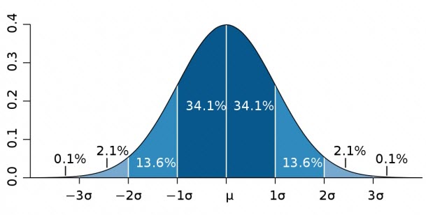
When you have a dataset that is normally distributed, your bell curve will follow the below rules:
- The center of the bell curve is the mean of the data point (also the highest point in the bell curve).
- 68.2% of the total data points lie in the range (Mean – Standard Deviation to Mean + Standard Deviation).
- 95.5% of the total data points lie in the range (Mean – 2*Standard Deviation to Mean + 2*Standard Deviation)
- 99.7% of the total data points lie in the range (Mean – 3*Standard Deviation to Mean + 3*Standard Deviation)
Image Source: MIT News
Now let’s see how to create a bell curve in Excel.
Creating a Bell Curve in Excel
Let’s take an example of a class of students that have been scored in an exam.
The mean score of the class is 65 and the standard deviation is 10. (You can calculate the mean using the AVERAGE function in Excel and Standard Deviation using the STDEV.P function).
Here are the steps to create a bell curve for this dataset:
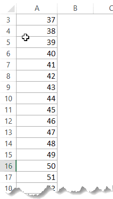
- In cell A1 enter 35. This value can be calculated using Mean – 3* Standard Deviation (65-3*10).
- In the cell below it enter 36 and create a series from 35 to 95 (where 95 is Mean + 3* Standard Deviation). You can do this quickly by using the autofill option, or use the fill handle and drag it down to fill the cells.
- In the cell adjacent to 35, enter the formula: =NORM.DIST(A1,65,10,FALSE)
- Note that here I have hardcoded the value of mean and standard deviation. You can also have these in cells and use the cell references in the formula.
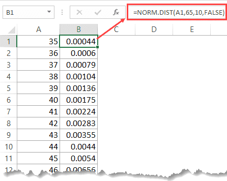
- Again use the fill handle to quickly copy and paste the formula for all the cells.
- Select the data set and go to Insert tab.

- Insert the ‘Scatter with Smooth Lines’ chart.
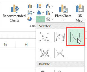
This will give you a bell curve in Excel.
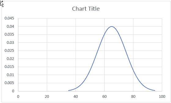
Now you can change the chart title and adjust the axis if you need.
Note that when you have a low standard deviation, you get a packed slim bell curve, and when you have a high standard deviation, the bell curve is wide and covers more area on the chart.
This kind of bell curve can be used to identify where a data point lies in the chart. For example, in case a team is full of high performers, when evaluated on a curve, despite being a high performer, someone can get an average rating as he/she was in the middle of the curve.
Note: In this blog post, I have discussed the concept of a bell curve and how to create it in Excel. A statistician would be better suited to talk about the efficacy of the bell curve and limitations associated with it. I am more of an Excel guy and my involvement with Bell curve has been limited to the calculations I did when I worked as a Financial Analyst.
Hope you found this tutorial useful!
Let me know your thoughts in the comments section.
You May Also like the following Excel Tutorials:
- How to Make a Histogram in Excel.
- How to Calculate Compound Interest in Excel + FREE Calculator.
- How to Create a Heat Map in Excel.
- Step Chart in Excel.
- How to Create a Timeline / Milestone Chart in Excel.
- Creating a Pareto Chart in Excel.
- Calculate P-value in Excel
- Creating a Pie Chart in Excel
- Advanced Excel Charts
- How to Find Slope in Excel? Using Formula and Chart
- Calculate Area Under Curve in an Excel


It’s 2023 and you’re still helping students!
THANK YOU!
very useful.
Thank you.
This was the easiest step-by-step guide for bell curves I’ve come across, many thanks!
is there any excel chart to create a rough predictive estimate of a pandemic based on previous known data applying present know data to project an estimate . now that would be very popular right now. A bell Gaussian distributions curve I think its called.
Thanks…very helpful
Hi. The standard deviation of the calculated weights is 17.7 and not 10. So, this bell curve does not comply with the created data.
Am I right (or I’m not)?
Best regards
ALSH
this is what I get too.
Many thanks
Thank you, life saver!
It is valuable
Useful. Thank you.
Thank very much you explain clarify good luck
Helped me a lot set up an activity for my class, than you!
Thank you so much for your step by step instructions, it was really usefull.
how can shade the curve which the area that i want to find
Could you please explain from where you got (mean value 65 AND STD deviation 10)
also from where do we got this role ( mean-3*STD Deviation )
For the mean, you can use the AVERAGE function, and for the deviation you can use the STDEV.P function. Both using your results as the range.
Thank you very much. Very nice and clear presentation. Just one question please: In which area of financial analysis did you meet the normal distribution? Aren’t the distributions of returns almost always leptokurtic?
QUITE USEFUL. THANK YOU
this doesnt work, you are idiot
it works perfectly
instead of saying (Thank you) you’re saying that, by the way the above example working with all the people
Very useful and helpful post. Thank you so much
This is really good tutorial but I was thinking if our data increases on daily basis so how we can maintain automatically this curve?
GREAT!!!!!
You have done a wonderful job.
Keep it up.
Good, very good. Thank you so much for this man, people like you who spread knowledge like this and make the lives of others easier for free are amazing. God bless you brother.
I wanted to know how to shade in all three standard deviations i.e. 68.2%, 95%, and 99.7%. I can create the curve. I just cannot figure out how to get the shading.
one thing which is not clear for me. When you said “In cell A1 enter 35. This value can be calculated using Mean – 3* Standard Deviation (65-3*10)”. Now what is the idea of writing 35, 36 and 37 and so on in the cells… may be there is no student in the class who got 35 marks.
So how can you transfer the actual student marks into the excel sheet.. We are like using the lowest value as 3 SD from the mean, is n’t it?