
While Excel is mostly used for data entry and analysis, it also has some great chart types that you can use to make your reports/dashboards better.
Apart from the default charts that are available in Excel, there are many advanced charts that you can easily create and use in your day-to-day work.
In this tutorial, I will list an example of advanced charts that can be useful when creating reports/dashboards in Excel.
What is an Advanced Chart?
For the purpose of this tutorial, I am considering any Excel chart type that is not available by default as an advanced chart.
For example, if you go to the insert tab, all the charts that you can see and directly insert from there are not covered as advanced charts. For creating an advanced chart, you will need to do some extra work (and a little bit of muggle magic).
Note: Some chart types (such as Histogram, Pareto, Sales Funnel, etc.) were added as default chart types in Excel 2016. I have still included these as advanced charts as I show how to create these in Excel 2013 and prior versions.
How to Use This Tutorial?
Here are some pointers that may help make this tutorial more useful to use.
- Since there are many advanced charts that I’ll be covering in this article, I will not be able to show you exactly how to make these in this tutorial itself. However, I will link to the tutorials where I show exactly how these advanced charts are made.
- For some charts, I have a video tutorial as well. I have embedded these videos in this tutorial itself.
- For every advance chart, I have listed the scenarios in which you can use it and some of its salient features.
- In most of the cases, I have also provided a download file that you can use to see how that advanced chart is made in Excel.
Let’s get started and learn some awesome charting tricks.
Examples of Advanced Charts in Excel
Below is a list of all the advanced charts covered in this tutorial. You can click on any of it and jump to that section immediately.
Actual Vs Target Charts
Actual Vs Target charts are useful if you have to report a data that has the target value and the actual or achieved value.
This could be the case when you want to show the sales achieved versus the target or the employee satisfaction ratings vs the target rating.
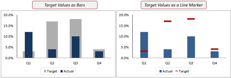
By default, you can not create such a chart, but it can be done by creating combination charts and playing with the chart type and the formatting.
While I have only shown two ways to create this chart, there can be many other ways. The idea is to have a target value that looks prominent and clearly shows whether the target has been achieved or not.
Below is a video on how to create an actual vs target chart in Excel:
Click here to read more about the Actual Vs Target Charts | Download Example file
Milestone Chart
A milestone chart allows you to plot milestones on a timeline. This chart type can be useful when you’re planning a new project and want to visually show the planned milestones during a certain period (or chart the milestones that have been achieved in the past).
A milestone chart visually shows you the milestones and the distance between each milestone (as shown below).
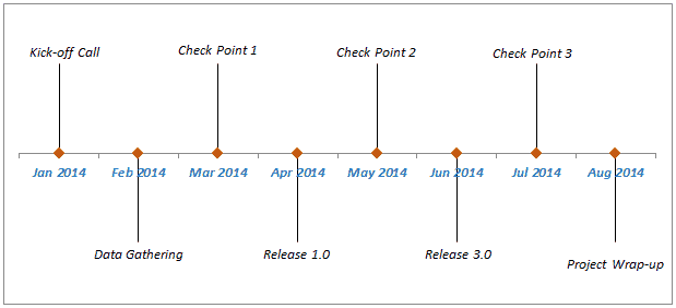
When I was in my day job, we used to create a milestone chart when we were planning a new project and had to report interim updates and deliverables. We showed the dates when we planned the check-in call and interim/final deliverables.
While you can have this data in a boring table, plotting it as a milestone chart helps visually see the progress (as well as the time between milestones).
Below is a video where I show how to create a milestone chart in Excel:
Click here to read more about the milestone chart in Excel | Download example file
Gantt Chart
Gantt chart is quite popular with project managers.
It is used to for creating a schedule for a project or tracking the progress.
With a Gantt chart, you can visually see:
- What all tasks/activities are schedules
- On what date a task starts and ends
- Number of days it takes for each task to get completed
- Any overlap on a date with other activities.
Below is an example of a Gantt chart (which is about Alfred – the butler – creating the Batsuit for Batman).
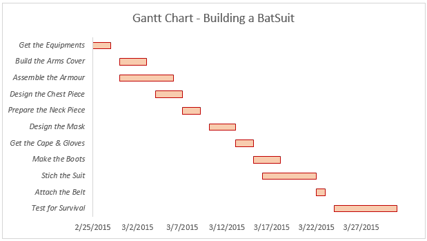
The biggest benefit of using a Gantt chart is that it shows you if there are any days where multiple activities/tasks overlap. This can help you plan better for your project.
Another good use of this kind of Gantt chart can be to plot leaves taken by your team members. It will show you the dates when more than one team member is on leave, and you can plan ahead.
Click here to read more about the Gantt Chart in Excel | Download example file
Bell Curve
A bell curve (also known as normal distribution curve) is a way to plot and analyze data that looks like a bell curve.
It is often used during employee appraisals or in schools/colleges to grade students.
While a bell curve is nothing but a ‘scatter line chart’ that you can insert with a single click, the reason I have added it as one of the advanced charts is that there is some pre-work needed before creating this chart.
If you have the employee ratings data or student marks data, you can not directly plot it as a bell curve.
You need to calculate the mean and the standard deviation values and then use these to create the bell curve.
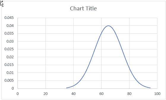
Click here to read how to make a bell curve in Excel
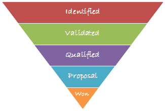
Sales Funnel Chart
In any sales process, there are stages. A typical sales stage could look something as shown below:
Opportunity Identified –> Validated –> Qualified –> Proposal –> Win
If you think about the numbers, you would realize that this forms a sales funnel.
Many opportunities are ‘identified’, but only a part of it is in the ‘Validated’ category, and even lesser ends up as a potential lead.
In the end, there are only a handful of deals that are won.
If you try and visualize it, it would look something as shown below:
If you have these numbers in Excel, then you can easily create a sales funnel chart. If you’re using Excel 2016, you have the option to insert the sales funnel chart directly from the insert tab.
But for versions prior to Excel 2016, you’ll have to use some charting trickery.
Below is the video where I show how to create a sales funnel chart in Excel 2013 or prior versions:
Click here to read the tutorial on creating a sales funnel chart | Download example file
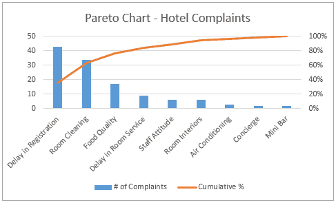
Pareto Chart
Pareto Chart is based on the Pareto principle (also known as the 80/20 rule), which is a well-known concept in project management.
According to this principle, ~80% of the problems can be attributed to about ~20% of the issues (or ~80% of your results could be a direct outcome of ~20% of your efforts, and so on..).
This type of chart is useful when you want to identify the 20% things that are causing 80% of the result. For example, in a hotel, you can create a Pareto chart to check the 20% of the issues that are leading to 80% of the customer complaints.
Or if you’re a project manager, you can use this to identify 20% of the projects that are generating 80% of the revenue.
If you’re using Excel 2016, you can insert the Pareto chart from the Insert tab, but if you’re using Excel 2013 or prior versions, then you need to take a few additional steps.
Below is a video where I show how to create a Pareto chart in Excel 2013 and prior versions:
Click here to read the tutorial on creating Pareto Chart in Excel | Download example file
Bullet Chart
Bullet chart is well suited for dashboards as it can punch a lot of information and takes very little space.
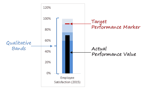
Bullet charts were designed by the dashboard expert Stephen Few, and since then it has been widely accepted as one of the best charting representations where you need to show performance against a target.
This single bar chart is power-packed with analysis. It has:
- Qualitative Bands: These bands help in identifying the performance level. For example, 0-60% is Poor performance (shown as a dark blue band), 60-75% is Fair, 75-90% is Good and 90-100% is Excellent.
- Target Performance Marker: This shows the target value. For example, here in the above case, 90% is the target value.
- Actual Performance Marker: This column shows the actual performance. In the above example, the black column indicates that the performance is good (based on its position in the qualitative bands), but it doesn’t meet the target.
Below is a video on how to create a bullet chart in Excel
Click here to read the tutorial on how to create a bullet chart in Excel | Download example file
Step Chart
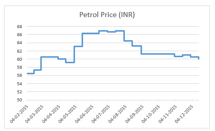
A step chart can be useful when you want to show the changes that occur at irregular intervals. For example, price rise in milk products, petrol, tax rate, interest rates, etc.
While Excel does not have an inbuilt feature to create a step chart, it can easily be created by rearranging the data set.
Below is an example of a step chart.
Now if you’re thinking why not use a line chart instead, have a look at the below charts.
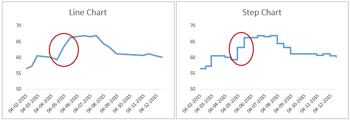
Both of these charts look similar, but the line chart is a bit misleading. It gives you the impression that the petrol prices have gone up consistently during May 2015 and June 2015 (see image below). But if you look at the step chart, you’ll notice that the price increase took place only on two occasions.
Below is a video where I show how to create a step chart in Excel.
Click here to read how to create a Step chart in Excel | Download example file
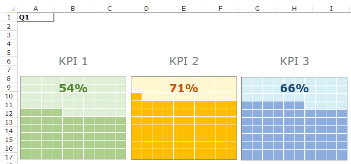
Waffle Chart
A waffle chart is a pie chart alternative that is quite commonly used in dashboards. It’s also called the squared pie chart.
Related Article: Creating a Pie Chart in Excel
In terms of Excel charting, a Waffle chart doesn’t really use any of the charting tools. It’s rather created using cells in the worksheets and conditional formatting.
Nevertheless, it looks like a proper chart and you can use it to jazz up your dashboards.
Below is an example of Waffle chart in Excel.
What do I like in a Waffle Chart?
- A waffle chart looks cool and can jazz up your dashboard.
- It’s really simple to read and understand. In the KPI waffle chart shown above, each chart has one data point and a quick glance would tell you the extent of the goal achieved per KPI.
- It grabs readers attention and can effectively be used to highlight a specific metric/KPI.
- It doesn’t misrepresent or distort a data point (which a pie chart is sometimes guilty of doing).
What are the shortcomings?
- In terms of value, it’s no more than a data point (or a few data points). It’s almost equivalent to having the value in a cell (without all the colors and jazz).
- It takes some work to create it in Excel (not as easy as a bar/column or a pie chart).
- You can try and use more than one data point per waffle chart as shown below, but as soon as you go beyond a couple of data points, it gets confusing.
Click here to read how to create a waffle chart in Excel | Download example file
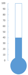
Thermometer Chart
A thermometer chart is another example where you can show the performance against a target value (similar to Actual vs Target chart or bullet chart).
It’s called a thermometer chart as you can make it look like a thermometer.
Note: Thermometer chart can be used when you’re measuring the performance of one KPI only. If you have to analyze multiple KPIs or metrics, you need to either create multiple thermometer charts or opt for a regular actual vs target chart I covered earlier.
Below is a video where I show how to create a thermometer chart in Excel.
Click here to read how to make a thermometer chart in Excel | Download example file
These are some of the advanced charts that you can create easily and use in your daily work. Using these charts can really spice up your reports or dashboards, and at the same time, it also helps in conveying more information as compared with a regular Excel chart.
If there is any chart type that you use (and can be considered an advanced chart), let me know in the comments section. I will continue to add more advanced charts to tutorials based on your feedback.
You May Also Like the Following Excel Tips & Tutorials:


Intresting ideas
Very useful
thank you very much for these tutorials. your explanation is clear and easy to follow!
Interesting
Do you provide training for creating chart for Process KPI
interesting!
what about stock charts, a bit complicated
very good
I have one improvement to Milestone Chart:
In column G I put “10” in G1 and put formulas
G3 =IF(F3=””;””;$G$1)
G4 (and other) = IF(F4=””;””;IF(SUM($G$3:G3)=0;$G$1;-$G$1))
So even if I remove some names from the line I do not have to change formulas in odds and evens row manually
What do you think about it?