
Have you heard of the Waffle Chart (also called the square pie chart)? I have seen these in a lot of dashboards and news article graphics, and I find these really cool. A lot of times, these are used as an alternative to the pie charts.
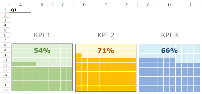
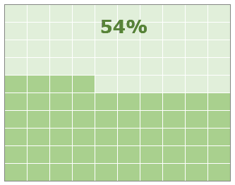
Here is an example of a waffle chart (shown below):

In the above example, there are three waffle charts for the three KPIs. Each waffle chart is a grid of 100 boxes (10X10) where each box represents 1%. The colored boxes indicate the extent to which the goal was achieved with 100% being the overall goal.
What do I like in a Waffle Chart?
- A waffle chart looks cool and can jazz up your dashboard.
- It’s really simple to read and understand. In the KPI waffle chart shown above, each chart has one data point and a quick glance would tell you the extent of the goal achieved per KPI.
- It grabs readers attention and can effectively be used to highlight a specific metric/KPI.
- It doesn’t misrepresent or distort a data point (which a pie chart is sometimes guilty of doing).
What are the shortcomings?
- In terms of value, it’s no more than a data point (or a few data points). It’s almost equivalent to having the value in a cell (without all the colors and jazz).
- It takes some work to create it in Excel (not as easy as a bar/column or a pie chart).
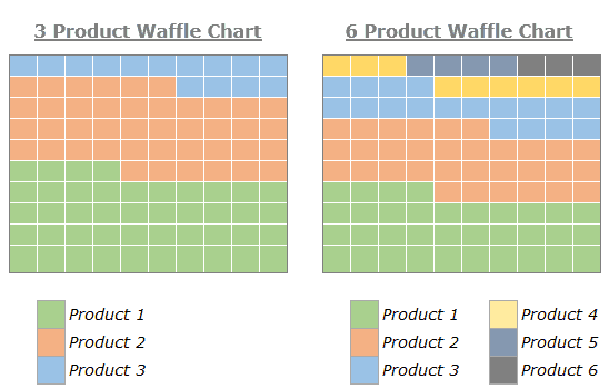
- You can try and use more than one data point per waffle chart as shown below, but as soon as you go beyond a couple of data points, it gets confusing. In the example below, having 3 data points in the chart was alright, but trying to show 6 data points makes it horrible to read (the chart loses its ability to quickly show a comparison).
If you want to deep dive into the good and bad of waffle charts, here is a really nice article (do check out the comments too).
Now let’s learn to create a waffle chart in Excel using Conditional Formatting.
Download the Example file to follow along.
Creating a Waffle Chart in Excel
While creating a waffle chart, I have Excel dashboards in mind. This means that the chart needs to be dynamic (i.e., update when a user changes selections in a dashboard).
Something as shown below:
Creating a waffle chart using conditional formatting is a three-step process:
- Creating the Waffle Chart within the Grid.
- Creating the Labels.
- Creating a Linked Picture that can be used in Excel Dashboards.
1. Creating the Waffle Chart within the Grid
- In a worksheet, select a grid of 10 rows and 10 columns and resize it to make it look like the grid as shown in the waffle charts.
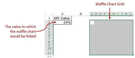
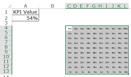
- In the 10X10 grid, enter the values with 1% in the bottom-left cell of the grid (C11 in this case) and 100% in the top-right cell of the grid (L2 in this case). You can either enter it manually or use a formula. Here is the formula that will work for the specified range of cells (you can modify the references to work in any grid of cells):
=(COLUMNS($C2:C$11)+10*(ROWS(C2:$C$11)-1))/100The font size in the image above has been reduced to make the values visible.
- With the grid selected, go to Home –> Conditional Formatting –> New Rule.
- In the New Formatting Rule dialog box, select Format Only cells that contain and specify the value to be between 0 and A2 (the cell that contains the KPI value).

- Click on the Format button and specify the format. Make sure to specify the same fill color and the font color. This will hide the numbers in the cells.
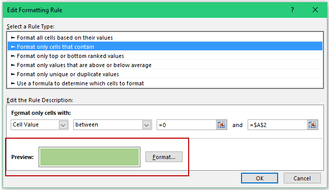
- Click OK. This will apply the specified format to the cells that have a value less than or equal to the KPI value.

- With the grid selected, change the fill color and the font color to a lighter shade of the color used in conditional formatting. In this case, since we have used Green color to highlight cells, we can use a lighter shade of green.

- Apply ‘All Border’ format using white border color.

- Give an outline to the grid with a gray ‘Outside Borders’ format.

This will create the waffle chart within the grid. Also, this waffle chart is dynamic as it is linked to cell A2. If you change the value in cell A2, the waffle chart would automatically update.
Now the next step is to create a label that is linked to the KPI value (in cell A2).
2. Creating the Label
- Go to Insert –> Text –> Text Box and click anywhere in the worksheet to insert the text box.

- With the text box selected, enter =A2 in the formula bar. This would link the text box to cell A2 and any change in the cell value would also be reflected in the text box.

- Format the text box and place it in the waffle chart grid.
The waffle chart is now complete, but it can’t be used in a dashboard in its current form. To use it in a dashboard, we need to take a picture of this waffle chart and put it in the dashboard, such that it can be treated as an object.
3. Creating the Linked Picture
- Select the cells that make the waffle chart.
- Copy these cells (Ctrl + C).
- Go to Home –> Clipboard –> Paste –> Linked Picture.

This will create a picture that is linked to the waffle chart. You can now place this picture anywhere in the worksheet or even in any other worksheet of the same workbook. Since this picture is a copy of the cells that have the waffle chart, whenever the chart would update, this linked picture would also update.
Did you find this tutorial useful? Let me know your thoughts/feedback in the comments section below.
Learn to create world-class dashboards in Excel. Join the Excel Dashboard Course.
You May Also Like the Following Excel Charting Tutorials:


Hi, Sumit!
Thank you for imparting knowledge, this will really help me a lot when presenting data. I am not sure if I overlooked it or something, however, can you share with us the steps how to create a 3-product waffle chart? Thank you.
hi Sumit,
I am new in here but thanks a lot for your impressive dash boards. Very dynamic and intuitive I must say. Looking forward to have the dash board course soon.
Please is it possible to come up with an election results dash board? Say Presidential and Parlementary election results. Thus, something more like the call center performance dash board.
Thank you
Hi Sumit,
Thanks for sharing this. This is really nice presentation of data.
I have a question, if I enter KPI value as 54.9% then it is showing 54% not 55%. Is there any solution to this? would like to have your comment on this. Thanks again.
Hello Anil, to do this, you can have the KPI value in cell B1, and in cell A2, use the formula =ROUND(B1,3)
Thanks Sumit
Thanks, this sort of chart will certainly impress sales people!
ouch!