Learn the exact steps I take to create World Class Dashboards in Excel. Join the Excel Dashboard Course.
A Key Performance Indicators (KPI) dashboard is one of the most used dashboards in business.
Its primary objective is to show the performance of key KPIs and provide a comparative view of other KPIs or companies.
In this tutorial, I will show you how to create a KPI dashboard in Excel.
This is an improved version of a dashboard that I created last year in my previous job role as a financial/data analyst.
I have broken down this Excel KPI Dashboard tutorial into three parts:
- KPI Dashboard in Excel – Part 1: Dynamic Scatter Chart.
- KPI Dashboard in Excel – Part 2: Dynamic Interpretation.
- KPI Dashboard in Excel – Part 3: Dynamic Data Extraction + Bullet Chart.
Objective: We have the KPI data of 100 companies, and the objective is to create a dashboard that would help in identifying key accounts based on the performance. Apart from a comparative view, it should also enable the user to drill down on individual companies.
KPI Dashboard in Excel – Part 1/3
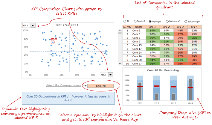
Let me first show you how the final KPI dashboard looks like:

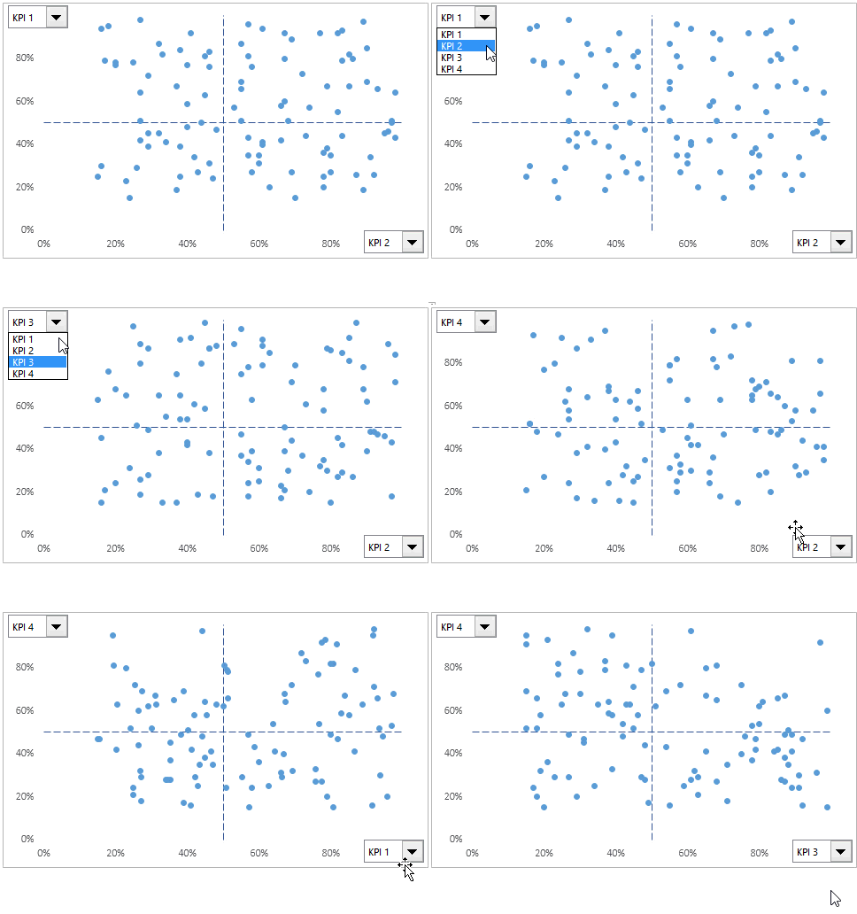
In this Key Performance Indicator (KPI) dashboard, a user can select the KPIs that he/she needs to compare. It would instantly update the scatter chart with a spread of all the 100 companies across the four quadrants. It is a great way to segment companies based on performance.
At the top-right (of the dashboard), a user has the option-buttons to select a quadrant and get a list of all the companies in that quadrant.
Below it, there is a bullet chart that shows the KPIs Vs. Peer Average comparison for the selected company.
I have broken down this dashboard creation process into 3 parts. In today’s article, I will show you how to create a dynamic scatter chart.
Click here to download the example file
KPI Dashboard in Excel – Dynamic Scatter Chart
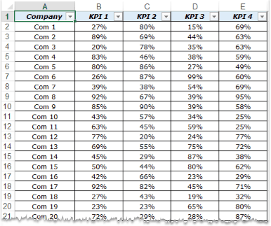
I have the KPI data for 100 companies. For the purpose of this dashboard, let’s call these companies Com 1, Com 2, and so on.. and the KPIs are KPI 1, KPI 2, KPI 3, and KPI 4. The data looks as shown below:

- The dashboard comprises 3 worksheets – ‘Data’, ‘Calculation’, and ‘Dashboard’.
- It is almost always a good idea to convert raw data into an Excel Table. In this case, I have named this table KPIData.
- In the Dashboard sheet, insert 2 ActiveX Combo Box. The input to these Combo Box would be the name of the KPIs (KPI 1, KPI 2…) and each Combo Box is linked to a cell in the Calculation sheet.

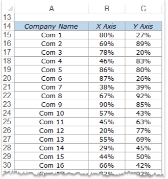
- We now need to create a dataset for the chart (this data resides in the Calculation worksheet). Since the chart updates when the drop-down selection is changed, the data needs to be dependent on the selection. We can do this using a combination of INDEX and ROWS formula. Here it is:
- X Axis: =INDEX(KPIData,ROWS($A$15:A15),$B$8+1)
- Y Axis: =INDEX(KPIData,ROWS($A$15:B15),$B$9+1)

- Now this data is fed into a scatter chart. Since the data is dependent on the Combo Box drop downs, as soon as the drop-down selection is changed, the chart instantly updates.

Download the Example File

This simple dynamic scatter chart is really helpful when you want to down-select a handful of companies based on their KPI performance.
In the next article of this series, I will show you how to spot a company in this chart, and how to get the dynamic interpretation of the chart (in the text box below the chart).
Let me know what you think? Leave your thoughts in the comments section.
Stay Tuned… More awesome excel stuff coming your way in the next article (KPI Dashboard in Excel – Part 2) 🙂
Other Excel Dashboard Tutorials:
- Excel Dashboards – Examples, Best Practices & Resources.
- Game of Thrones Dashboard in Excel.
- Excel Dashboard: Premier League Season 2014-15 visualized.
- KPI Dashboard by Chandoo – A 6 Part Series.
You May Also Like the Following Excel Tutorials:


what is no numbers or percentage is given , how do we make the chrts then .
i have an excel file , where theres no percentage given , n i have to make a kpi dashboard of it .
I Love This site
I want to learn VBA, can anyone provide me a right path for it ?
Muchas gracias por compartir tu conocimiento e inteligencia, (thank you very much!! from argentina)
Sumit I just got to know your website last month. Plenty of good stuff. I will be visiting more often for ideas.
Thanks for commenting.. Glad you find the website useful.. Look forward to having you here more often 🙂
I want to have the strike price wise OI data across weeks (max-3) culled from NSE.COM site after certain intervals.
Can you help me
I want to have the strike price wise OI data across weeks (max-3) culled from NSE.COM site after certain intervals.
Can you help me
Good one Sumit
Glad you liked it 🙂
Hi Sumit,
Keep On Keeping On!
Hi Sumit, I just made a thermometer chart as per your guidance. One issue comes up when I set actual value more than 85 then the Axis value changes, it works fine when actual value is less. Down loaded your copy also and find the same.
Could you give clue how this can be fixed.
Hi Sumit,
Just ignor earlier note, I tried and now it is ok. Axis setting changed to RESET from Auto for Min and Max.
Thanks
Regards,
This is Great……..
Thanks for commenting Pradip.. Glad you liked it 🙂
Thanks for such a tip u really made it so simple
Thanks for stopping by and commenting.. Glad you liked it 🙂
Hi Sumit,
I created a marketing dashboard using VBA which has lots of formulas. Making it slow while clicking on command button. Would request you to provide some tricks or tools in order to make it faster. Thanks
A lot of formulas does make a dashboard slow. There are some tips here on making the dashboard faster – http://trumpexcel.com/2014/04/suffering-from-slow-excel-spreadsheets/
Thanks Sumit for this post. It’s always helpful to visit your site. However, I downloaded the file and it doesn’t seem to contain all the components of the dashboard as shown in picture above. Would be great if you re-upload the file. Thanks.
Hello Anil.. Thanks for dropping by and commenting.. I will be posting the remaining 2 parts of the dashboard series soon. The 3rd part would have the fully functional dashboard. I have kept the download file to show only the elements that I talk about in this tutorial.
Thanks Sumit for your prompt reply. You are awesome.
Thank you for making it look so simple – this can be such a treasure to my work.
Thanks for commenting Pierre.. Glad you find this useful 🙂
This is awesome.. Would love to get my hands on the final dashboard
Thanks for commenting Scott.. I will soon be publishing the remaining 2 parts of this series