This tutorial is a part of a three-part Excel KPI Dashboard tutorial series:
- KPI Dashboard in Excel – Part 1: Dynamic Scatter Chart.
- KPI Dashboard in Excel – Part 2: Dynamic Interpretation.
- KPI Dashboard in Excel – Part 3: Dynamic Data Extraction + Bullet Chart.
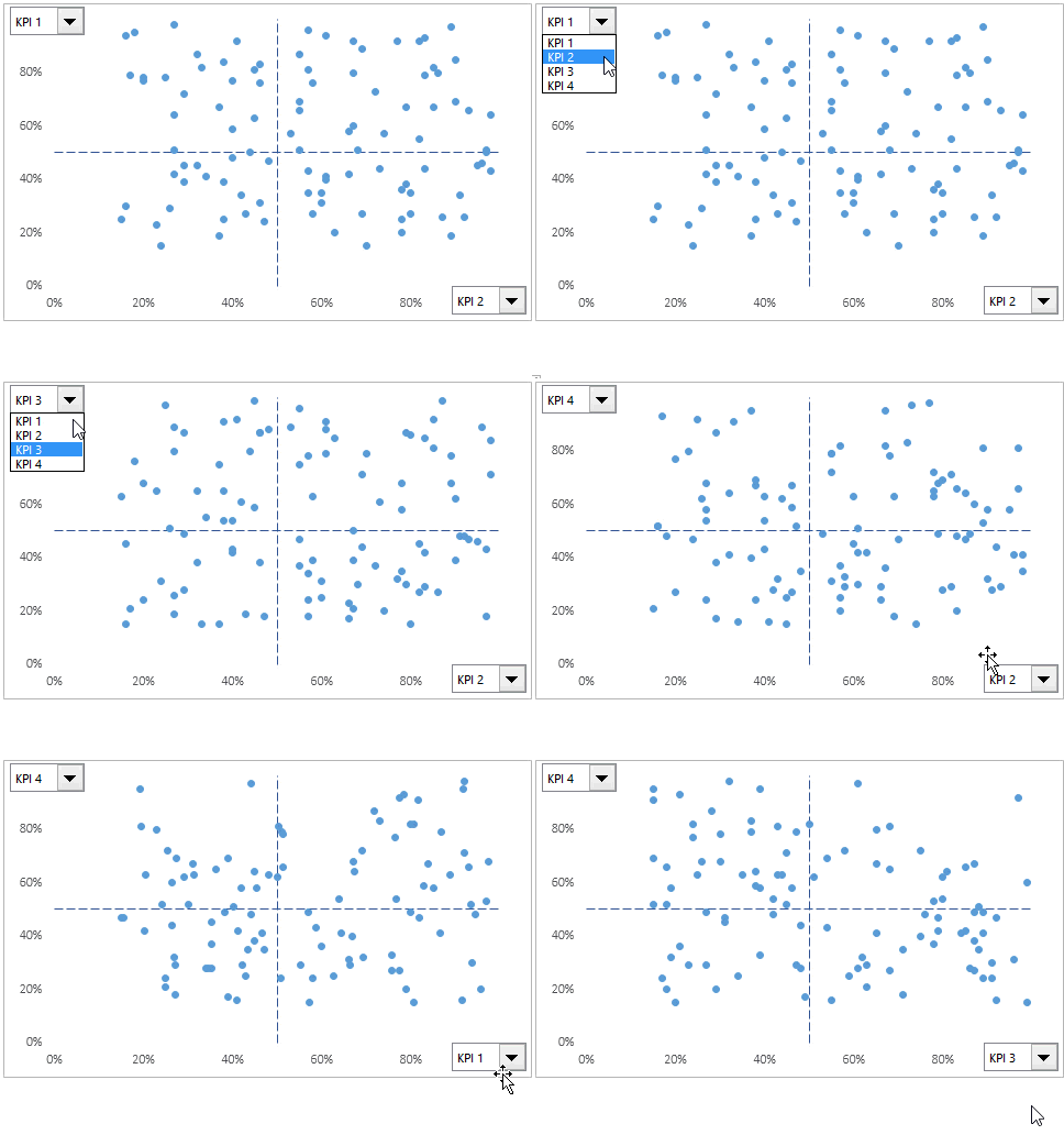
In the previous article of this 3 part ‘KPI Dashboard in Excel’ series, we learned how to create a dynamic scatter chart.
Something as shown below:

KPI Dashboard in Excel – Part 2/3
In this article, I will show you:
- How to highlight a company in the chart when you select its name
- How to create a dynamic interpretation from the Chart for the selected company
Click here to download the example file
Highlighting the Selected Company in the Scatter Chart
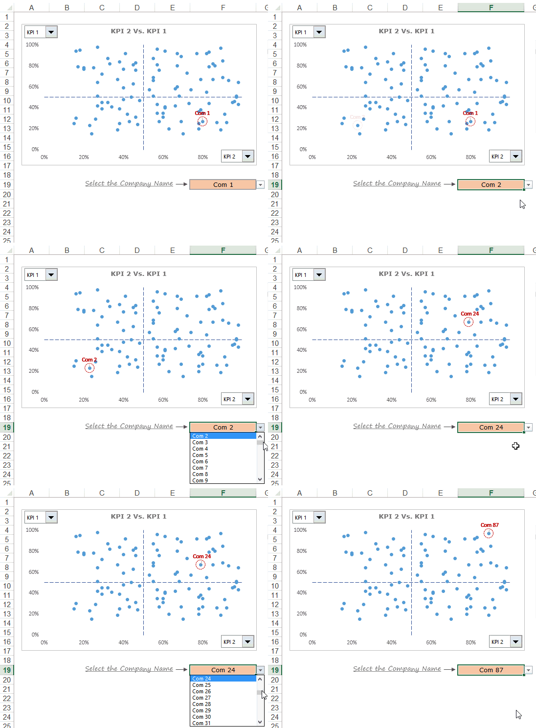
To enable this, we need to create a drop down with the names of all the companies. Something as shown below:

This drop-down in Excel can be made using the data validation feature. Once we have the drop-down list in place, we need to add a new series to the scatter chart such that the company’s data point gets highlighted when we select the company from the drop down. Something as shown below:

To create this, we need to plot another series that has only one data point (for the company that we select). Here is a detailed tutorial on how to make it – Spot Data Point in Excel Scatter Chart.
Once you have the chart in place, next step is to create the dynamic interpretation for the selected company.
Dynamic Interpretation of a Data Point in the Chart
This idea came to me when I was working with a few sales guys in my previous organization. We had created a KPI Dashboard in Excel which had a similar dynamic scatter chart that also highlighted the selected company’s data point.
While the chart and the highlighted data point was a good visualization, some still struggled to quickly interpret the chart. To address this, we came up with the dynamic interpretation feature.
This dynamic interpretation feature lets you dynamically show the text that describes the chart insights in words. Something as shown below:

While I have used generic KPI names, a good example could be to show Profit Vs Cost chart, where the interpretation could be – “Despite mounting costs, Com 1 was able to increase its margins” OR “Rising Costs lead to a decline in profitability for Com 1”
To create this, we need to create dynamic text for all the 4 quadrants. For example, for the bottom left quadrant (X-axis value < 50% and Y-axis value < 50%), the text would be “Com 1 Lags in Both the KPIs”. Similarly, we need to create text for all the four quadrants. Here the company name and KPI names would be the ones that are selected by the user.

A data point plotted on the scatter chart would lie in any one of the four quadrants. All we need to do now is check the X and Y axis values for a company and select the text from the matching quadrant. For example, if X and Y axis values both are less than 50%, then it is bottom left quadrant, and so on…
Based on the quadrant the relevant text is selected and linked to the text box in the dashboard.
Download the File and Try it yourself

In the next and final part of this series, I will show you how to extract the list of companies based on their position on the scatter chart (by quadrants), and also create a bullet chart to show company level performance against peers.
In the meantime, let me know what you think? Leave your thoughts in the comments section.
Stay Tuned 🙂
Other Dashboard Tutorials:
- Excel Dashboards – Examples, Best Practices & Resources.
- Game of Thrones Dashboard in Excel.
- Excel Dashboard: Premier League Season 2014-15 visualized.
- Call Center Performance Dashboard in Excel.
You May Also Like the Following Excel Tutorials:


I really love your way of teaching, thank you so much. Can I ask how did put that cross on the chart? Did you use ‘insert, shape’?
I cannot wait for Part 3 🙂
Thanks for commenting Leanne. Part 3 is available here – http://trumpexcel.com/2015/07/kpi-dashboard-in-excel-part-3/
Sumit – I love this idea of dynamic interpretation. It so cool. Look forward to the last part
Thanks for commenting Phil.. Glad you liked it 🙂