
One of the challenges while creating a dashboard is to present the analysis in limited screen space (preferably a single screen). Hence, it is important to make smart choices while creating the right chart. And here is where Bullet Charts score over others.
Bullet charts were designed by the dashboard expert Stephen Few, and since then it has been widely accepted as one of the best charting representations where you need to show performance against a target.
One of the best things about bullet charts is that it is power-packed with information and takes little space in your report or dashboards.
Here is an example of a Bullet Chart in Excel: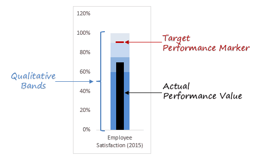
This single bar chart is power-packed with analysis:
- Qualitative Bands: These bands help in identifying the performance level. For example, 0-60% is Poor performance (shown as a dark blue band), 60-75% is Fair, 75-90% is Good and 90-100% is Excellent.
- Target Performance Marker: This shows the target value. For example, here in the above case, 90% is the target value.
- Actual Performance Marker: This bar shows the actual performance. In the above example, the black bar indicates that the performance is good (based on its position in the qualitative bands), but it doesn’t meet the target.
Download Bullet Chart Template
Now, let me show you how to create a bullet chart in Excel.
Creating a Bullet Chart in Excel
Here are the steps to creating a Bullet Chart in Excel:
- Arrange the data so that you have the band values (poor, fair, good, and excellent) together, along with the actual value and the target value.

- Select the entire data set (A1:B7), go to Insert –> Charts –> 2D Column –> Stacked Column.

- In the above step, you will get a chart where all the data points have been plotted as separate columns. To combine these into one, select the chart and go to Design –> Data –> Switch Row/Column. This will give you one column with all the data points (the first four colors are the qualitative bands, the fifth one is actual value and the top most is target value).

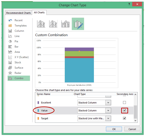
- Click on Target Value bar (the orange color bar at the top). Right-click and select change series chart type.
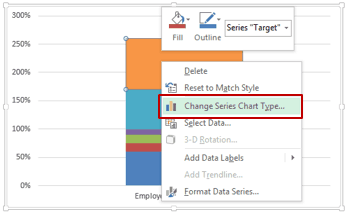
- In the Change Chart Type dialog box, change the Target Value chart type to Stacked Line with Markers, and put it on the secondary axis. Now, there would be a dot in the middle of the bar.

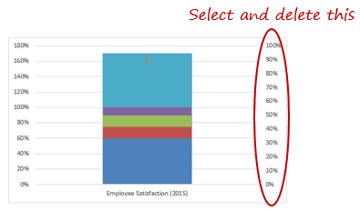
- You would notice that the primary and secondary vertical axis are different. To make it same, select the secondary axis and delete it.
- Select the Actual Value bar, right-click and select Change Chart Type. In the Change Chart Type dialog box, put Actual Value on the secondary axis.
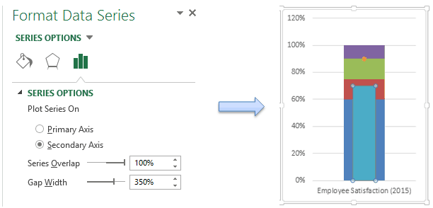
- Select the Value bar, right-click and select Format Data Series (or press Control + 1).
- In the Format Data Series pane, change the Gap Width to 350% (you can change it based on how you want your chart to look).
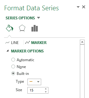
- Select the Target value marker dot, right click and select format data series (or press Control +1).
- In the Format Data Series dialogue box, select Fill & Line –> Marker –>Marker Options –> Built-in (and make the following changes):
- Type: Select dash from the drop down
- Size: 15 (change it according to your chart)
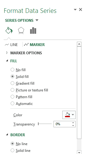
- Also, change the Marker fill to red and remove the border
- Now you are all set! Just change the color of the bands to look like a gradient (gray and blue look better)

Download the Excel Bullet Chart Template
Creating Multi KPI Bullet Chart in Excel
You can extend the same technique to create a multi-KPI bullet chart in Excel.
Here are the steps to create a multi KPI bullet chart in Excel:
- Get the data in place (as shown below)
- Create a single KPI bullet chart as shown above
- Select the chart and drag the blue outline to include additional data points

Note: Creating Multi-KPI bullet chart technique works well if the axis is the same for all the KPIs (for example here all the KPIs are scored in percentage varying from 0 to 100%). You can extend this to margins – for example comparing Net Income margin, EBITDA margin, Gross profit margin, etc. If the scales are different, you would need to create separate bullet charts.
While I am a big fan of bullet charts, I believe a single-KPI bullet chart is not always the best visualization. I often gravitate towards a speedometer/gauge chart in
I often gravitate towards a speedometer/gauge chart in the case of a single KPI. Let me know what you think by leaving a comment below.
You May Also Like the Following Excel Tutorials:


I have taught Excel and I use charts in my career, but today I have learned something new. Thank you! This is a great chart and well put together!
Can I have help in getting a thermometer chart to show the increasing value of invoices paid for school fees. I know the total of all invoices but would like to show the actual in a thermometer graph during the year. Can you assist.
Hello Dottie.. Have a look a this tutorial: https://trumpexcel.com/thermometer-chart-in-excel/
Smart way! very short but very meaningful. Thanks Sumit. Keep on keeping on.
Thanks for commenting Amal.. Glad you liked the tutorial 🙂
I hope that one day is equal to you
I found this way of presenting the fantastic results Sumit.
Congratulations on your expertise.
Thanks for commenting Pablo.. Glad you liked it 🙂