
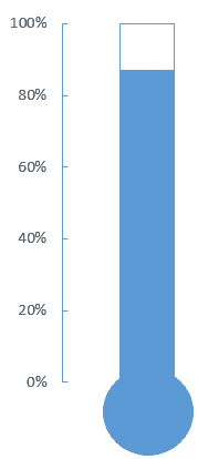
Thermometer chart in Excel could be a good way to represent data when you have the actual value and the target value.
A few scenarios when where it can be used is when analyzing sales performance of regions or sales rep, or employee satisfaction ratings vs the target value.
In this tutorial, I will show you the exact steps you need to follow to create a thermometer chart in Excel.
Click here to download the example file and follow along.
Creating Thermometer Chart in Excel
Suppose you have the data as shown below for which you want to create a chart to show the actual value as well as where it stands as compared with the target value.
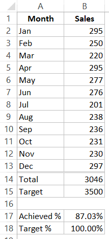
In the above data, the Achieved% is calculated using the Total and Target values (Total/Target). Note that the Target percentage would always be 100%.
Here are the steps to create a thermometer chart in Excel:
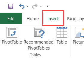
- Select the data points.

- Click the Insert tab.
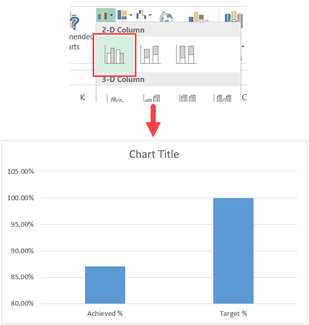
- In the Charts group, click on the ‘Insert Column or Bar chart’ icon.

- In the drop-down, click the ‘2D Clustered Column’ chart. This would insert a Cluster chart with 2 bars (as shown below).
- With the chart selected, click the Design tab.

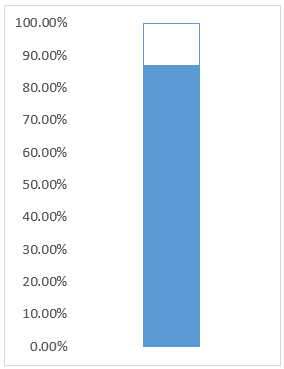
- Click on Switch Row/Column option. This will give you the resulting chart as shown below.

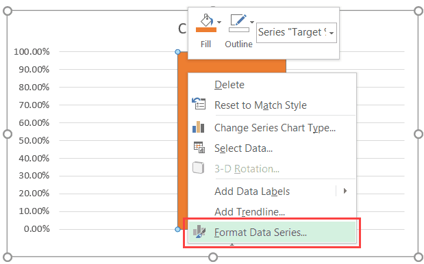
- Right-click on the second column (orange column in this example) and select format data series.
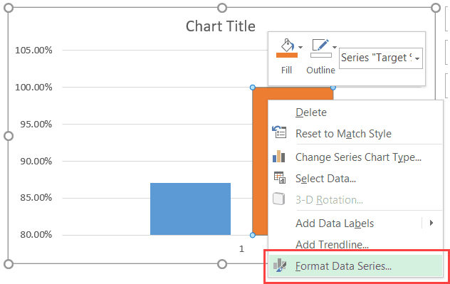
- In the Format Data Series task pane (or dialog box if you are using Excel 2010 or 2007), select Secondary Axis in Series Options. This will make both the bars align with each other.
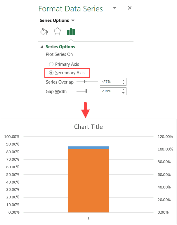
- Note that there are two vertical axes (left and right), with different values. Right-click on the vertical axis on the left and select format axis.
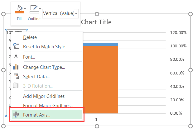
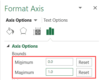
- In the Format Axis task pane, change the maximum bound value to 1 and minimum bound value to 0. Note that even if the value is already 0 and 1, you should still manually change this (so that you see the Reset button on the right).
- Delete the axis on the right (select it and hit the delete key).
- Right-click on the column visible in the chart, and select format data series.
- In the format data series, make the following
- Fill: No Fill
- Border: Solid Line (choose the same color as that of actual value bar)

- Delete the chart title, grid lines, the vertical axis on the right, and horizontal (category) axis, and the legend. Also, resize the chart to make it look like a thermometer.
- Select the vertical axis on the left, right-click on it and select ‘Format Axis’.

- In Format Axis task pane, select Major Tick Mark Type as Inside.

- Select the chart outline, right-click and select Format Chart Area.
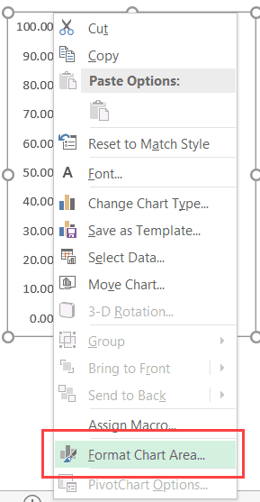
- In the task pane, make the following selection
- Fill: No Fill
- Border: No Line

- Now click the Insert tab and insert a circle from the Shapes drop-down. Give it the same color as thermometer chart and align it to the bottom.

That’s it! Your Thermometer chart is ready to measure.
Download Thermometer Chart Example File
Note: The thermometer chart is useful when you have one actual value and target value set. In case you have multiple such datasets, you either need to create multiple such thermometer charts, or need to use a different chart type (such as the Bullet chart or the Actual Vs. Target charts).
You May Also Like the Following Excel Tutorials:
- Creating a Pareto Chart in Excel.
- Gantt Chart in Excel.
- How to Make a Bell Curve in Excel (Step-by-step Guide).
- Step Chart in Excel – A Step by Step Tutorial.
- How to Make a Histogram in Excel (Step-by-Step Guide).
- Creating a Heatmap in Excel.
- Area Chart in Excel.
- 10 Advanced Excel Charts that You Can Use In Your Day-to-day Work.


Hi, thank you for this information. I am having trouble finding the secondary axis in order to align the column bars (Step 7 & 8). I am using google sheets and am wondering how to execute this using google sheets program and if there is an alternative way to get these steps done. Would really appreciate the help, thank you!
Amazing
Awesome! Thanks a bunch!
Thanks for these explanations. It was very helpful!!!
@mecoinst
Thank You.I created a thermometer chart by reading your tutorial and in our office they are still using this daily for tracking teams score.Thank You so much.
Thank you for this great tutorial! I was able to create the thermometer for tracking out team’s giving. Thank you for providing a great resource.
Hi Sumit,
I am attempting to modify this and changed the axis range to 7000. Every month, for the next 36 months I will be adding approx. 200. By the end of 36 months the thermometer should reach the target. I want be able to enter a value (that I am adding monthly) in a cell and also on another cell to show a cumulative running total of how much I’ve added. How do I do this?
Thanks,
Jay.
Hello.. In this case, make the target value (in B3) 7000 and for actual value (in A3) use the formula =SUM(A5:A41) – assuming that the you’ll be entering the monthly values in A5:A41. Now, the cumulative sum would be reflected in A3 and the thermometer chart would work.
That was not the way I quite wanted, however I figured out a fancier way from searching the web for tips.
The data entry part is in a separate tab sheet where I have a table with the date, amt. paid, and sum. (A1 to C1). In another cell, G2 I have an array formula =OFFSET(Data,ROWS(Data)-1,2), which gives the cummulative total from the table. I have a defined name data for the table to automatically expand as I enter data: =OFFSET(Data!$A$1:$C$1,0,0,COUNT(Data!$A:$A)+1) .
The actual value in the chart sheet (A3) is a named referenced cell to the data sheet G2.
Works like a charm!
Jay.