An area chart is similar to a line chart with one difference – the area below the line is filled with a color.
Both – a line chart and an area chart – show a trend over time.
In case you’re only interested in showing the trend, using a line chart is a better choice (especially if the charts are to be printed).
For example, in the below case, you can use a line chart (instead of an area chart)

Area charts are useful when you have multiple time series data and you also want to show the contribution of each data set to the whole.
For example, suppose I have three product lines of Printers (A, B, and C).
And I want to see how the sales have been in the past few years as well as which printer line has contributed how much to the overall sales, using an area chart is a better option.

In the above chart, we can see that Printer B (represented by the orange color) has the maximum contribution to the overall sales.
While it’s the same data, using an area chart, in this case, makes the overall contribution stands out.
Now let’s see how to create an area chart in Excel and some examples where area charts can be useful.
There are three in-built types of area charts available in Excel:
- Area Chart
- Stacked Area Chart
- 100% Stacked Area Chart
Let’s see how to create each of these and in which scenario which one should be used.
Creating an Area Chart
This is just like a line chart with colors.
The problem with this type of chart is that there is always an overlap in the colors plotted on the chart.
For example, if you have a dataset as shown below:

If you use this data to create an area chart, you may end up getting a chart as shown below (where we have plotted three types of data, but you only see one color).
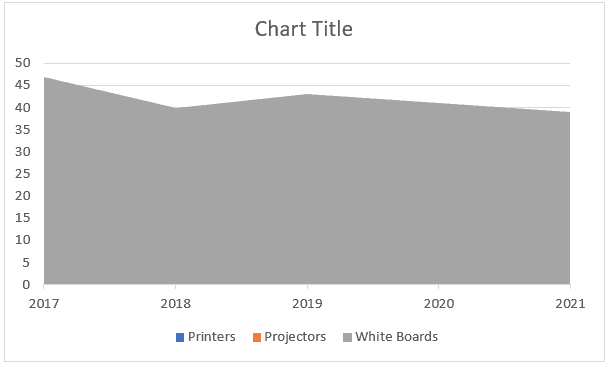
The above chart has data for Printers, Projectors, and White Boards, but only the data for White Boards is visible as it more than the rest two categories.
In such a case, a stacked area chart or a 100% stacked area chart is more suited (covered later in this tutorial).
The regular 2-D area chart is better suited for cases where you have two types of the dataset (an overall data set and a subset).
For example, suppose you have a dataset as shown below (where I have shown the Overall sales of the company and the Printer sales):

I can use this data to create a regular area chart as there would no complete overlapping of colors (as one data series is a subset of another).
Here are the steps to create an area chart in Excel:
- Select the entire dataset (A1:D6)
- Click the Insert tab.

- In the Chart group, click on the ‘Insert Line or Area Chart’ icon.

- In the 2-D Area category, click on Area.

This will give you an area chart as shown below:
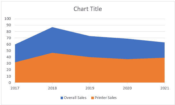
In this case, this chart is useful as shows the ‘Printer’ sales as well as the overall sales of the company.
At the same time, it also visually shows the printer sales as a proportion of the overall sales.
Note: There is an order plotting the colors in this chart. Note that the orange color (for printer sales) is over the blue color (overall sales). This happens as the in our dataset, the printer sales are on the column which is on the right of the overall sales column. If you change the order of columns, the order of colors would also change.
Creating a Stacked Area Chart
In most of the cases, you will be using a stacked area chart.
Suppose you have the dataset below, which shows the sales of three different items (in thousands):
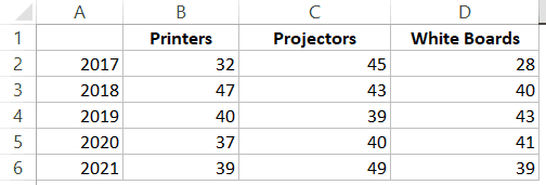
Here are the steps to create an Area chart in Excel with this data:
- Select the entire dataset (A1:D6)
- Click the Insert tab.
- In the Chart group, click on the ‘Insert Line or Area Chart’ icon.
- In the 2-D Area category, click on Stacked Area.
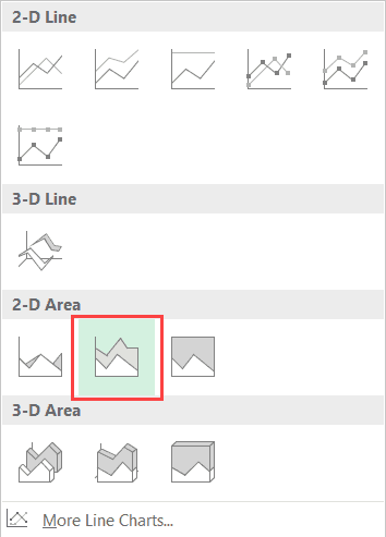
This will give you the stacked area chart as shown below:
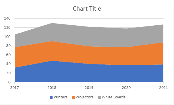
In the above chart, you get the following insights:
- The overall value for any given year (for example, 1o5 in 2017 and 130 in 2018).
- The overall trend as well as the product wise trend.
- A visual representation of the proportion of each product sales to the overall sales. For example, you can visually see and deduce that the sales if projectors contributed the most to the overall sales and the White Boards contributed the least.
Creating a 100% Stacked Area Chart
This chart type is just like a stacked area chart with one difference – all the values on the Y-axis amount to 100%.
Something as shown below:
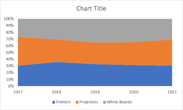
This helps you get a better representation of individual product lines, but it doesn’t give you the trend in the overall sales (as the overall sales for each year would always be 100%).
Here are the steps to create a 100% Stacked Area chart in Excel:
- Select the entire dataset (A1:D6)
- Click the Insert tab.
- In the Chart group, click on the ‘Insert Line or Area Chart’ icon.
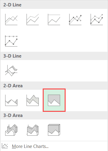
- In the 2-D Area category, click on 100% Stacked Area.
In the above chart, you get the following insights:
- The overall trend in the proportion of each product line. For example, we can see that printers’ contribution to overall sales increased in 2018 but then declined in 2019.
- The percentage contribution of each product line to the overall sales. For example, you can visually deduce that projectors contributed ~40% of the overall sales of the company in 2017.
Note: This chart gives you a trend in the proportion of the contribution of overall sales, and NOT the trend of their absolute value. For example, if the proportion of Printer sales in 2018 went up, it doesn’t necessarily mean that the Printer sales went up. It just means that it’s contribution increased. So if the printer sales decline by 10% and all other product line sales decline by 30%, the overall contribution of printer sales automatically goes up (despite a decline in its own sales).
You May Also Like the Following Excel Chart Tutorials:
- How to Create a Thermometer Chart in Excel.
- How to Create a Timeline / Milestone Chart in Excel.
- Creating a Pareto Chart in Excel (Static & Dynamic)
- How to Make a Bell Curve in Excel.
- Excel Sparklines – A Complete Guide with Examples.
- Combination Charts in Excel.
- Creating a Pie Chart in Excel
- Excel Histogram Chart.
- Step Chart in Excel
- Calculate Area Under Curve in an Excel


Absolute definition of each chart in excel. Much appreciated.
This is helpful, thanks