
Sparklines feature was introduced in Excel 2010.
In this article, you’ll learn all about Excel Sparklines and see some useful examples of it.
What are Sparklines?
Sparklines are tiny charts that reside in a cell in Excel. These charts are used to show a trend over time or the variation in the dataset.
You can use these sparklines to make your bland data look better by adding this layer of visual analysis.
While Sparklines are tiny charts, they have limited functionality (as compared with regular charts in Excel). Despite that, Sparklines are great as you can create these easy to show a trend (and even outliers/high-low points) and make your reports and dashboard more reader-friendly.
Unlike regular charts, Sparklines are not objects. These reside in a cell as the background of that cell.
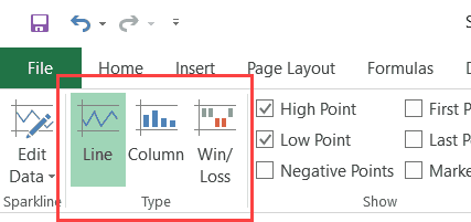
Types of Sparklines in Excel
In Excel, there are three types of sparklines:
- Line
- Column
- Win-loss
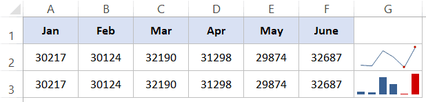
In the below image, I have created an example of all these three types of sparklines.
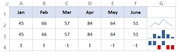
The first one in G2 is a line type sparkline, in G3 is a column type and in G4 is the win-loss type.
Here are a few important things to know about Excel Sparklines:
- Sparklines are dynamic and are dependent on the underlying dataset. When the underlying dataset changes, the sparkline would automatically update. This makes it a useful tool to use when creating Excel dashboards.
- Sparklines size is dependent on the size of the cell. If you change the cell height or width, the sparkline would adjust accordingly.
- While you have sparkline in a cell, you can also enter a text in it.
- You can customize these sparklines – such as change the color, add an axis, highlight maximum/minimum data points, etc. We will see how to do this for each sparkline type later in this tutorial.
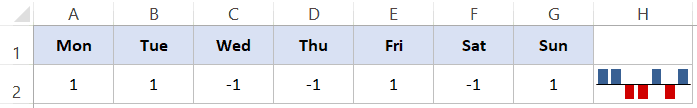
Note: A Win-loss sparkline is just like a column sparkline, but it doesn’t show the magnitude of the value. It is better used in situations where the outcome is binary, such as Yes/No, True/False, Head/Tail, 1/-1, etc. For example, if you’re plotting whether it rained in the past 7 days or not, you can plot a win-loss with 1 for days when it rained and -1 for days when it didn’t. In this tutorial, everything covered for column sparklines can also be applied to the win-loss sparklines.
Now let’s cover each of these types of sparklines and all the customizations you can do with it.
Inserting Sparklines in Excel
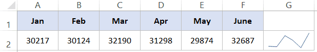
Let’s say that you want to insert a line sparkline (as shown below).
Here are the steps to insert a line sparkline in Excel:
- Select the cell in which you want the sparkline.
- Click on the Insert tab.

- In the Sparklines group click on the Line option.

- In the ‘Create Sparklines’ dialog box, select the data range (A2:F2 in this example).

- Click OK.
This will insert a line sparkline in cell G2.
To insert a ‘Column’ or ‘Win-loss’ sparkline, you need to follow the same above steps, and select Columns or Win-loss instead of the Line (in step 3).
While the above steps insert a basic sparkline in the cell, you can do some customization to make it better.
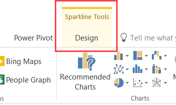
When you select a cell that has a Sparkline, you’ll notice that a contextual tab – Sparkline Tools Design – becomes available. In this contextual tab, you’ll find all the customization option for the selected sparkline type.
Editing the DataSet of Existing Sparklines
You can edit the data of an existing sparkline by using the Edit Data option. When you click on the Edit Data drop down, you get the following options:
- Edit Group Location & Data: Use this when you have grouped multiple sparklines and you want to change the data for the entire group (grouping is covered later in this tutorial).
- Edit Single Sparkline’s Data: Use this to change the data for the selected sparkline only.
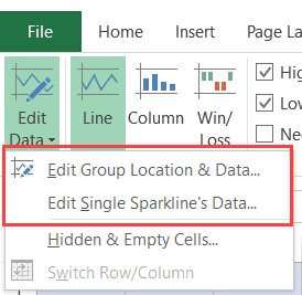
Clicking on any of these options open the Edit Sparklines dialog box where you can change the data range.
Handling Hidden and Empty Cells
When you create a line sparkline with a dataset that has an empty cell, you will notice that the sparkline shows a gap for that empty cell.
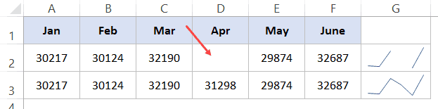
In the above dataset, the value for April is missing which creates a gap in the first sparkline.
Here is an example where there is a missing data point in a column sparkline.
You can specify how you want these empty cells to be treated.
Here are the steps:
- Click the cell that has the sparkline.
- Click the Design Tab (a contextual tab that becomes available only when you select the cell that has a sparkline).
- Click on the Edit Data option (click on the text part and not the icon of it).
- In the drop-down, select ‘Hidden & Empty Cells’ option.

- In the dialog box that opens, select whether you want to show
- Empty cells as gaps
- Empty cells as zero
- Connect the before and after data points with a line [this option is available for line sparklines only].

In case the data for the sparkline is in cells that are hidden, you can check the ‘Show data in hidden rows and columns’ to make sure the data form these cells is also plotted. If you don’t do this, data from hidden cells will be ignored.
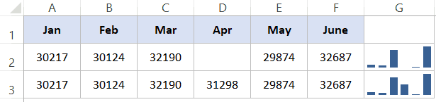
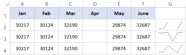
Below is an example of all three options for a line sparkline:
- Cell G2 is what happens when you choose to show a gap in the sparkline.
- Cell G3 is what happens when you choose to show a zero instead.
- Cell G2 is what happens when you choose to show a continuous line by connecting the data points.
You can do the same with column and win-loss sparklines as well (not the connecting data point option).
Changing the Sparkline Type
If you want to quickly change the sparkline type – from line to column or vice versa, you can do that using the following steps:
- Click the sparkline you want to change.
- Click the Sparkline Tools Design tab.
- In the Type group, select the sparkline you want.
Highlighting Data Points in Sparklines
While a simple sparkline shows the trend over time, you can also use some markers and highlights to make it more meaningful.
For example, you can highlight the maximum and the minimum data points, first and the last data point, as well as all the negative data points.
Below is an example where I have highlighted the maximum and minimum data points in a line and column sparkline.
These options are available in the Sparkline Tools tab (in the show group).
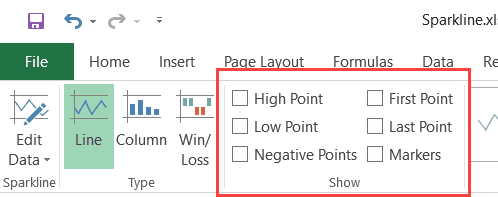
Here are the different options available:
- High/Low Point: You can use any one or both of these to highlight the maximum and/or the minimum data point.
- First/Last Point: You can use any one or both of these to highlight the first and/or the last data point.
- Negative Points: In case you have negative data points, you can use this option to highlight all of these at once.
- Markers: This option is available only for line sparklines. It will highlight all the data points with a marker. You can change the color of the marker using the ‘Marker Color’ option.
Sparklines Color and Style
You can change the way sparklines look using the style and color options.
It allows you to change the sparkline color (of lines or columns) as well as the markers.
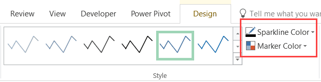
You can also use the pre-made style options. To get the full list of options. click on the drop-down icon in the bottom-right of the style box.
Pro Tip: If you’re are using markers to highlight certain data points, it’s a good idea to choose a line color that is light in color and marker that is bright and dark (red works great in most cases).
Adding an Axis
When you create a sparkline, in its default form, it shows the lowest data point at the bottom and all the other data points are relative to it.
In some cases, you may not want this to be the case as it seems to show a huge variation.
In the below example, the variation is only 5 points (where the entire data set is between 95 and 100). But since the axis starts from the lowest point (which is 95), the variation looks huge.
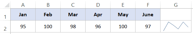
This difference is a lot more prominent in a column sparkline:
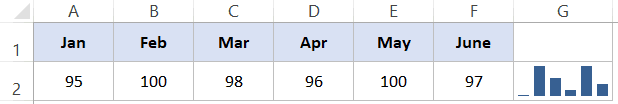
In the above column sparkline, it may look like the Jan value is close to 0.
To adjust this, you can change the axis in the sparklines (make it start at a specific value).
Here is how to do this:
- Select the cell with the sparkline(s).
- Click on the Sparkline Tools Design tab.
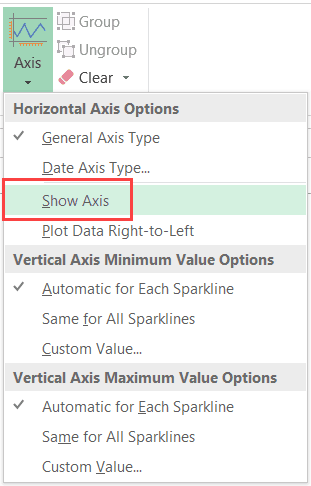
- Click on the Axis option.

- In the drop-down, select Custom Value (in the Vertical Axis Minimum Value Options).

- In the Sparkline Vertical Axis Settings dialog box, enter the value as 0.

- Click OK.
This will give you the result as shown below.
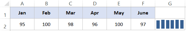
By setting the customs value at 0, we have forced the sparkline to start at 0. This gives a true representation of the variation.
Note: In case you have negative numbers in your data set, it’s best to not set the axis. For example, if you set the axis to 0, the negative numbers would not be shown in the sparkline (as it begins from 0).
You can also make the axis visible by selecting the Show Axis option. This is useful only when you have numbers that cross the axis. For example, if you have the axis set at 0 and have both positive and negative numbers, then the axis would be visible.
Group & Ungroup Sparklines
If you have a number of sparklines in your report or dashboard, you can group some of these together. Doing this makes it easy to make changes to the whole group instead of doing it one by one.
To group Sparklines:
- Select the ones that you want to group.
- Click on the Sparklines Tools Design tab.
- Click the Group icon.

Now when you select any of the Sparkline that has been grouped, it will automatically select all the ones in that group.
You can ungroup these sparklines by using the Ungroup Option.
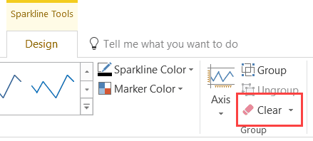
Deleting the Sparklines
You can not delete a sparkline by selecting the cell and hitting the delete key.
To delete a sparkline, follow the steps below:
- Select the cell that has the sparkline that you want to delete.
- Click the Sparkline Tools Design tab.
- Click the Clear option.
You May Also Like the Following Excel Tutorials:


Fabulous, one question though – how do i highlight the marker on a sparkline?
Excellent explanation about sparklines. Thank you very much.
All of my sparklines are coming out as a flat line – even though there is variation in the data. I am wondering if the data needs to be in a particular format ?
Great tutorial thanks. I am trying to add a marker to the last point of a Sparkline with data (not the end of the Sparkline which is blank) but it does not show up. Situation is a Sparkline for data for the 12 months of the year, but within the year (say July) the remainder of the year’s months are empty. I want to show the full year so one can get a sense of being part way through but then I suspect excel thinks the last data point is Dec and the marker is placed there and does not show up as blanks are not shown. In this situation I want a dynamic last point marker of July and next month of Aug etc, while ignoring the blanks months until year end. Anyone have a solution to this?
İt is great tutorials. I am working for as a Athletic performance coach in a soccer clup. Therefore l would like to organize Gps data with excell heat map etc. Raw data formulas from opponent data etc.
Awesome content like it
https://www.govtstaffing.com/2018/07/ssc-gd-constable-vacancy-57000.html
https://www.govtstaffing.com/
I like this notes and it very useful to me