
Pareto Chart is based on the Pareto principle (also known as the 80/20 rule), which is a well-known concept in project management.
According to this principle, ~80% of the problems can be attributed to about ~20% of the issues (or ~80% of your results could be a direct outcome of ~20% of your efforts, and so on..).
The 80/20 percentage value may vary, but the idea is that of all the issues/efforts, there a few that result in maximum impact.
This is a widely used concept in project management to prioritize work.
Creating a Pareto Chart in Excel
In this tutorial, I will show you how to make a:
- Simple (Static) Pareto Chart in Excel.
- Dynamic (Interactive) Pareto Chart in Excel.
Creating a Pareto Chart in Excel is very easy.
All the trickery is hidden in how you arrange the data in the backend.
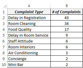
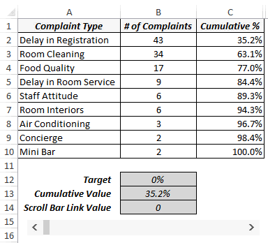
Let us take an example of a Hotel for which the complaints data could look something as shown below:
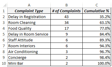
NOTE: To make a Pareto chart in Excel, you need to have the data arranged in descending order.
Download the Excel Pareto Chart Template

Creating a Simple (Static) Pareto Chart in Excel
Here are the steps to create a Pareto chart in Excel:
- Set up your data as shown below.
- Calculate cumulative % in Column C. Use the following formula: =SUM($B$2:B2)/SUM($B$2:$B$1)
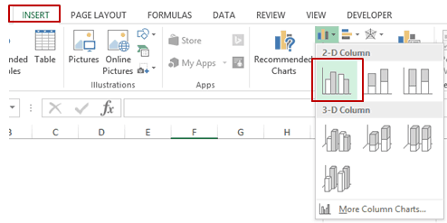
- Select the entire data set (A1:C10), go to Insert –> Charts –> 2-D Column –> Clustered Column. This inserts a column chart with 2 series of data (# of complaints and the cumulative percentage).
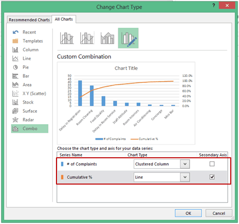
- Right-click on any of the bars and select Change Series Chart Type.
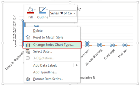
- In the Change Chart Type dialogue box, select Combo in the left pane.
- Make the following changes:
- # of Complaints: Clustered Column.
- Cumulative %: Line (also check the Secondary Axis check box).[If you are using Excel 2010 or 2007, it will be a two-step process. First, change the chart type to a line chart. Then right click on the line chart and select Format Data Series and select Secondary Axis in Series Options]
- Your Pareto Chart in Excel is ready. Adjust the Vertical Axis values and the Chart Title.
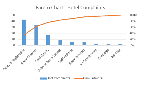
How to Interpret this Pareto Chart in Excel
This Pareto chart highlights the major issues that the hotel should focus on to sort the maximum number of complaints. For example, targeting the first 3 issues would automatically take care of ~80% of the complaints.
For example, targeting the first 3 issues would automatically take care of ~80% of the complaints.
Creating a Dynamic (Interactive) Pareto Chart in Excel
Now that we have a static/simple Pareto chart in Excel, let’s take it a step further and make it a bit interactive.
Something as shown below: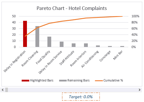
In this case, a user can specify the % of complaints that need to be tackled (using the excel scroll bar), and the chart will automatically highlight the issues that should be looked into.
The idea here is to have 2 different bars.
The red one is highlighted when the cumulative percentage value is close to the target value.
Here are the steps to make this interactive Pareto chart in Excel:
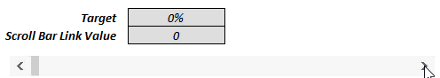
- In cell B14, I have the target value that is linked to the scroll bar (whose value varies from 0 to 100).

- In cell B12, I have used the formula =B14/100. Since you cannot specify a percentage value to a scroll bar, we simply divide the scroll bar value (in B14) with 100 to get the percentage value.
- In cell B13, enter the following combination of INDEX, MATCH, and IFERROR functions: =IFERROR(INDEX($C$2:$C$10,IFERROR(MATCH($B$12,$C$2:$C$10,1),0)+1),1) This formula returns the cumulative value that would cover the target value. For example, if you have the target value as 70%, it would return 77%, indicating that you should try and resolve the first three issues.
- In cell D2, enter the following formula (and drag or copy for all cell – D2:D10): =IF($B$13>=C2,B2,NA())
- In cell E2 enter the following formula (and drag or copy for all cell – E2:E10): =IF($B$13<C2,B2,NA())
- Select the Data in Column A, C, D & E (press control and select using the mouse).
- Go to Insert –> Charts –> 2-D Column –> Clustered Column. This will insert column chart with 3 series of data (cumulative percentage, the bars to be highlighted to meet the target, and remaining all other bars)
- Right-click on any of the bars and select Change Series Chart Type.
- In the Change Chart Type dialogue box, select Combo in the left pane and make the following changes:
- Cumulative %: Line (also check the Secondary Axis check-box).
- Highlighted Bars: Clustered Column.
- Remaining Bars: Clustered Column.
- Right-click on any of the highlighted bars and change the color to Red.
That’s It!
You have created an interactive Pareto Chart in Excel.
Now, when you change the target using the scroll bar, the Pareto chart would update accordingly.
Download the Excel Pareto Chart Template
Do you use the Pareto Chart in Excel?
I would love to hear your thoughts on this technique and how you have used it. Do leave your footprints in the comments section 🙂
Related Project Management and Charting Tutorials:
- Analyzing Restaurant Complaints using Pareto Chart.
- Creating a Gantt Chart in Excel.
- Creating a Milestone chart in Excel.
- Creating a Histogram in Excel.
- Excel Timesheet Calculator Template.
- Employee Leave Tracker Template.
- Calculating Weighted Average in Excel.
- Creating a Bell Curve in Excel.
- Advanced Excel Charts
- How to Add a Secondary Axis in Excel Charts.


If you are using excel this deeply you should be investing in software that does this already for you.
If you can learn to do this in Excel, you may not need to invest in more expensive software. Learning to be a power user with less expensive and more commonly available tools is a valuable proposition.
formula: =SUM($B$2:B2)/SUM($B$2:$B$1) SHOWING WRONG NUMBER.
S/B
formula: =SUM($B$2:B2)/SUM($B$2:$B$10)
Fantastic. You helped me 100% at right time
The error in the formula is fixed by making the last reference B10 instead of B1. B10 is the last cell in the column of data. You also have to multiply by 100 to get percentage.
=SUM($B$2:B2)/SUM($B$2:$B$10)*100
I’m not able to get the cumulative percentage to work. The first line says 100% and then the rest are in the thousands of percents?
My Excel cannot open the “developer” can you help me how to do this?
Thanks for sharing this to us. Really big useful to me.
Nice Post, thnx alot
Learn Excel Online – Free Online Excel Training Course – Improve Excel Skills. Excel Everest is one of the reputed institutes for Online Excel Course in UK.
Help, steps 9 onwards don’t work for me! Everything else is great just can’t get the bars to change colour.
Got asked to do my first Pareto Graph today. By the end of the day, I had produced what I refer to as a “Live Pareto Graph”. All the data is compiled and resorted on the fly as data within the spreadsheet is changed. This can be real handy if you need multiple people to manipulate the project. Less steps to train.
l like this blog Excel Everest offers Microsoft ExcelTutorials: Our administrations are Microsoft Excel Training, Online Excel Training,Excel Courses.
Why My excel Target % can’t auto update , when I scroll bar link value to 10, 20 etc.. the target is remain 0%
Have you linked the target cell with the scroll bar value?
If I add a value of 0 (Zero) in the complaints column the chart is no longer sorted from high to low.
Hello Kevin.. You’ll need to sort the data in an descending order for this chart to work. If you add a value once you have created the chart, simply sort column A and B (using the values in column B in a descending order)
Sumit – nice post – love your creative thought process. One question – does this make sense? I added another IFERROR function to the overall INDEX formula so that if you have a 100% target it registers 1 (100%). I was getting a #REF error otherwise.
Hi Mike.. I just noticed the #REF error at 100%. I have updated the article and the download file.. Thanks for sharing..You are awesome!
Nice charts!
However, the dynamic one highlights one colum to much, e.g. for 80% 4 columns are highlighted, but – as you mentioned – 3 would be correct, i.e. INDEX($C$2:$C$10,MATCH($B$12,$C$2:$C$10,1)).
Furthermore, you won’t need an additional column for the remaining bars if you optimize the order of the other columns.
Hi Frank.. Thanks for commenting..The reason I highlight 4 columns for 80% is because 3 columns would constitute only 77%. So I take an additional value (uptill 84.4%). But if you need it to be 3 only, then your formula is the way to go.
This is great!
Thanks for commenting Meera.. Glad you liked it 🙂
I liked this !!! Well in my Excel 2010 (Std.), the combo option is not available. However, I could select individual series and could do it.
Hi Yogi.. Thanks for commenting.. Glad you liked it 🙂 You are right! Excel 2010 doesn’t have the combo option, but it can be done using chart type.
Nice work. I really like the dynamic slider.
Hi Terry.. Thanks for commenting.. Glad you liked it!
Thank you SO much for this’ MUCH needed
Thanks for commenting Ferriyah.. Glad you found it useful!