Excel charts allow you to do a lot of customizations that help in representing the data in the best possible way.
And one such example of customization is the ease with which you can add a secondary axis to Excel charts.
But before I get into the mechanics of adding a secondary axis, let me take a step back and explain why it’s needed.
Why Add a Secondary Axis in Excel Charts?
Let me try and explain this by using an example.
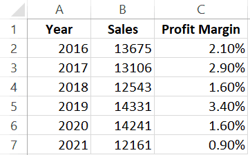
Suppose you have the following data set of Sales and Profit margin of a company for six years.
Below is the chart that I have created using this data. The blue bars represent the sales value and the red ones (the little bars next to the blue sales bars) represents the profit margin.
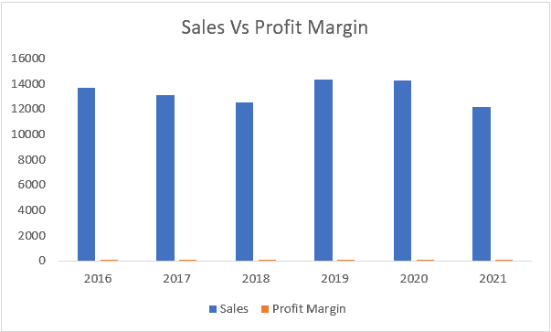
Do you see the problem?
What if I ask you to tell me how much change happened in profit margin in 2019 (compared with 2018).
I am sure you can’t tell by looking at the chart.
But if you look at the numbers, the profit soared by 125% in 2019.
And that’s the issue with this Excel chart.
When you plot all the data on the same axis, you lose the ability to compare data of different scales. While Sales numbers are likely to be high, profit margins are usually very low values.
And these two can’t be plotted on the same axis.
Solution – adding a secondary axis to plot the profit margin numbers.
So, we add a secondary axis to the mix and make the chart better (as shown below).
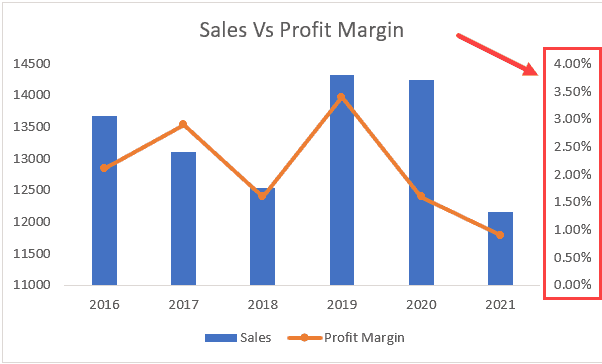
A secondary axis has been added to the right which has different scales. The lowest value is 0% and the highest is 4% (which is determined by the profit margin percentage values in your dataset).
This combination chart now allows you to see the variation in both series of data – Sales and profit margin values.
Adding Secondary Axis to Excel Charts
Adding a secondary axis is very simple in all the versions of Excel (more so in the latest ones).
In this section, I will show you the steps to add a secondary axis in different versions.
Using Recommended Charts
In Excel 2013 and higher versions (Excel 2016, 2019 and Office 365), there is a quick way to create charts using the recommended charts feature.
This feature quickly analyzes your data and show you a few options.
If you have a simple dataset (like the one we are using in this example), it’s likely that recommended charts will show you an option that already includes a second axis as a part of the chart.
Below are the steps to add a secondary axis to a chart:
- Select the dataset.
- Click the Insert tab.
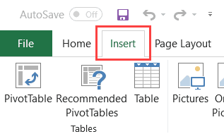
- In the Charts group, click the Recommended Charts option. This will open the Insert Chart dialog box.

- Scan the charts in the left pane and select the one that has a secondary axis.

- Click OK.
Note: You also get other chart options that you can use. Excel tries to be helpful but may not always be on point. If you don’t find the chart that you want to use, you can create it manually (covered next).
One of the things I like about the ‘Recommended charts’ feature is that it identifies the time data (such as years or months). This sometimes doesn’t happen when creating a chart manually, in which case you have to manually set the axis value.
Adding the Secondary Axis Manually (2013 and above versions)
In case the ‘Recommended Charts’ feature does not work for you, there is always the option to do it manually (only takes a few clicks).
Below are the steps to add a secondary axis to the chart manually:
- Select the data set
- Click the Insert tab.
- In the Charts group, click on the Insert Columns or Bar chart option.

- Click the Clustered Column option.

- In the resulting chart, select the profit margin bars. If these are too small to select, select any of the blue bars and hit the tab key.

- With the Profit margin bars selected, right-click and click on ‘Format Data Series’

- In the right-pane that opens, select the Secondary Axis option. This will add a secondary axis and give you two bars.
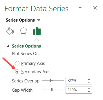
- Right-click on the Profit margin bar and select ‘Change Series Chart Type’.

- In the Change Chart Type dialog box, change the Profit Margin chart type to ‘Line with Markers’

That’s it!
This will give you a chart that has the secondary axis and the chart type of data on a secondary axis is a line chart.
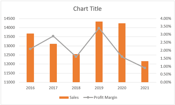
You can also format the line by right-clicking and selecting the Format Data Series option. Simple things such as making the line and columns in contrasting colors can make your Excel charts professional and easy to understand.
Caution: In case you have a dataset where the axis values are numbers (such as years), the column chart you create may not be what you expect. It’s likely to consider the year’s data as something that should be plotted in the chart as bars instead of the axis (the axis in such case takes the numbers 1,2,3 and so on..). The fix here would be to delete the series where the year’s data has been plotted as columns and then manually change the axis or convert the axis values in the dataset into text.
Note that in the above example, we are adding a vertical secondary axis.
Note: When creating Excel charts, it’s always a good idea to keep in mind that these might be printed. In such cases, using light and dark colors to show contrast can help even when the printed charts are seen (which are often printed in black and white).
Adding the Secondary Axis Manually (Excel 2010)
In case you’re using Excel 2010, you can follow the below steps to add a secondary axis:
- Select the data and insert the chart
- Click the chart. This will also make visible the Chart Tools tab. This is a contextual tab and appears only when you select a chart.
- Click the Format tab
- In the current selection group, select the series for which you want to add a secondary axis
- After selecting the column, click on Format selection. This will open the Format Data Series dialog box.
- In the dialog box, select Series Options in the left pane
- Select the Secondary Axis option
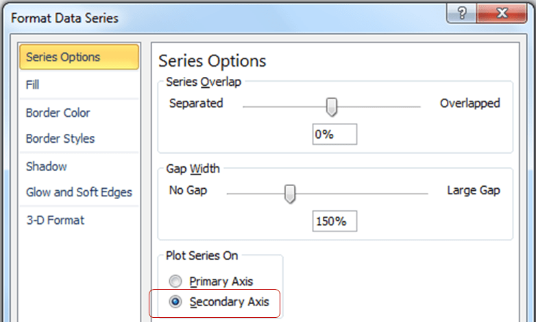
- Close the dialog box
Removing the Secondary Axis
Removing the secondary axis is as simple as hitting the Delete key (literally).
To delete a secondary axis, click on it.
Hit the Delete Key (or right-click and click on Delete).
Note: In most cases, you’ll need to add a vertical secondary axis only. But in cases, you want a horizontal secondary axis you can use the same steps to do add it.
You May Also Like the Following Excel Charting Tutorials:


Hi Sumit,
could you please help me out with some excel third line axis?
I need to help a friend with this. i read your article and can do it, but i would need to read and understand it, which is going to take too much time.
so if i could give you the excel file, i need your help to just add 1 third axis and you could email me back.
I appreciate you helping me out. Looking forward to your positive response.
Is there a way to get the % axis (secondary axis) to be on the left side of the chart?
you’re life saver <3
superb