
Last week I wrote an article on how to create a Dynamic Pareto Chart in Excel. With the charting fever still riding high, today I will show you how to create a Gantt Chart in Excel.
Gantt Chart is a simple yet powerful project management tool that can be used for creating a schedule or tracking the progress.
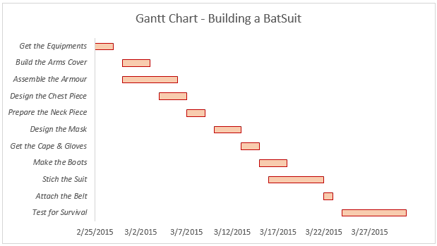
Let’s say Bruce Wayne (Batman) wants a new Batsuit and instructs Alfred (the butler and his confidante) to get it made. Alfred, who is an avid project management student, comes up with a simple Gantt Chart in Excel to get the plan ready. And this is what he shows Mr. Wayne when asked for a status report:
Follow Along.. Download the Example File
Creating a Gantt Chart in Excel
Here are the steps to quickly create this Gantt Chart in Excel:
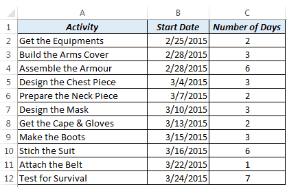
- Get the Data in place. Here we need three data points:
- Activity Name
- Start Date
- Number of Days it takes to complete the activity
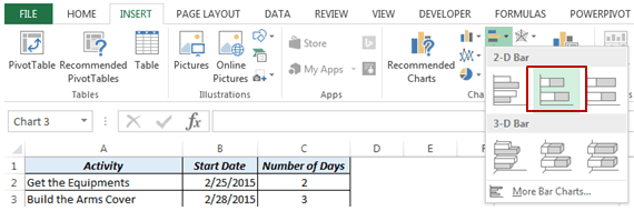
- Go to Insert –> Charts –> Bar Chart –> Stacked Bar. This will insert a blank chart in the worksheet.
- Select the Chart and go to Design tab. In the Design Tab, Go to Data Group and click on Select Data.

- In Select Data Source dialogue box, click on Add. In the Edit Series dialogue box, enter the following data:
- Series Name: Start Date
- Series Values: =’Gantt Chart’!$B$2:$B$12

- Again click on Add in Select Data Source dialogue box and use the following data:
- Series Name: Number of Days
- Series Values: =Sheet1!$C$2:$C$12

- In the Select Data Source dialogue box, in the right half of the pane titled Horizontal (Category) Axis Labels, click on Edit.

- In the Axis Labels dialogue box, select the range that has all the activities names.

- Now your chart would look something as shown below. You would notice that the activities are in the reverse order (for example, Test for Survival is the first one).

- To correct the order of activities, right click on the vertical axis (that has activity names) and select Format Axis. In Format Axis Pane, under Axis Options, click on the checkbox – ‘Categories in Reverse Order’

- As of now, your horizontal Axis (which has dates) is at the top. Right click on the Horizontal Axis (which has dates) and select Format Axis. In the Format Axis Pane make the following changes:
- In Axis Options, change the Minimum to 2/25/2015 (you can also type 42060, which is the number that represents this date) [This ensures that your chart starts at 2/25/2015]
- In Labels, change Label Position to High

- Now your Gantt Chart is almost ready. Just select the blue bars and remove the color fill and border color.
- Change the Title, do some formatting to make it look awesome (and it makes you look awesome).
Gantt Chart is so powerful, even Batman uses it 🙂
Try it Yourself.. Download the Example File
I would love to learn from you. Let me know how you use Gantt Chart and/or other project management tools. Leave your footprints in the comments section below!
You May Also Like the Following Excel Tutorials:


HI,
I CANNOT COMPLETE THE 4TH STEP.
ITS SHOWING ERROR .=’Gantt Chart’!$B$2:$B$12
MY DATA RANGES FROM a2 TO a14
Plz guide how to make gantt chart with predecessor
Dear Sumit,
If you dont mind, please also teach us tutorial on how to create these kind of gantt chart:
http://excelhawk.com/gantt+chart+excel+template.html
Thanks,
Stuart
Thanks Sumit for this fantastic idea.
I have other question. I’m trying to make a combination with two graphics. One is similar to this, and the other is one update with real start date and percentage (I have transformed to days). But the only way I have found is to make the second transparent and move exactly over the first one.
Can I make in other way? THANKS!
Sumit,
Thank you for posting this training, will you be posting more about grant charts?
Thanks for commenting Dan.. I plan to post more tutorials on Project Management using Excel. I am also working on a Gantt Chart style template and will post it soon.. Stay Tuned!
If you have any ideas, do share with me 🙂
Thanks for posting this! I was looking for guidance to create Gantt Chart – your post makes it quite simple to understand and the Batman Suit example made it very interesting as well 🙂 I would definitely implement it in my work!
Thanks for commenting Mehar.. Glad you found it useful 🙂
Thanks for commenting Mehar.. Glad you found this useful 🙂