
I am currently working on creating a sales pipeline management dashboard. I have all the data in place and now I am looking for some visualization to create the dashboard. One of the charts that I absolutely want in there is a sales funnel chart.
What is a Sales Funnel?
In any sales process, there are stages. A typical sales stage could look something as shown below:
Opportunity Identified –> Validated –> Qualified –> Proposal –> Win/Loss
If you think about the numbers, you would realize that this forms a sales funnel.
Many opportunities are ‘identified’, but only a part of it is in the ‘Validated’ category, and even lesser ends up as a potential lead.
In the end, there is only a handful of deals that are either won or lost.
If you try and visualize it, it would look something as shown below: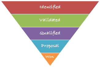
Now let’s recreate this in Sales Funnel Chart Template in Excel.
Download the Sales Funnel Chart Template to follow along
Watch Video – Creating a Sales Funnel Chart in Excel
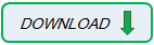
Sales Funnel Chart Template in Excel
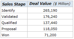
Lets first have a look at the data:
Here are the steps to create the sales funnel chart in Excel:
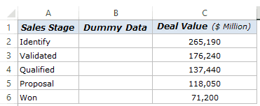
- Arrange the data. I use the same dataset, as shown above, but have inserted an additional column between sales stage and deal value columns.
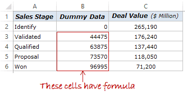
- In the dummy data column, enter 0 in B2, and use the following formula in the remaining cells (B3:B6)
=(LARGE($C$2:$C$6,1)-C3)/2
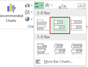
- Select the data (A2:C6), and go to Insert –> Charts –> Insert Bar Chart –> Stacked Bar.
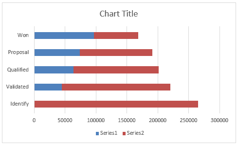
- The above steps creates a stacked bar chart as shown below:
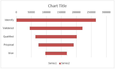
- Select the vertical axis and press Control +1 (or right click and select Format Axis). In the Format Axis pane, within Axis Options, select categories in reverse order. This would reverse the order of the chart so that you have the ‘Identified’ stage bar at the top.

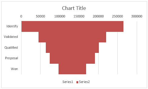
- Select the blue bar (which is of dummy data) and make its color transparent
- Select the red bars, and press Control +1 (or right click and select Format Axis). In the Format Data series pane, select Series Options and change Gap Width to 0%. This would remove the gap between these bars
- That’s it. Now remove the chart junk and format your chart to look awesome. Here are some steps I took to format it:
- Removed the legend and horizontal axis
- Changed Chart Title to ‘Sales Funnel’
- Changed bar colors to blue
- Added a border to the bars
- Added data labels
- Removed gridlines
Download the Sales Funnel Template
That’s all right Sumit. But where is the Dashboard?
I am working on it, and soon as I am done with it, I will share it with you all. For now, here is a glimpse of how I plan to use this sales funnel chart in the sales pipeline management dashboard.

I am really excited as it is the first time I will share a full-fledged dashboard on my blog. If you would like to see more of Excel dashboard tutorials on this blog, give me a shout-out in the comments section.
Also, if you think there are any visualizations that would look cool in the sales pipeline dashboard, just drop me a note or leave your thoughts in the comments section.
You May Also Like the Following Excel Tutorials:


Its nice job with step by step explanations. Thanks a lot sir.
Great tutorial, and Are you done with the Dashboard thing?
Great tool!
Also have a look at https://goo.gl/CKPyeZ
It is a great Sales Funnel Template for online whiteboard with realtime collaboration
Can you do this with a pivot table/chart?
Great tool you’ve created – visualizing the sales funnel is so important.
sir please send all excel formula training chapter
You can find videos and live examples for 70+ formulas here – http://trumpexcel.com/learn-excel/excel-formulas/
Good technique , I liked that. !
Thanks for commenting.. Glad you liked it 🙂
This is so cool 🙂
Thanks for commenting Mehar.. Glad you liked it 🙂
Thanks for sharing Sumit.. Look forward to the dashboard
I will share it end of this month.. trying to come up with some useful visualizations
Thanks for sharing! Did you upload the tutorial for the dashboard?
Good technique. Thanks for sharing.
Thanks for commenting.. Glad you liked it 🙂