
A colleague asked me if there was a way to create a dynamic in-cell 100% stacked bar chart in Excel for three product sales.
As usually is the case, there were thousands of rows of data. There is no way she could have used Excel in-built charts as that would have taken her ages to create charts for each set of data points.
This got me thinking, and fortunately, conditional formatting came to the rescue. I was able to quickly create something neat that fits the bill.
Creating a 100% Stacked Bar Chart in Excel
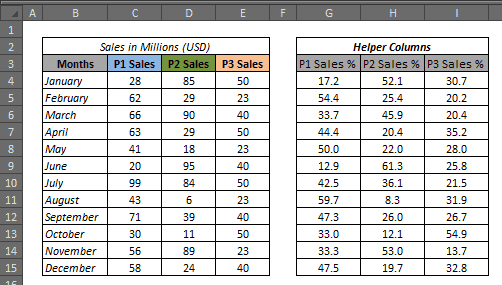
Suppose you have sales data for 12 months for three products (P1, P2, and P3). Now you want to create a 100% stacked bar chart in Excel for each month, with each product highlighted in a different color.
Something as shown below:

Download the Example file

How to create this:
First, you need to calculate the percentage breakup for each product for each month (I was trying to make a 100% stacked chart remember!!).
To do this, first create three helper columns (each for P1, P2, and P3) for all the 12 months. Now simply calculate the % value for each product. I have used the following formula:
=(C4/SUM($C4:$E4))*100)
 Once you have this data in place, let’s dive in right away to make the stacked chart
- Select 100 columns and set their column width to 0.1.
- Select these 100 cells in the first data row (K4:DF4) in this case.
- Go to Home –> Conditional Formatting –> New Rule.
- In New Formatting Rule Dialogue box, click on ‘Use a formula to determine which cells to format’ option.

- In the ‘Edit the Rule Description’ put the following formula and set the formatting to Blue (in ‘Fill’ tab)
=COLUMNS($K$4:K4)<=$G4

- Now again select the same set of cells and go to Home – Conditional Formatting – Manage Rules. Click on New Rule tab and again go to ‘Use a formula to determine which cells to format’ option. Now put the formula mentioned below and set the formatting to green color.
=AND(COLUMNS($K$4:K4)>$G4,COLUMNS($K$4:K4)<=($G4+$H4))
- And finally again repeat the same process and add a third condition with the following formula and set the formatting to orange color.
=AND(COLUMNS($K$4:K4)>($G4+$H4),COLUMNS($K$4:K4)<=100)
- Now click Ok and you would get something as shown below:
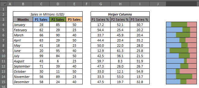 Hide the helper columns, and you have your dynamic 100% stacked bar chart ready at your service.
Now it’s time to bask in the glory and take out some time to brag about it ![]()
Try it yourself.. Download the Example file from here
If you have enjoyed this tutorial, you might also like these:
- Creating a Sales funnel chart in Excel.
- Creating a Gantt Chart in Excel.
- Creating a dynamic Pareto Chart in Excel.
- Step Chart in Excel – A Step by Step Tutorial.
- Creating Heat Map in Excel Using Conditional Formatting.
- How to Quickly Create a Waffle Chart in Excel.
- Excel Sparklines – A Complete Guide


It’s an ingenious solution and mr. TrumpExcel is the master of such hacks. The math baffles me, but I managed to get it working on columns just by adding another helper column and including it into the calculations such as the part with +.
While working on it be careful cos the $K$4:K4 part seems to change all of a sudden while adding the other conditional formatting rules, so you need to check back at end for any such seemingly random changes that may have occurred.
Next process is to try and figure out how to make this with just 10 columns, cos 100 columns is insane and may slow down a huge worksheet…
…get it working on 4* columns…
Hi, We have this in an excel report but left to right scrolling becomes difficult as there are 100 columns. Is there a different way to do it without 100 columns?
do with 10 columns. Most can probably do without such a high precision in the chart.
Is there a quick way to “select 100 columns”?
HI Summit
Can you help me understating the Formulas and the results — I am not getting the logics and not the reaching the solution too.
=COLUMNS($K$4:K4) no of columns =1 which is less than or equal to Cell g4
=AND(COLUMNS($K$4:K4)>$G4,COLUMNS($K$4:K4)($G4+$H4),COLUMNS($K$4:K4)<=100 ???
I need a stacked data bar that is in-cell. Doesn’t need to be 100% Can you help?
Can you explain the COLUMNS function a little bit, please? Why do you start at row 9?
Hi Amanda.. Here is a video tutorial on COLUMNS function – http://trumpexcel.com/learn-excel/excel-formulas/columns/
Hope this helps!
Really cool idea and implementation!
Thank you for an excellent written tutorial! I was wondering if this can also be realised when you have more than 3 ‘Sales’ columns. Would you happen to have an example with 5 or 7 cells? Thanks a lot!
Thanks Candrex. Glad you like it. This would work more than 3 columns as well. You can follow the same process with 5 or more columns, where you will have to put in 5 (or more) conditions with different colors.
I don’t have a ready format for more than 3 columns, but if you get stuck, feel free to comment and I can help you out.
Yeah that was very easy to put another column. Just had to add another + calculation after the others. I also made the last column data =100-G4-H4 and to show it as white, so now it looks rather like data bars all ending at different lengths.
Actually if you’ve got little time I’d (and probably a few others) would need help converting this into just 10 columns, cos 100 is just too much processing power. The loss in accuracy is not an issue.