I often use scatter chart with many data points. One of the most irritating things is to spot the data point in Excel chart. Excel does not give you a way to display the names of the data points.
While there are many add-ins available to do this, I will show you a super cool (without add-in) workaround to spot the data point you are looking for.
Something as shown below: 
This technique instantly gives you a way to identify the company’s position in the scatter chart.
Spot Data Point in Excel Scatter Chart
- Go to Insert –> Charts –> Scatter Chart.

- Click on the empty chart and go to Design –> Select Data.

- In the Select Data Source dialogue box, click on Add.

- In the Edit Series dialogue box, select the range for X axis and Y axis.
- Click Ok.
This will create a simple scatter chart for you. Now comes the interesting part – creating the marker to spot your selected company. This has 3 parts to it:
2.1 – Create a Drop Down List with Company (data point) Names
- Go to a cell where you want to create the drop down.
- Go to Data –> Data Validation.
- In the Data Validation dialogue box, select List (as validation criteria) and select the entire range that has names of the companies (in this case, the list is in B3:B22), and click OK.

2.2 – Extracting the Values for the Selected Company
- Select a cell and refer it to the cell with the drop down. For example, in this case, the drop down is in F3, and in B25 I have the formula =F3.
- Cell B25 would change whenever I change the drop down selection.
- In cell C25, use the VLOOKUP formula to extract the Revenue (X axis) value for the company in cell B25:
=VLOOKUP(B25,$B$3:$D$22,2,0) - In cell D25, use the VLOOKUP formula to extract the Profit Margin (Y axis) value for the company in cell B25:
=VLOOKUP(B25,$B$3:$D$22,3,0)
2.3 – Creating the Spotter
- Select the already created scatter chart.
- Go to Design –> Select Data.
- In the Select Data Source dialogue box, Click Add.
- Select cell C25 as x-axis value.
- Select cell D25 as Y axis Value.
- There would be a data point in a color and shape different from the other data points. Select that data point, right click and select Format Data Series.
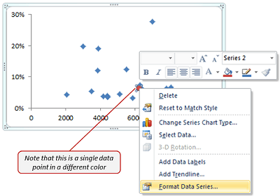
- In Format Data Series Dialogue box
- Select Marker Option –> Built-in –> Type (select circular shape and increase the size to 11).
- Marker Fill –> No Fill.
- Marker Line Color –> Solid Line (Red or whatever color you want).
- Marker Line Style –> Width (Make it 1 or higher).

That’s it. You have it ready. Now you can select a company and it would circle and highlight the company. Cool isn’t it?
Note: If you have a lot of data points, your highlighter may get hidden behind the data points. In this case, simply put it on secondary axis, and ensure that setting are same for primary and secondary axis
Try it yourself.. Download the file