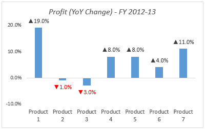
If you create an Excel chart that represents YoY change, it is a good formatting technique to highlight chart data labels with a negative value in red. And at the same time, if you could also add upward/downward arrows to the data labels, then that’s icing on the cake.
With a simple number formatting trick, you can create and Excel chart as shown below:

You can see the negatives values in chart data labels are highlighted in Red and all the values have either an upward or downward arrow with it.
Chart Data Labels with Trend Arrows
To create this, right-click on the chart data labels and select Format Data Labels (shortcut – Control + 1). In the Format Data Labels task-pane, select Number, and make the formatting as shown below:

Here I have specified the number formatting when the value is positive and when it is negative. Arrow symbol in double quotes ensures that it is added before the value in the data label. (Read more about Excel Number Formatting)

Neat Trick.. Isn’t it!!
Try it yourself.. Download the file

You May Also Like the Following Excel Tutorials:


How do you change the color of the arrow only while leaving the numerical font color black?