
Excel chart data labels are quite boring. While there is not much you can do with these, a bit of excel trickery can add some glamor to it. In this post, I will show you how to show trends in chart labels in a bar chart. Something as shown below:
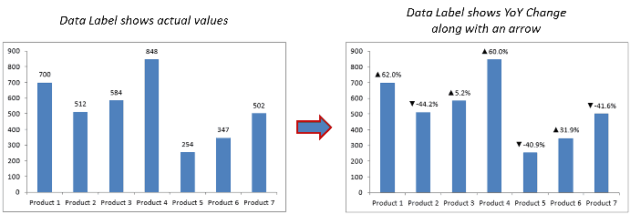
Show Positive/Negative Trend Arrows in Excel Chart Data Labels
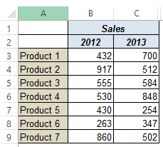
Suppose I have the data as shown below:
If I plot 2013 data only, it won’t tell us how much the sales of a product have increased/decreased over the last year. However, I can do this by changing the chart data label to show the YoY change. To do this, we first need to modify our data set a bit.

Changes made to the data set
- Added YoY change in Column D
- Added an upward arrow in B11 and downward arrow in C11
- To do this, go to Insert –> Symbol
- In the Symbol dialog box, select Arial font (or whatever you are using), and scroll down to find the arrow symbols
- In column E, use the following combination of TEXT and IF formula:
=TEXT(D3,"0.0%")&IF(D3>0,$B$11,$C$11)
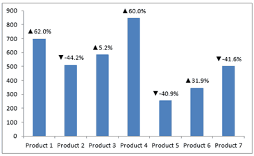
When you have the data set in place, create a bar chart using 2013 values. You will get a chart as shown below:

Now to show the YoY change instead of 2013 values in chart labels, follow the steps below:
For Excel 2013
- Click on any of the data labels
- Right-click and select Format Data Labels
- In Label Option, check Value from Cells, click on Select Range and select the cells the new labels (E3:E9 in this case)

For Excel 2010
- Select the first data label (click on it twice)
- Click on the formula bar and type =
- Select E3
- This will change the first data label to display the value in E3 (along with the arrow). Now you can do this for all the data labels (a bit of manual labor – but a straight forward method)
That’s it!! You would have your chart ready.
Try it yourself.. Download the file
You May Also Like the Following Excel Tutorials:
- Color Negative Chart Data Labels in Red with a downward arrow.
- Creating Pareto Chart in Excel (Simple + Interactive).
- Insert Arrows in Excel
- How to Spot Data Point in Excel Scatter Chart.
- Format Numbers in Millions in Excel Charts
- How to Type Degree Symbol in Excel.
- How to Apply Superscript and Subscript Format in Excel.
- How to Insert Bullets in Excel.
- Adding Trendlines in Excel Charts.


I have the same problem as Chris Macro
I can’t figure out how to insert the arrow symbols into Excel 2016 as Insert > Symbol only gives me 255 Arial characters, none of which are the arrows.
=CODE(B11) returns 63, which is the Arial Question Mark.
However, if I copy the arrows from your example file into 2016 it works perfectly!
Hi Sumit, Thanks for the amazing video. I just had a confusion, can you help me in adding the colored up and down arrow in the chart, currently it only black in color.
Can you insert the arrow symbol in Excel 2007? I can’t figure out how to insert the arrow symbols (see dialog in attached picture) but if I copy the arrows from your example file into 2007 it works perfectly!
Hi Chris.. This is weird.. I don’t have 2007 (have 2010 and 2013). Let me get hold of a machine with 2007 and check this out. But if these arrows are not in 2007, the one at the bottom left of this picture should work the same I guess 🙂
thanks alot for the tip. i have a bubble chart and would like to add trend up / down arrows against the bubbles to denote if there is a increase or decrease in the value.
This is a cool trick! I’ve used it several times. However, it is very tedious to go over each data label to change it. Do you have some VBA code to change the labels automatically?
There’s an add-in that you can use for scatterplots (X-Y plots) but I’m not aware of any add-ins for column charts.
Hi Orlando.. There is a non-VBA way you can use to do this in Excel 2010. Have a look at this link (I have mentioned how to do this below the chart in this file). Hope this is what you are looking for
https://www.dropbox.com/s/qm9qxp2r5ykj4rr/Excel%20Chart%20with%20Trend%20in%20Data%20Labels%20for%202010.xlsx
This is a very clever trick. Excel never stops to amaze me.