
In this article, I will show you how to add a trendline in Excel charts.
A trendline, as the name suggests, is a line that shows the trend.
You’ll find it in many charts where the overall intent is to see the trend that emerges from the existing data.
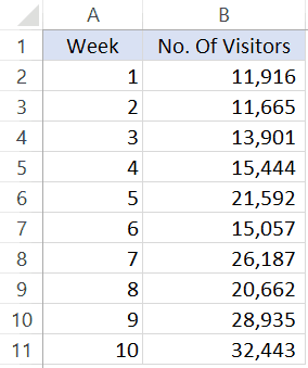
For example, suppose you have a dataset of weekly visitors in a theme park as shown below:
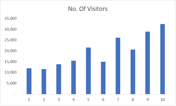
If you plot this data in a line chart or column chart, you will see the data points to be fluctuating – as in some weeks the visitor numbers decreased as well.
A trendline in this chart will help you quickly decipher the overall trend (even when there are ups and downs in your data points).
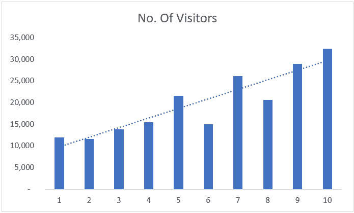
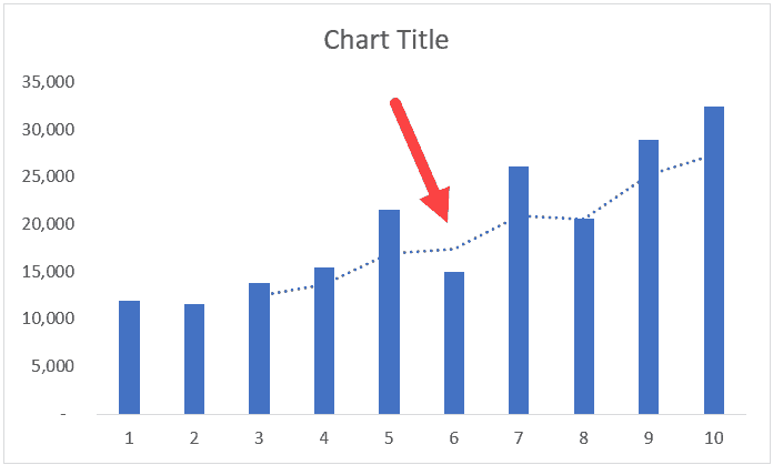
With the above chart, you can quickly make out that the trend is going up, despite a few bad weeks in footfall.
Adding a Trendline in Line or Column Chart
Below are the steps to add a trendline to a chart in Excel 2013, 2016 and above versions:
- Select the chart in which you want to add the trendline
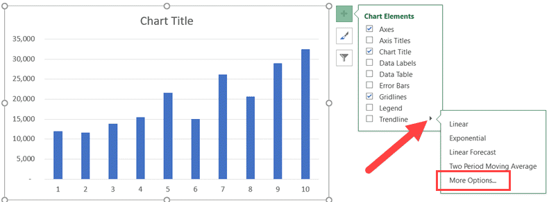
- Click on the plus icon – this appears when the chart is selected.
- Select the Trendline option.
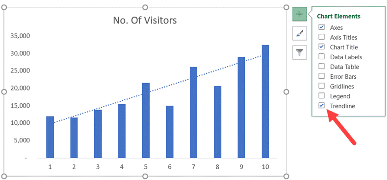
That’s it! This will add the trendline to your chart (the steps will be the same for a line chart as well).
Another way to add a trendline is to right-click on the series for which you want to insert the trendline and click on the ‘Add Trendline’ option.
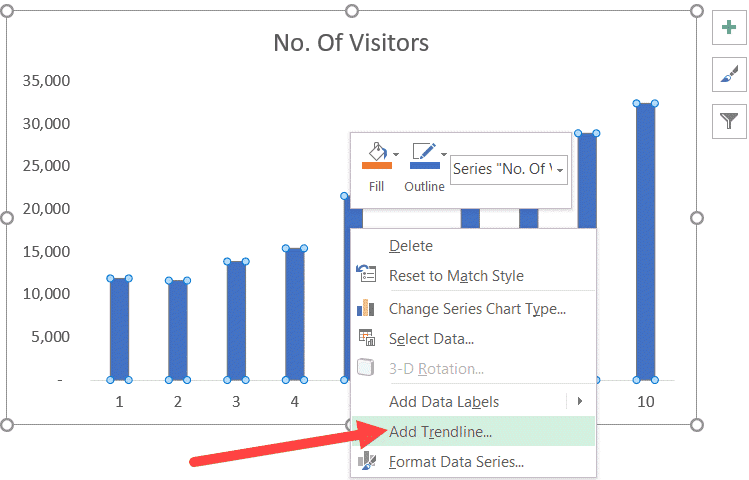
The trendline that is added in the chart above is a linear trendline. In layman terms, a linear trendline is the best fit straight line that shows whether the data is trending up or down.
Also read: How to Add Axis Titles in Charts in Excel?
Types of Trendlines in Excel
By default, Excel inserts a linear trendline.
However, there are other variations as well that you can use:
- Exponential
- Linear
- Logarithmic
- Polynomial
- Power
- Moving Average
Here is a good article that explains what these trend lines are and when to use these.
To select any of these other variations. click on the small triangle icon that appears when you click on the plus icon of the chart element. It will show you all the trendlines that you can use in Excel.
Apart from linear trendline, another useful option is a moving average trendline. This is often used to show the trend by considering an average of the specified number of periods. For example, if you do a 3-part moving average, it will show you the trend based on the past three periods. This is useful as it shows the trend better by smoothening any fluctuations. Below is an example where even though there was a dip in the value, the trend remained steady as it was smoothened by the other two period values.
Formatting the TrendLine
There are many formatting options available to you when it comes to trendlines.
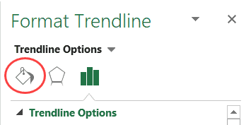
To get all the options, right-click on the trendline and click on the ‘Format Trendline’ option.
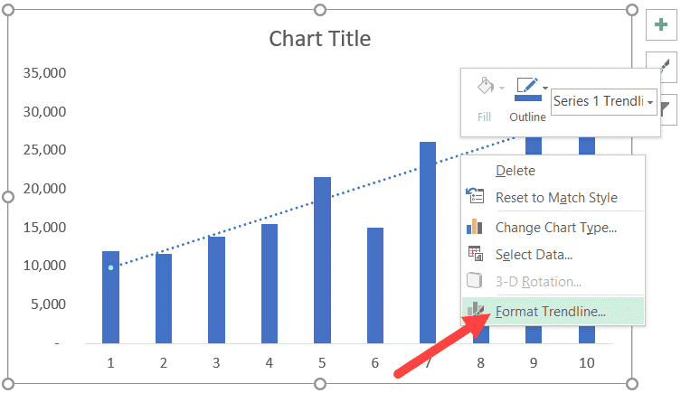
This will open the ‘Format Trendline’ pane or the right.
Through this pane, you can make the following changes:
- Change the color or width of the trendline. This can help when you want it to stand out by using a different color.
- Change the trendline type (linear, logarithmic, exponential, etc).
- Adding a forecast period.
- Setting an intercept (start the trendline from 0 or from a specific number).
- Display equation or R-squared value on the chart
Let’s see how to use some of these formatting options.
Change the Color and Width of the Trendline
To change the color of the trendline, select the Fill & Line option in the Format Trendline pane.
In the options, you can change the color option and the width value.

Note: If you’re using a trendline in reports or dashboards, it is a good idea to make it stand out by increasing the width and using a contrast color. At the same time, you can lighten the color of the data bars (or lines) to make the importance of the trendline more clear.
Also read: How to Add Axis Titles in Charts in Excel?
Adding Forecast Period to the Trendline
You can extend the trendline to a couple of periods to show how it would be if the past trend continues.
Something as shown below:
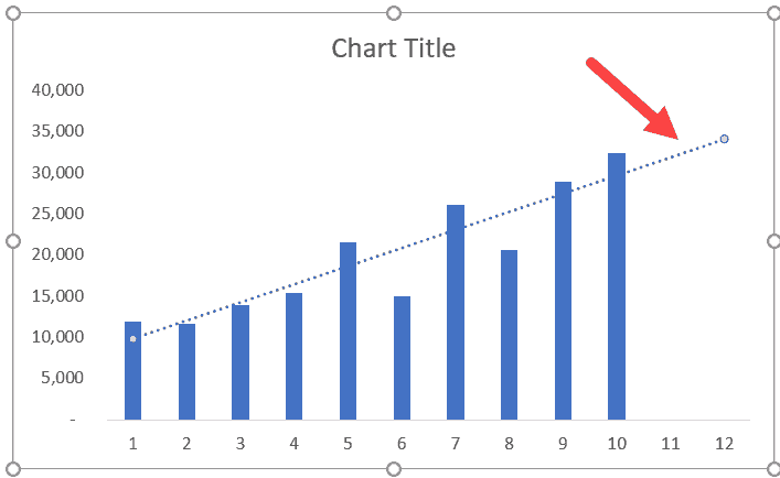
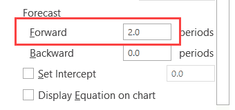
To do this, change the forecast ‘Forward’ Period value in the ‘Format Trendline’ pane options.
Also read: Forecast in Excel (Formulas & Forecast Sheet)
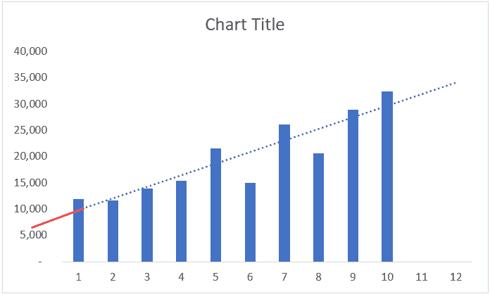
Setting an Intercept for the Trendline
You can specify where you want the trendline to intercept with the vertical axis.
By default (when you don’t specify anything), it will automatically decide the intercept based on the data set.
For example, in the below chart, the intercept will be somewhere a little above the 5,000 value (shown with a solid red line – which I have drawn manually and is not exact).
If you want the trendline to intercept at 0, you can do that changing it by modifying the ‘Set Intercept’ value.
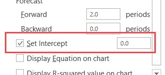
Note that you can only change the intercept value when you’re working with exponential, linear, or polynomial trendlines.
Hope you find this tutorial useful.
You may also like the following Excel Charting tutorials:
- Creating a Step Chart in Excel
- Creating a Histogram in Excel.
- Creating a Bell-curve in Excel
- Creating a Waffle Chart in Excel
- Creating Combination Charts in Excel
- Actual Vs Target Charts in Excel
- How to handle data gaps in Excel charts
- How to Find Slope in Excel? Using Formula and Chart
- How to Insert/Draw a Line in Excel (Straight Line, Arrows, Connectors)


What is advance Excel, Explain with Examples.
Excellent, easy, a step by step teaching . Sr. citizen like me could understand and do.
May give similar tutorials like this.
thanking you Sir,
EXCELLENT SIMPLE AND EASY APPROACH EVEN A LAME MAN CAN UNDERSTAND
Thank you, It is really helpful
very good
GOOD