
This is the third and final article of the three-part tutorial series on Creating a KPI Dashboard in Excel.
Part 1: Creating a Dynamic Scatter Chart in Excel
Part 2: Spotting the Data Point and Creating a Dynamic Interpretation for the Chart
Part 3: Extract List of Companies from the Scatter Chart + Company comparison( using Bullet Charts)
If you have followed Part 1 and Part 2 of this KPI Dashboard in Excel series, by now you would know how to create a dynamic scatter chart, spot a data point in the chart, and create a dynamic interpretation for the chart. Something as shown below:

KPI Dashboard in Excel – Part 3/3
In this final part of the series, I will show you:
- How to extract a list of companies from a specific quadrant of the scatter chart
- How to Insert a Dynamic Bullet Chart
Click here to download the dashboard
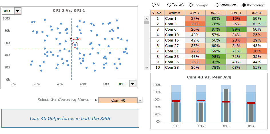
Extract List of Companies from the Scatter Chart
To extract the list of all the companies from a quadrant, we need to insert 5 radio buttons (four buttons for the four quadrants and one for getting all the companies)
Inserting Radio/Option Buttons
To insert a radio button:
- Go to Developer Tab –> Insert –> Form Controls –> Option Button.
- Click anywhere on the worksheet and it would insert a radio button.
- Right-click on the radio button and select Format Controls.
- In the Format Control dialog box, specify a cell link (in this dashboard, I have linked it to cell B11 in the calculation sheet).
- Rename the button text.
Follow the same steps (as mentioned above) to insert four more radio buttons. Note that you can only select one radio button at a time. All these radio buttons are linked to the same cell. When you select All, it returns the value 1 in the cell B11. When you select Top-Left button, it returns the value 2 and so on..

Extracting Data based on Radio Button Selection
Based on the radio button selection, matching records are extracted. For example, if the Top-left radio button is selected, then all the companies in the top-left quadrant gets extracted. Below is the snapshot from the calculation worksheet showing how to set up and extract the data:

This extracted data is now shown on the dashboard. Since all the data can not be shown in the dashboard at one go, I have inserted a scroll bar (to show 10 records at a time).
Here is a detailed tutorial on how to insert a scroll bar in Excel.
To make the dashboard more visually appealing and to increase the readability, I have created a heat map of the KPI values.

Inserting a Dynamic Bullet Chart
Once we have the list of all the companies in a specific quadrant, the next logical step is too deep dive into company performance. A bullet chart can come in handy to show a comparison of the company’s KPIs versus peer average. As soon as the user selects a company (from the drop down), the bullet chart gets updated with selected companies KPI values.
Here is a step-by-step tutorial on how to create a bullet chart in excel.
Here is how the final dashboard looks like:
Download the Full Dashboard
As a whole, this KPI dashboard in Excel enables a user to quickly segment a list of companies into quadrants (based on selected KPI values). The user can drill down further and focus on a specific quadrant by extracting the list of companies in that quadrant. He can further drill down to see how a company performs as compared to its peers on the KPIs.
As mentioned, I and my team have used this dashboard as a starting point to down-select accounts. So this has real world utility. Go ahead and use these techniques in creating awesome Excel Dashboards.
Also, take a minute and let me know what you think. Leave your thoughts in the comments section.Other
Learn to Create World-Class Dashboards in Excel. Join the Excel Dashboard Course.
Other Dashboard Tutorials:
- Excel Dashboards – Examples, Best Practices & Resources.
- Game of Thrones Dashboard in Excel.
- Excel Dashboard: Premier League Season 2014-15 visualized.
- Call Center Performance Dashboard in Excel.
You May Also Like the Following Excel Tutorials:


Sumit,
Every one of your tutorials has been able to strengthen my ability to provide meaningful guidance to the decision makers at my firm. Additionally, they are fun and invigorating. Thank you for your amazing resources!!
Thanks for this! Do you have an example of how to create the chart on the bottom right? Is it a template? Thanks!
Edited – nevermind! Found it!
Good day, How do i add other types of leaves for example my company has the following types leave
Annual Leave
Sick Leave
Maternity / Paternity Leave
Compassionate Leave
Time off
Unpaid leave
Hi Sumit, i need an help even i created a similar kind of chart to display product name and Add to bag % and my question here is i created a scatter chart with 4 list box for Quadrants to show the product names and when someone select a product in the list box that data point is highlighted in the chart but management team want when someone select the data point in the graph it should highlight that particular product name in the list box and also it should show the product name in the selected data point in the graph. is this possible? if so can you please let me know how this can achieved.
Hello Nandish.. I am afraid I don’t know how to do this. When I was creating this dashboard for the management in my company, this was one of the things they asked for. I tried but it gets overly complicated and had to give it up. This is the reason I created the way to spot the data point feature in the dashboard.
Hello Sumit, your work is AWESOME. It is unbelievable how you use your knowledge in the creation of this Master Pieces. I have a question. Do you know how to create the extrapolation model (formula for forecasting) for “Fan Charts”? Or how to get something like what the prediction check mark does on the Google Trend charts? Thank you again!
This is great stuff! Thanks!
Thanks for commenting.. Glad you liked it 🙂
Thanks so much for this 3 part tutorial. I have gradually being working through it as time permits. As someone who has used Excel since it’s first release (Lotus 1-2-3 and Multiplan before that) I find you presentations informative and easy to follow.
Thanks for commenting Chris.. Glad you like the tutorial 🙂
Great Job. Sumit, You are very specialist in create dashboard. Congrats
Thanks for the kind words Pablo 🙂
Love the dashboard. It makes a lot of business sense. I will try and customize it to use for some KPI tracking that I do. Thanks for sharing
Thanks for commenting Jon.. Do let me know what you come up with 🙂