A chart gets difficult to read if it has a lot of data plotted on it. While it is a good practice to plot only the relevant data, there are situations where you need to show a lot of data points on a single chart.
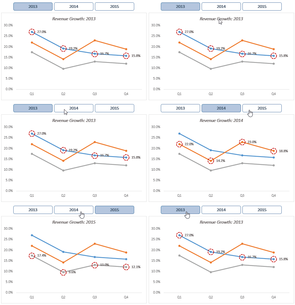
If you are stuck in such a situation, it is a good idea to have a dynamic chart that highlights the selected series so that it is easier to read and compare. Something as shown below:

In the above chart, when you click on the button, the selected year’s series gets highlighted with red marker outline and the data labels.
Follow Along.. Download the Chart

Highlight Data Points in Excel Line Chart
Here is how you can create this type of charts:
- Get the data in place. For this chart, I have Revenue Growth numbers for each quarter during 2012-15.

- Select the entire data, go to Insert –> Charts –> Line with Markers. This would insert a line chart with three different lines for each year.

- Go to Insert –> Illustrations –> Shapes –> Rounded Rectangle. Click anywhere on the worksheet and it will insert a Rounded Rectangle in the worksheet.

- Insert 2 more Rounded Rectangles and place it over the chart. Enter the Series Name (years) in the shapes as shown below:

- Select the rectangle for 2013, go to Name Box and enter 2013. Similarly, do the same for 2014 and 2015 boxes as well (Name Box is at the left of formula bar).

- In cell F2, enter 2013 (you can enter any year from the data).
- In cell F3, enter the following combination of INDEX, ROWS and MATCH functions (and drag it for cells F3:F6)
=INDEX($B$3:$D$6,ROWS($E$3:E3),MATCH($F$2,$B$2:$D$2,0)) - Select cells F3:F6 and copy it (press Control + C), select the chart and paste (control + v). This would create two lines for the same year (while copying, notice that the line color of the selected year changes).
- Select the line for the year (for which you copied the data), right click and select Format Series Data. In the Format Data Series:
- Change Line Color to No Line
- In Marker Options, make the following changes
- Built-in Type: Round shape
- Built-in Size: 15
- Change the Marker Fill to No Fill
- Change Marker Border Color (I have used red color), width and dash type
- Right click on any of the round markers and select Add Data Labels. Format it to show percentages


If you have followed all the above steps, you would have something as shown below:

Now to make the buttons functional, we will use a simple VBA code.
The VBA code
We will use VBA code to do 2 things:
- Change the year value in cell F3 when the shape is clicked, and
- Change the color of the selected shape
Simply copy the following code in the VB Editor.
Sub SelectYear2013()
Range("F2").Value = 2013
ActiveSheet.Shapes("2013").Fill.ForeColor.RGB = RGB(176, 196, 222)
ActiveSheet.Shapes("2014").Fill.ForeColor.RGB = RGB(255, 255, 255)
ActiveSheet.Shapes("2015").Fill.ForeColor.RGB = RGB(255, 255, 255)
End Sub
Sub SelectYear2014()
Range("F2").Value = 2014
ActiveSheet.Shapes("2013").Fill.ForeColor.RGB = RGB(255, 255, 255)
ActiveSheet.Shapes("2014").Fill.ForeColor.RGB = RGB(176, 196, 222)
ActiveSheet.Shapes("2015").Fill.ForeColor.RGB = RGB(255, 255, 255)
End Sub

Sub SelectYear2015()
Range("F2").Value = 2015
ActiveSheet.Shapes("2013").Fill.ForeColor.RGB = RGB(255, 255, 255)
ActiveSheet.Shapes("2014").Fill.ForeColor.RGB = RGB(255, 255, 255)
ActiveSheet.Shapes("2015").Fill.ForeColor.RGB = RGB(176, 196, 222)
End Sub
To copy this code:
- Press Alt + F11. It will open the VBE Editor.
- Go to Insert and click on Module. This will insert a module.
- Double click on module icon, and paste the code on the code area on the right.
Assign Macros to Buttons
Once you have the VBA code in place, you need to assign macros to the buttons/shapes. To do this:
- Right-click on the shape and select Assign Macro.
- In the Assign Macro dialog box, select the macro and click OK.

Note: Since this workbook contains a macro, save it as a .xlsm or .xls format file.
Now your dynamic chart is ready. With a single click, you can now highlight data points for the selected series.
Download the file

More on Dynamic Excel Charting Tutorials:


Hello Sumit,
I have market data for various brands for 2013, 2014, 2015 and it contains varying data types (i.e. Numbers, %ages and floats etc). How can I use charts to show these values with dynamic Y-Axis values according to the particular column header.
Note: My data is like:- Brands in rows and various parameters in column headings. Above column headings I have year for particular set of headings. I need something like you showed here in this article. Please help.
Great..wonderful..I can impress my boss with this one! thanks Sumit!
That’s what we all want 😉 Glad you liked it
Sumit,
I like your concept for highlighting the data points in the chart.
I will typically create a dummy pivot table based on a list of the years so that I can use slicers to select the year to highlight the data points instead of shapes. This eliminates the need for the VBA code and adding named ranges in setting up the chart.
Thanks for sharing. It is a good alternate approach for this 🙂
This is awesome. Now I can see hundreds of situations where I could have used it. Thanks for sharing this..
Thanks for commenting Glen. Glad you found this useful 🙂