Apart from being super cool, Excel dynamic charts are really helpful in presenting a comparative analysis from the data.
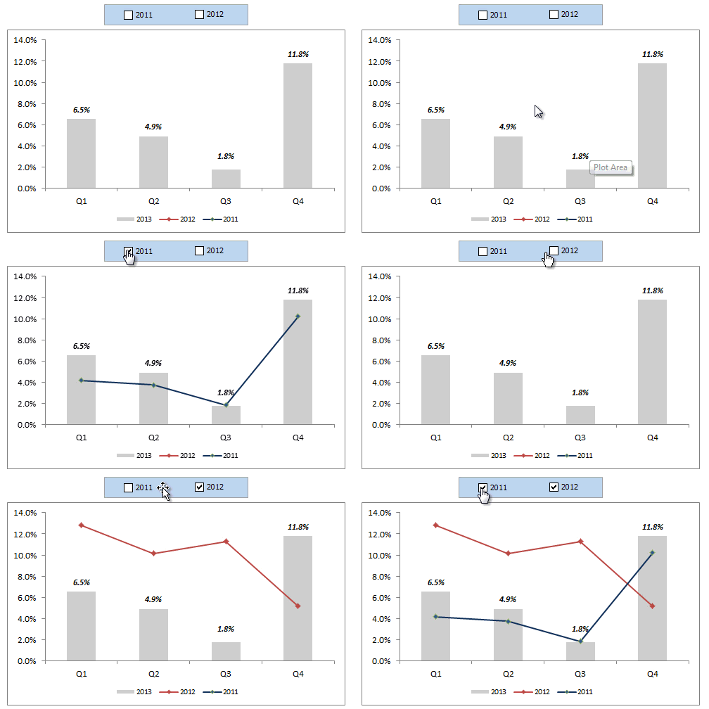
Suppose you have the financial data for a company ABC Ltd, and you want to see how the revenue has grown over the quarters. At the same time, you also want to compare the growth with previous years. Dynamic excel chart can give you something as shown below:

Dynamic Excel Chart with Series Selection Check-box
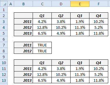
- Arrange the data as shown below:

- Go to Developer tab –> Insert –> Form Controls –> Check Box (Form Control)

- Click anywhere in the worksheet to insert the check box. Change the name of the Checkbox from Check Box 1 to 2011.
- Right click on the check box and select Format Control, specify a cell link (in this case I have used C7).
- Cell C7 would return TRUE when the check box is checked, and FALSE when unchecked.
- Repeat Steps 2 to 4 to insert another check box for 2012, and use a different cell link (I have used C8 here).
- Copy the original chart data from B2:F5 and paste it in some other location. I have used B10:F13.

- Delete the data for 2011 and 2012, and use the following formula:
- In C11: =IF($C$7,C3,NA()) [Drag this to fill the row from D11 to F11]
- In C12: =IF($C$8,C4,NA()) [Drag this to fill the row from D12 to F12]
- This formula returns the value from original data if the check box for that year is checked, and #N/A if it is unchecked.
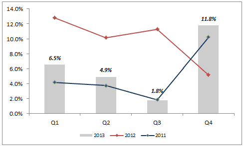
- With both the checkboxes checked, select the entire data and go to Insert –> Charts–> Column–> Clustered Column. This will insert a column chart with three column bars for each Quarter.

- Click on any data bar for 2011 (this will select all the data bars for 2011) and right click. From the menu select Change Series Chart Type. This will change the chart type from a bar chart to a line chart.

- Repeat the same process for 2012 bar to convert it into a line chart. Format the chart as you wish.

- That’s it. You have a dynamic chart ready. Now when you uncheck the checkbox for a year, its data would disappear from the chart, and when checked, it would reappear.
Try it Yourself.. Download the file

You May Also Like the Following Excel Tutorials:


Hi Sumit,
I got the formulas all to work. How do I get the check boxes on the chart itself?
Hi Sumit, All works well until I get to changing the 2011 bar to line. It changes the whole chart to line. I follow the instructions exactly, “Click on any data bar for 2011 (this will select all the data bars for 2011) and right click. From the menu select Change Series Chart Type. This will change the chart type from a bar chart to a line chart” but the whole chart changes. Help?
great job. It’s very impressive and clear, thanks you.
Very good this article
Thanks for commenting Pablo.. Glad you like it 🙂
good
Thanks for stopping by and commenting 🙂