
If you are in the sales department and your life is all about targets, this charting technique is for you. And if you are not, read it anyway to learn some cool excel charting tricks.
In this blog post, I will show you a super way to create a dynamic target line in an Excel chart, that can help you track your performance over the months. Something as shown below: 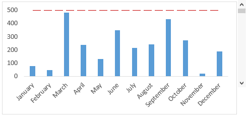
The target line is controlled by the scroll bar, and as if the target is met (or exceeded) in any of the months, it gets highlighted in green.
Creating a Dynamic Target Line in Excel Bar Chart
There are 3 parts to this chart:
- The bar chart
- The target line (horizontal dotted line)
- The scroll bar (to control the target value)
The Bar Chart
I have data as shown below:

Cells B2:B13 has all the values while C2:C13 only shows a value if it exceeds the target value (in cell F2). If the value is lower than the target value, it shows #N/A. Now we need to plot these values in a cluster chart
- Select the entire data set (A1:C13)
- Go to Insert –> Charts –> Clustered Column Chart

- Select any of the bars for ‘Above Target’ values and right click and select Format Data Series
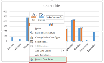
- In the Series Option section, change Series Overlap value to 100%

- This creates a chart, where all the values that exceed the target are highlighted in a different color (you can check this by changing the target value)

The Target Line
Here let me show you a smart way to create a target line using error bars
- Select the chart and go to Design –> Select Data

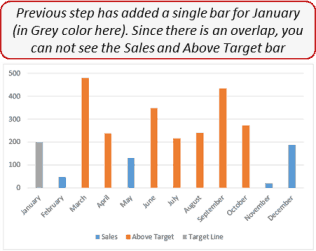
- In the Select Data Source dialog box, Click Add
- In the Edit Series box, Type Series Name as ‘Target Line’ and in Series Value select your Target Value cell

- This will insert a bar chart only for the first data point (January)
- Select this data bar and right click and select Change Series Chart Type
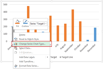
- Change its Chart Type to Scatter Chart. This will change the bar into a single dot in January

- Select the data point and go to Design –> Chart Layouts –> Add Chart Element –> Error Bars –> More Error Bars Options
- For Excel 2010, select the data point and go to Layout –> Analysis –> Error Bars –> More Error Bars Options

- You will notice horizontal error bar lines on both sides of the scatter point. Select that horizontal error bar and then in the Error Bar Options section, select Custom and click on Specify Value

- Give positive value as 11 and negative value as 0 (you can use hit and trial to see what value look good for your chart)

- Select the Scatter data point and right-click and select Format Series Data. Go to Marker Options and select Marker Type as none. This removes the data point and you only have the error bar (which is your target line)
- Note that your error bar would change whenever you change the target value. Just format it to make it a dotted line and change its color to make it look better
The Scroll Bar
- Create a scroll bar and align it with the chart. Fit the scroll bar along with the chart. Click here to learn how to create a scroll bar in Excel.
- Make the maximum value of the scroll bar equal to the maximum value in your chart, and link the scroll bar value to any cell (I have used G2)
- In the cell that has the target value, use the formula =500-G2 (500 is the maximum value in the chart)
- This is to make sure that your target value now moves with the scroll bar
That’s it!! Now when you move the scroll bar and change the target values, the bars that meet the target will automatically get highlighted in a different color.
Try it yourself.. Download the file
You May Also Like the Following Excel Tutorials:
- Dynamic Pareto Chart – The 80/20 phenomenon.
- Dynamic Charting – Highlight Data points with a click of a button.
- Creating a Gantt Chart in Excel.
- Creating a Milestone chart in Excel.
- How to Make a Histogram in Excel.
- Creating Actual Vs Target Charts in Excel.
- Creating Combination Charts in Excel.
- How to Create a Dynamic Chart Range in Excel.
- Adding Trendlines in Excel Charts.
- How to Add Axis Titles in Charts in Excel?


If i wanted the target to be between -10% and +10% how would i do the formula?
DID NOT WORK!!!!!! SUCKS!!!!!
Very useful video. Thanks
This is very educative. It has saved me a lot of time and has answered most of my questions. Thanks so much for sharing such a helpful information
thank you, thank you, thank you
your are the best, God protect you brother
I love this tutorial but the I cannot overlap the data if I have more than one type of sum and one target. It works like the example with one, but if you apply this to one than one column, it tires to cover it as a series. Is this possible to go around?
Hello! Thank you for your post, it worked well. If you are still accepting queries, I am an educator looking to create a dynamic target line across multiple assessments on the same chart. Using your method above, I can create one chart for each test a student has taken, but when I attempt for multiple tests for each student, the step that tells me to move the Series Overlap to 100%, it causes all but one bar to show per student. I would like to combine all tests for all students in a class into one chart, having each multiple test bar per student react to the dynamic target line as you show for the sales bar per month. (Basically, for each month in your example and all on one chart, I would like to track the sales of 7 different products, and have each product sales bar show up next to each other, and all change color depending on the target line’s value). Is that something that can be done?
I have the same problem. I love this tutorial but the I cannot overlap the data if I have more than one type of sum and one target. It works like the example with one, but if you apply this to one than one column, it tires to cover it as a series. Is this possible to go around? Did you ever get an answer?
fantastic post also share some dashboard example
Great trick. This was very useful today. I am sure that I will use this often. Thanks for sharing.
Greetings Sumit, I really like this as it addresses something I’ve been thinking about for some time. Creating a Histogram and using the standard deviation and color the chart accordingly. Your method would allow me to assign the target line as the Standard deviation line, those below the line are my outliers and those above are within the acceptable range. Unfortunately I work on a Mac so I will be finding a way around my limitations to make this work. Thank you for your inspirations!
Hello Sumit,
That’s really awesome but How can i do it in Excel 2010.
Thanks,
Mahesh
Hello Mahesh,
Great question, and I’m certain if you follow the instructions in the video, it should work well for you as it does for me, and I’m working on a Mac(Excel 2011) which has less capability than Excel 2010 for Windows.
I hoped that answered your question
Regards,
Dane
I think you are the best in excel dashboard.
Thanks for the kind words Pablo 🙂
downloaded template and works wonders
Thanks for commenting.. Glad you liked it 🙂
Hi Sumit. Any tips on how to create a excel dashboard.
I would soon be writing more about dashboard examples and how to create it.
Hello Sumit! I downloaded this template but target line is not moving by scrolling.Do I need to change some excel opetions?
Hello Imran.. Thanks for pointing out. I have updated the download file.
For a different approach: http://hesseldewalle.blogspot.nl/2014/04/excel-chart-with-target-line-based-on.html
Dear Sumit,
Nice post sumit….
Regards,
pAvi
Thanks Pavi.. Glad you liked it.