
When you represent data in a chart, there can be cases when there is a level of variability with a data point.
For example, you can not (with 100% certainty) predict the temperature of the next 10 days or the stock price of a company in the coming week.
There will always be a level of variability in the data. The final value could be a little higher or lower.
If you have to represent this kind of data, you can use Error Bars in the Charts in Excel.
What are Error Bars?
Error bars are the bars in an Excel chart that would represent the variability of a data point.
This will give you an idea of how accurate is the data point (measurement). It tells you how far the actual can go from the reported value (higher or lower).
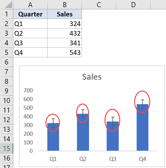
For example, in the below chart, I have the sales estimates for the four quarters, and there is an error bar for each of the quarter bar. Each error bar indicates how much less or more the sales can be for each quarter.
The more the variability, the less accurate is the data point in the chart.
I hope this gives you an overview of what is an error bar and how to use an error bar in Excel charts. Now let me show you how to add these error bars in Excel charts.
How to Add Error Bars in Excel Charts
In Excel, you can add error bars in a 2-D line, bar, column or area chart. You can also add it to the XY scatter chart or a bubble chart.
Suppose you have a dataset and the chart (created using this dataset) as shown below and you want to add error bars to this dataset:

Below are the steps to add data bars in Excel (2019/2016/2013):
- Click anywhere in your chart. It will make available the three icons as shown below.
- Click on the plus icon (the Chart Element icon)
- Click on the black triangle icon at the right of ‘Error bars’ option (it appears when you hover the cursor on the ‘Error Bars’ option)
- Choose from the three options (Standard Error, Percentage, or Standard Deviation), or click on ‘More Options’ to get even more options. In this example, I am clicking on Percentage option

The above steps would add the Percentage error bar to all the four columns in the chart.

By default, the value of the percentage error bar is 5%. This means that it will create an error bar that goes a maximum of 5% above and below the current value.
Types of Error Bars in Excel Charts
As you saw in the steps above that there are different types of error bars in Excel.
So let’s go through these one-by-one (and more on these later as well).
‘Standard Error’ Error Bar
This shows the ‘standard error of the mean’ for all values. This error bar tells us how far the mean of the data is likely to be from the true population mean.
This is something you may need if you work with statistical data.
‘Percentage’ Error Bar
This one is simple. It will show the specified percentage variation in each data point.
For example, in our chart above, we added the percentage error bars where the percentage value was 5%. This would mean that if your data point value is 100, the error bar will be from 95 to 105.
‘Standard Deviation’ Error Bar
This shows how close the bar is to the mean of the dataset.
The error bars, in this case, are all in the same position (as shown below). And for each column, you can see how much is the variation from the overall mean of the dataset.
By default, Excel plots these error bars with a value of standard deviation as 1, but you can change this if you want (by going to the More Options and then changing the value in the pane that opens).
‘Fixed Value’ Error Bar
This, as the name suggests, shows the error bars where the error margin is fixed.
For example, in the quarterly sales example, you can specify the error bars to be 100 units. It will then create an error bar where the value can deviate from -100 to +100 units (as shown below).
‘Custom’ Error Bar
In case you want to create your own custom error bars, where you specify the upper and lower limit for each data point, you can do that using the custom error bars option.
You can choose to keep the range the same for all error bars, or can also make individual custom error bars for each data point (example covered later in this tutorial).
This could be useful when you have a different level of variability of each data point. For example, I may be quite confident about sales numbers in Q1 (i.e, low variability) and less confident about sales numbers in Q3 and Q4 (i.e., high variability). In such cases, I can use custom error bars to show the custom variability in each data point.
Now, let’s dive into more into how to add custom error bars in Excel charts.
Adding Custom Error Bars in Excel Charts
Error bars other than the custom error bars (i.e., fixed, percentage, standard deviation, and standard error) are all quite straightforward to apply. You need to just select the option and specify a value (if needed).
Custom error bars need a little more work.
With custom error bars, there could be two scenarios:
- All data point have the same variability
- Every data point has its own variability
Let’s see how to do each of these in Excel
Custom Error Bars – Same Variability for all Data Points
Suppose you have the data set as shown below and a chart associated with this data.
Below are the steps to create custom error bars (where the error value is the same for all data points):
- Click anywhere in your chart. It will make available the three chart option icons.
- Click on the plus icon (the Chart Element icon)
- Click on the black triangle icon at the right of ‘Error bars’ option
- Choose on ‘More Options’

- In the ‘Format Error Bars’ pane, check the Custom option

- Click on the ‘Specify Value’ button.

- In the Custom Error dialog box that opens, enter the positive and negative error value. You can delete the existing value in the field and enter the value manually (without any equal to sign or brackets). In this example, I am using 50 as the error bar value.

- Click OK
This would apply the same custom error bars for each column in the column chart.

Custom Error Bars – Different Variability for all Data Points
In case you want to have different error values for each data point, you need to have these values in a range in Excel and then you can refer to that range.
For example, suppose I have manually calculated the positive and negative error values for each data point (as shown below) and I want these to be the plotted as error bars.

Below are the steps to do this:
- Create a column chart using the sales data
- Click anywhere in your chart. It will make available the three icons as shown below.
- Click on the plus icon (the Chart Element icon)
- Click on the black triangle icon at the right of ‘Error bars’ option
- Choose on ‘More Options’

- In the ‘Format Error Bars’ pane, check the Custom option
- Click on the ‘Specify Value’ button.
- In the Custom Error dialog box that opens, click on the range selector icon for the Positive Error Value and then select the range that has these values (C2:C5 in this example)
- Now, click on the range selector icon for the Negative Error Value and then select the range that has these values (D2:D5 in this example)

- Click OK
The above steps would give you custom error bars for each data point based on the selected values.

Note that each column in the above chart has a different size error bar as these have been specified using the values in the ‘Positive EB’ and ‘Negative EB’ columns in the dataset.
In case you change any of the values later, the chart would automatically update.
Formatting the Error Bars
There are a few things you can do to format and modify the error bars. These include the color, thickness of the bar, and the shape of it.
To format an error bar, right-click on any of the bars and then click on ‘Format Error bars’. This will open the ‘Format Error Bars’ pane on the right.

Below are the things you can format/modify in an error bar:
Color/width of the Error bar
This can be done by selecting the ‘Fill and Line’ option in then changing the color and/or width.

You can also change the dash type in case you want to make your error bar look different than a solid line.
One example where this could be useful is when you want to highlight the error bars and not the data points. In that case, you can make everything else light in color to make the error bars pop out
Direction/Style of the Error bar
You can choose to show error bars that go on both sides of the data point (positive and negative), you can choose to only show the plus or minus error bars.
These options can be changed from the Direction option in the ‘Format Error Bars’ pane.

Another thing you can change is whether you want the end of the bar to have a cap or not. Below is an example where the chart on the left has the cap and one on the right doesn’t

Adding Horizontal Error Bars in Excel Charts
So far, we have seen the vertical error bars. which are the most common in Excel charting (and can be used with column charts, line charts, area charts, scatter charts)
But you can also add and use horizontal error bars. These can be used with bar charts as well as the scatter charts.
Below is an example, where I have plotted the quarterly data into a bar chart.

The method of adding the horizontal error bars is the same as that of vertical error bars that we saw in the sections above.
You can also add horizontal (as well as vertical error bars) to scatter charts or bubble charts. Below is an example where I have plotted the sales and profit values in a scatter chart and have added both vertical and horizontal error bars.

You can also format these error bars (horizontal or vertical) separately. For example, you may want to show a percentage error bar for horizontal error bars and custom error bars for vertical ones.
Adding Error Bars to a Series in a Combo Chart
If you work with combo charts, you can add error bars to any one of the series.
For example, below is an example of a combo chart where I have plotted the sales values as columns and profit as a line chart. And an error bar has only been added to the line chart.

Below are the steps to add error bars to a specific series only:
- Select the series for which you want to add the error bars
- Click on the plus icon (the Chart Element icon)
- Click on the black triangle icon at the right of ‘Error bars’ option
- Choose the error bar that you want to add.
If you want, you can also add error bars to all the series in the chart. Again, follow the same steps where you need to select the series for which you want to add the error bar in the first step.
Note: There is no way to add an error bar only to one specific data point. When you add it to a series, it’s added to all the data points in the chart for that series.
Deleting the Error bars
Deleting the error bars is quite straightforward.
Just select the error bar that you want to delete, and hit the delete key.
When you do this, it will delete all the error bars for that series.
If you have both horizontal and vertical error bars, you can choose to delete only one of these (again by simply selecting and hitting the Delete key).
So this is all that you need to know about adding error bars in Excel.
Hope you found this tutorial useful!
You may also like the following Excel tutorials:


You only explain the obvious. The most important explanation is how to add Horizontal error bars. And about this nothing, just stuff. Bahhhh
Bien compris la procédure à travers les explications fournies
Bonjour,
Merci beaucoup pour toutes ces explications limpides.