
If you want to repeat a piece of text a set number of times in Excel, the REPT function does exactly that. You hand it some text and a number, and it gives you back that text repeated as many times as you asked.
What makes REPT genuinely useful is what you can create in-cell visualizations with it. Bar charts, progress bars, star ratings, and even a simple Gantt chart, all living inside a single cell with no chart object anywhere.
In Excel 365, you can also feed REPT a range of numbers and the repeated text spills into the cells below.
In this article, I’ll show you how to use REPT with practical examples, starting with a plain repeat and building up to the in-cell visualizations I use in my own dashboards.
Follow along with the example file
REPT Function Examples.xlsx
REPT Function Syntax
Here is the syntax of the REPT function:
=REPT(text, number_times)
- text – the text you want to repeat. This can be a single character, a word, or a cell reference.
- number_times – how many times to repeat the text. It can’t be negative, and if it isn’t a whole number, REPT drops the decimal part.
Both arguments are required. The text argument is where the look of your chart comes from, so it is worth thinking about. A pipe character gives you thin lines, a block character gives you a solid bar, and a star gives you a rating.
The number_times argument is where the math happens. It is almost never the raw value from your data. You scale that value down first, so the longest bar still fits inside the column.
That scaling matters more than it sounds. REPT can return at most 32,767 characters. The limit applies to the complete result, including the length of each piece of text you repeat.
Repeating a two-character string 20,000 times exceeds that limit, even though the repeat count is below 32,767.
Pro Tip: If number_times is 0, REPT returns an empty string. That’s handy for bars that should disappear when a value hits zero.
When to Use REPT
Use the REPT function when you need to:
- Draw an in-cell bar chart without inserting an actual chart
- Turn a score into a row of filled and empty stars
- Show progress as a bar of completed and remaining segments
- Lay out a lightweight Gantt chart on a worksheet
- Pad numbers or text to a fixed width so they line up
REPT works in Excel for Microsoft 365, Excel 2024, 2021, 2019, 2016, and older versions, plus Excel on the web. The spilling examples below (one formula across a whole range) need Microsoft 365, Excel 2021, or Excel 2024.
Let me show you a few practical examples of how to use this function.
Example 1: Repeat Text a Set Number of Times
Let’s start with the simplest use of REPT.
Below I have a small habit tracker. Column A has the habit, and column B has the number of days I completed it this week.
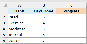
I want to show each habit’s progress as a row of check marks, one check for every day it was done.
The check mark itself is sitting in cell F1, so I can reference it instead of typing it into the formula.
Here is the formula:
=REPT(F1,B2:B6)
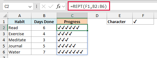
REPT takes the check mark from F1 and repeats it as many times as the number in column B.
Because I fed it the whole range B2:B6 at once, the results spill down the column on their own. So Read, with 6 days, gets six check marks, and Meditate, with 3, gets three.
Already this reads faster than the column of numbers next to it.
Pro Tip: The text you repeat doesn’t have to be a single character. =REPT("Go! ",3) returns “Go! Go! Go! “, repeating the whole word and the space each time.
Example 2: Create an In-Cell Bar Chart With REPT
Now for the use REPT is famous for. A bar chart that lives right inside a cell.
Below I have sales by product. Column A has the product and column B has the sales value for the year.
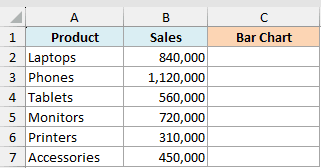
I want a horizontal bar next to each product, short enough that the longest one still fits in the column.
Here is the formula:
=REPT("|",B2:B7/100000)
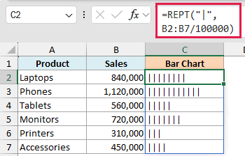
The pipe character is doing the drawing, and the division is doing the scaling.
I divided by 100,000 because feeding REPT the raw sales numbers would ask it for 840,000 characters and return a #VALUE! error. Dividing brings that down to 8 pipes for Laptops and 11 for Phones.
Pick the divisor from your own data. Take your largest value, decide how many characters you want that bar to be, and divide by the result.
Pro Tip: Set the result cells to a monospace font like Consolas or Courier New. In those fonts every character is the same width, so the bars line up cleanly. In a normal font they come out ragged.
Example 3: Make the Bars Look Like a Real Bar Chart
The bars in the last example work, but there is a lot of white space between the pipes. It reads more like a barcode than a bar chart.
The fix has nothing to do with the formula. Changing the font on the result cells is what closes those gaps.
Below is the same sales data. Column A has the product and column B has the sales value.
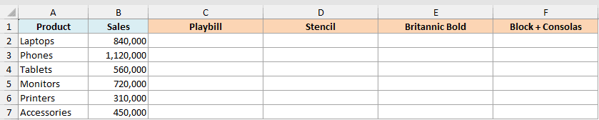
I want the same pipes packed tightly enough that each row reads as one solid bar.
Here is the formula:
=REPT("|",B2:B7/20000)
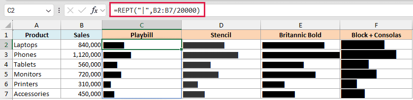
I dropped the divisor to 20,000 so there are more pipes per row, then set those cells to the Playbill font. Playbill squeezes the pipes together so tightly that the gaps vanish and each row reads as one compact slab.
Stencil is the one that keeps its texture. The pipes stay separate enough that you can still see the individual lines, so the bar reads as a striped pattern.
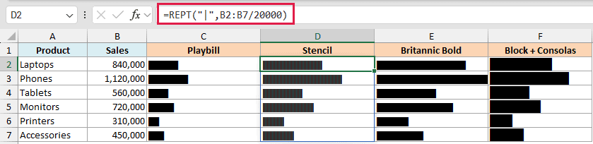
Britannic Bold goes the other way. Its pipes are the widest of the three, so they close up into a solid bar that runs much longer for the same number of characters.
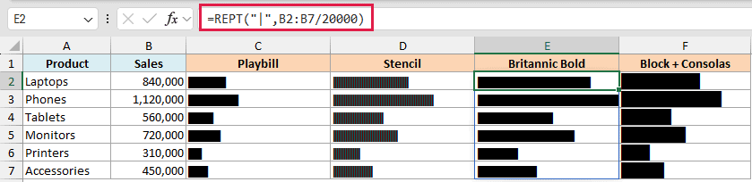
All three take the same formula. The only thing you change is the font on the result cells, so try them and keep the look you want.
If you don’t have those fonts, or you want a solid bar without depending on a font at all, swap the pipe for a block character.
Here is the formula:
=REPT("█",B2:B7/75000)
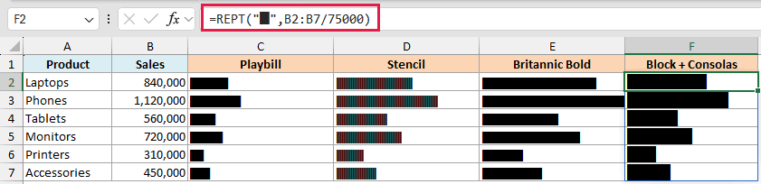
That block is a real character you can type. Hold the Alt key, type 219 on the numeric keypad, and let go. Because the block already fills its own width, the bar comes out solid in any font, and I’ve used Consolas here.
I raised the divisor to 75,000 for this one, since blocks are much wider than pipes and 42 of them would run off the screen.
Pro Tip: Playbill, Stencil, and Britannic Bold are Windows fonts and may not exist on a Mac or on Excel for the web. The block character approach works everywhere, so use it when other people will open your file.
Example 4: Show a Score Against a Target on a Track
Here’s a different way to look at the same idea. Instead of a bar that grows, you draw a fixed-length track and put a marker where the value sits.
Below I have scores for six marketing campaigns. Column A has the campaign, column B has its score, and the target of 100 is in cell F1.
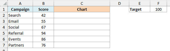
I want a 20-character track for every campaign, with a marker showing where that campaign’s score falls along it.
Here is the formula:
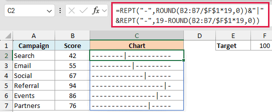
=REPT("-",ROUND(B2:B7/$F$1*19,0))&"|"&REPT("-",19-ROUND(B2:B7/$F$1*19,0))
How this formula works:
B2:B7/$F$1*19converts each score into a position along the track. The track is 20 characters wide, one of which is the marker, so there are 19 dashes to place.- ROUND(…,0) turns that position into a whole number of dashes, and the first REPT draws them before the marker.
- The “|” in the middle is the marker itself, joined on with the & operator.
- 19 minus that same count is how many dashes are left, and the second REPT draws them after the marker.
Search scores 42, so 8 dashes go before the marker and 11 after it. Referral scores 94, so its marker sits almost at the end of the track.
The cells are set to Consolas here. On a fixed-width track that matters more than usual, because every row has to be exactly the same length for the markers to line up.
Pro Tip: If a score can go above the target, the second REPT gets a negative count and returns a #VALUE! error. Cap the position with MIN, using MIN(19,ROUND(B2/$F$1*19,0)) in both halves of the formula, so an overshoot parks the marker at the end of the track instead of breaking it.
This MIN example is for one row, copied down. MIN and MAX over a range return one aggregate result, not a separate limit for each row.
Example 5: Turn the Track Into a Lollipop Chart
The track from the last example does the job, but the dashes after the marker are not telling you anything. Drop them and you get a lollipop chart.
Below is the same campaign data. Column A has the campaign, column B has the score, and the target of 100 sits in cell F1.
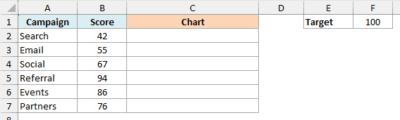
I want a line that stops at each campaign’s score, with a dot on the end of it.
Here is the formula:
=REPT("-",ROUND(B2:B7/$F$1*19,0))&"●"
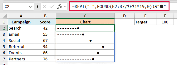
It’s the same first half as the previous formula. The dashes run out to the campaign’s position, and then a single dot is joined on instead of a marker plus trailing dashes.
Now the lengths do the comparing for you. Referral clearly runs the longest and Search the shortest, without you reading a single number.
To get the dot, go to the Insert tab, click Symbol, and pick the one you want. Any symbol from that dialog box can be pasted straight into a formula, so it’s worth scrolling through for ideas.
Example 6: Make a Progress Bar With REPT
A progress bar is the same idea with two characters. One for the part that’s done and one for the part that’s left.
Below I have a list of projects with how far along each one is. Column A has the project and column B has the percent complete.
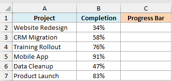
I want a 10-segment bar for each project, filled for the finished portion and hollow for the rest.
Here is the formula:
=REPT("■",ROUND(B2:B7*10,0))&REPT("□",10-ROUND(B2:B7*10,0))
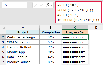
How this formula works:
- Multiplying B2:B7 by 10 turns a percentage like 34% into a number of segments, in this case 3.4 out of 10.
- ROUND(…,0) rounds that to a whole segment so the filled and empty halves always add up to 10.
- The first REPT fills the finished segments, the second fills the rest with hollow squares, and & joins them into one bar.
The ROUND is doing real work here. Without it, REPT would chop 3.4 down to 3 and 6.6 down to 6, leaving this bar one segment short.
This happens when the unrounded segment counts have decimal parts. Counts that are already whole numbers still add up to 10.
These cells are set to Calibri. Filled and hollow squares are one of the few pairs that don’t sit well in Consolas, so this is the exception to the monospace rule.
For a longer, finer bar, swap the squares for block characters and raise the segment count.
Here is the formula:
=REPT("█",ROUND(B2:B7*20,0))&REPT("░",20-ROUND(B2:B7*20,0))
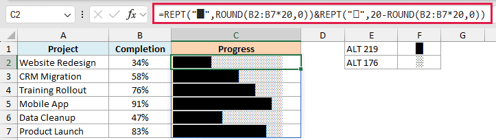
This one uses 20 segments instead of 10, so each block is worth 5% and the bar reads more precisely. The solid block is Alt 219 and the shaded one is Alt 176.
Because both characters fill their whole width, every cell ends up completely covered. There is no white gap between the done part and the remaining part, which is what makes it look like a real progress bar.
Example 7: Color the In-Cell Bars With Conditional Formatting
Right now every bar is the same color. Coloring them by value means you can spot the projects that are behind without reading a single percentage.
Below is the same project list, with the 20-segment progress bars already in column C.
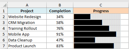
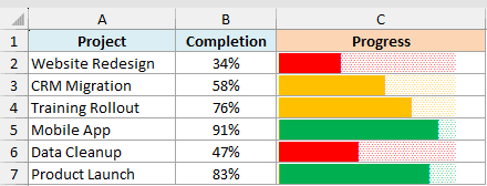
I want the projects above 80% in green, the ones above 50% in orange, and everything else in red.
Here are the steps to color the bars with conditional formatting:
- Select the cells that hold the bars, which is C2:C7 here.
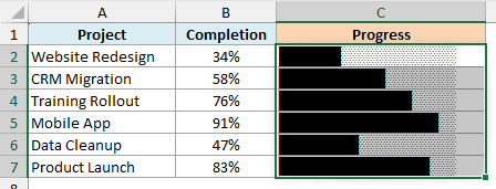
- On the Home tab, click Conditional Formatting, then click New Rule.
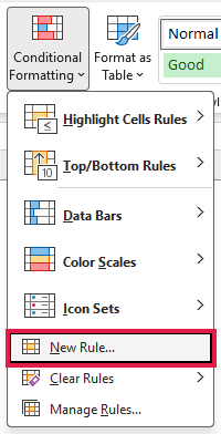
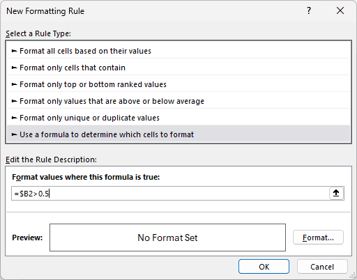
- Choose “Use a formula to determine which cells to format”, then enter
=$B2>0.8in the formula box.
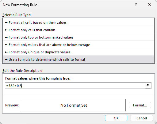
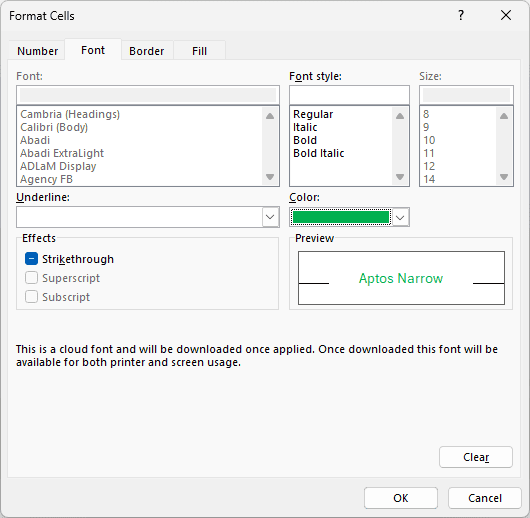
- Click Format, go to the Font tab, pick green, then click OK on both dialog boxes.
- Add a second rule the same way, this time with
=$B2>0.5and an orange font.
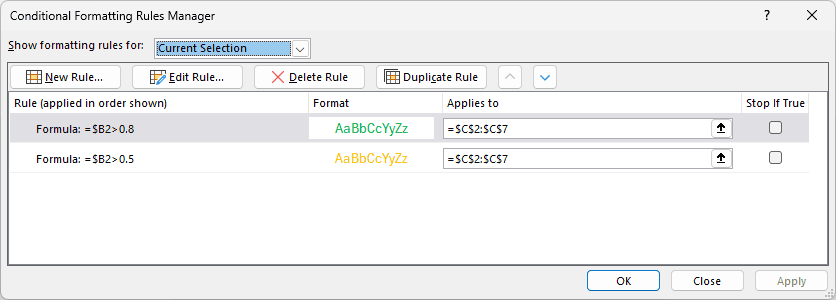
- Open Conditional Formatting, click Manage Rules, and move the 0.8 rule above the 0.5 rule, then click Apply.
Two things here are easy to get wrong.
The first is the Font tab. Fill would color the whole cell background, but the bar is text, so the color has to go on the font.
The second is the $B2 reference. The dollar sign locks the column so every rule keeps looking at column B, while the row stays free to change down the range.
Rule order is the third thing to watch. A project at 91% is above 0.8 and above 0.5, so both rules match it. Excel applies whichever sits higher in the list, which is why the 0.8 rule has to be on top.
For the projects that neither rule catches, just select the cells and apply a red font directly. Conditional formatting always wins over manual formatting, so the green and orange bars stay as they are.
Pro Tip: You cannot color part of a REPT result. The formula returns one string, so the whole cell takes one font color. If you need the done and remaining parts in different colors, split them into two adjacent cells with one REPT each.
Example 8: Add a Percentage Label to the Progress Bar
A bar tells you roughly where a project is. Add the number to the end of it and you can hide the original column entirely.
Below is the same project list. Column A has the project and column B has the percent complete.
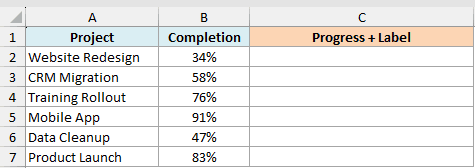
I want each bar to carry its own percentage, so column B can be hidden without losing anything.
Here is the formula:
=REPT("█",ROUND(B2:B7*20,0))&REPT("░",20-ROUND(B2:B7*20,0))&" "&TEXT(B2:B7,"0.0%")
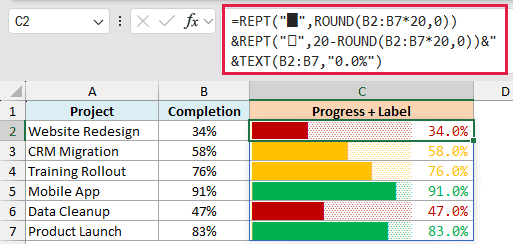
The first two REPT calls are unchanged. Everything after them is the label.
The " " adds two spaces so the number doesn’t touch the bar, and the TEXT function turns the raw 0.34 into a readable 34.0%.
The "0.0%" is the format code, and it is where you control the label. Use "0%" for a whole number, or "0.00%" if you want two decimals.
The conditional formatting rules from the previous example still apply, and now they color the number along with the bar.
Example 9: Show Actual vs Target in the Same Bar
This one packs two numbers into a single cell. You see how far someone got, and where they were supposed to get to.
Below I have sales reps with their actual achievement in column B and their target in column C.
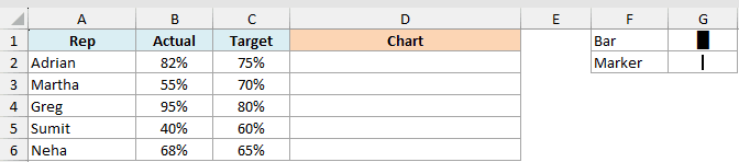
I want a bar showing each rep’s actual number, with a marker sitting on top of it at the target position.
Here is the formula:
=REPLACE(REPT("█",ROUND(B2*20,0))&REPT("░",20-ROUND(B2*20,0)),MAX(1,ROUND(C2*20,0)),1,"┃")
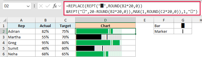
How this formula works:
- The two REPT calls build the normal 20-segment progress bar from the actual value in column B.
ROUND(C2*20,0)works out which of those 20 positions the target falls on.- MAX(1,…) keeps that position from dropping to 0, which REPLACE would reject.
- REPLACE(…,pos,1,”┃”) swaps whatever character is at that position for a thin vertical line, which becomes the target marker.
Reading it is quick. If the marker sits inside the filled part of the bar, the rep beat the target. If it sits out in the empty part, they missed it.
Adrian is at 82% against a 75% target, so his marker is inside the solid section. Sumit is at 40% against 60%, so his marker sits out in the empty part.
A conditional formatting rule of =$B2>=$C2 with a green font colors the rows that hit the target, using the same steps as Example 7.
Pro Tip: The thin marker character is Unicode 9475. If you’d rather not hunt for it, =UNICHAR(9475) returns it in a cell, and you can copy it from there into your formula.
Example 10: Build a Star Rating With Half Stars
REPT is the easiest way to turn a score into a row of stars, the way review sites show them.
Below I have average customer ratings for six products. Column A has the product and column B has its rating out of 5.
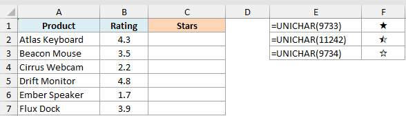
I want each rating shown as five stars, rounded to the nearest half star.
Here is the formula:
=LET(h,ROUND(B2:B7*2,0),REPT("★",INT(h/2))&REPT("⯪",MOD(h,2))&REPT("☆",5-INT(h/2)-MOD(h,2)))
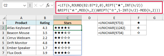
How this formula works:
ROUND(B2:B7*2,0)counts the rating in half stars. A 4.3 rating becomes 9 halves, which is 4.5 stars. LET stores that count as h so the rest of the formula can reuse it.- INT(h/2) is how many whole stars that is, and the first REPT draws them.
- MOD(h,2) returns 1 when there’s a leftover half and 0 when there isn’t, so the second REPT draws a half star only when it’s needed.
- 5 minus both counts is how many hollow stars are left, and the third REPT fills the row out to five.
Doubling and rounding is what puts the cutoff at the quarter mark. A 4.3 rounds up to four and a half stars, while a 4.2 rounds down to four.
The three star characters come from UNICHAR: 9733 for the filled star, 11242 for the half star, and 9734 for the hollow one. In this file they’re sitting in column F so you can see them.
Pro Tip: The half star (Unicode 11242) doesn’t exist in every font, and can show up as a box on a Mac or in older Excel versions. If it does, drop the half and use =REPT("★",ROUND(B2,0))&REPT("☆",5-ROUND(B2,0)) for whole stars only, which renders everywhere.
Example 11: Create a Harvey Ball Rating Chart
Harvey balls are the circles you see in comparison tables, filled a quarter, half, or three quarters of the way round. They’re a nice alternative to stars.
Below I have the same six products with their average ratings. Column A has the product and column B has the rating out of 5.
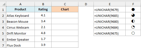
I want each rating drawn as five circles, filled to the nearest quarter.
The five circle characters sit in F1 to F5, running from completely full down to empty.
Here is the formula:
=IF(B2:B7=5,REPT($F$1,5),REPT($F$1,INT(B2:B7))&CHOOSE(ROUND((B2:B7-INT(B2:B7))/0.25,0)+1,$F$5,$F$4,$F$3,$F$2,$F$1)&REPT($F$5,4-INT(B2:B7)))
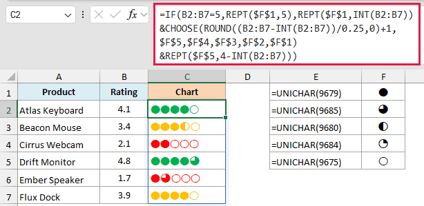
How this formula works:
- REPT($F$1,INT(B2:B7)) draws one full circle for every whole point in the rating.
- (B2:B7-INT(B2:B7))/0.25 takes what’s left over and works out how many quarters it is worth, and ROUND snaps it to 0, 1, 2, 3, or 4.
- CHOOSE picks the matching circle for that partial value, from empty through quarter, half, and three quarters up to full.
- REPT($F$5,4-INT(B2:B7)) pads the row out to five circles with empty ones.
- The IF wrapper handles a perfect 5, where there is no partial circle to draw at all.
So a 3.4 rating gives three full circles, a half circle for the 0.4, and one empty circle. A 4.8 gives four full circles and a three-quarter one.
These cells are set to Aptos Narrow at size 14. The circle characters are one of the fussier sets to get right, and other fonts either sized them differently or knocked them out of line.
The colors come from three conditional formatting rules on the chart cells, each one keyed to the rating in column B: green above 4, orange above 2.5, and red for the rest.
The steps are the same as Example 7, with one difference. Here the red is a third rule rather than a font color applied by hand.
Example 12: Build a Simple Gantt Chart With REPT
Building a Gantt chart with a real Excel chart is fiddly. With REPT it’s one formula, and for a quick project view that’s usually enough.
Below I have six project tasks. Column A has the task, column B has the week it starts, and column C has how many weeks it runs.
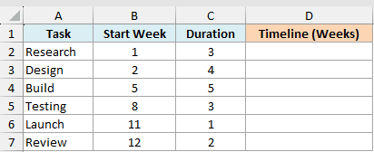
I want a bar for each task, positioned at its start week and as long as its duration.
Here is the formula:
=REPT(" ",MAX(0,B2-1))&REPT("█",MAX(0,C2))
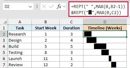
The trick here is that the first REPT repeats a space, not a visible character. Those invisible spaces push the bar to the right until it lines up with the task’s start week.
B2-1 is the count, because a task starting in week 1 needs no padding at all. Then the second REPT draws one block per week of duration.
The MAX around each count keeps it from going negative. A blank or zero start week removes the padding, but a positive duration still draws its blocks.
A blank or zero duration draws no blocks, although a positive start can still leave padding spaces. MAX doesn’t check whether the schedule inputs are valid.
Consolas matters more here than anywhere else in this article. A space and a block have to be exactly the same width, or the bars drift out of alignment down the column.
Pro Tip: Add a conditional formatting rule like =$C2>4 with a red font to make the long tasks stand out. On a schedule, the tasks worth looking at are usually the ones that run longest.
Example 13: Pad Numbers to a Fixed Width
REPT is not only for charts. It is also handy for padding numbers to a fixed width so a column of them lines up.
Below I have raw invoice numbers in column A. They’re different lengths, and I want every one to show as a six-digit ID.
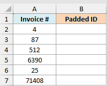
I want each number padded with leading zeros, so a short number like 7 becomes 000007.
Here is the formula:
=REPT("0",6-LEN(A2:A7))&A2:A7
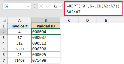
How this formula works:
- LEN(A2:A7) counts the digits in each number.
- 6-LEN(…) works out how many zeros are missing to reach six digits.
- REPT adds that many zeros in front, and & sticks the original number on the end.
Keep in mind the result is text, not a number. Use it for display and keep your real values in the original column.
If a number is longer than six digits, 6-LEN goes negative and REPT returns a #VALUE! error. A number that is exactly six digits comes through unchanged. Set the width to at least your longest number.
For these nonnegative numeric IDs, TEXT is simpler:
=TEXT(A2:A7,"000000")
The REPT version teaches how padding counts are calculated and requires inputs no longer than six characters. TEXT keeps longer numbers instead of returning a negative-count error.
The range version needs spill-capable Excel. In older versions, use a single-cell reference and copy the formula down.
Pro Tip: To right-align numbers in a report instead of adding zeros, repeat spaces instead, like =REPT(" ",8-LEN(A2))&A2, and set the column to a monospace font so they line up.
Tips & Common Mistakes
- The result can’t be longer than 32,767 characters. Ask REPT to repeat text past that limit and it returns a #VALUE! error, which is why every chart formula scales its number down first.
- number_times can’t be negative. A negative repeat count gives a #VALUE! error. Keep completion values between 0% and 100%. MAX can set a zero lower bound in a single-row formula, but it doesn’t cap positive counts or validate the inputs.
- REPT drops decimals. A number_times of 4.9 repeats the text 4 times, not 5. When you need the nearest whole number, wrap the count in ROUND first.
- Use a monospace font for bars and tracks. Block and bar characters only line up when every character is the same width, so pick a font like Consolas for those cells. Progress squares and Harvey balls are the exceptions, and the examples above name the font that works for each.
- You can’t color part of a REPT result. The formula returns one string, so a font color applies to the whole cell. Conditional formatting can color the whole bar by value, but not the filled half separately from the empty half.
- Check your characters on other machines. Fonts like Playbill and characters like the half star aren’t on every system. If you’re sharing the file, stick to the block characters and plain stars.
- The result is always text. Repeated numeric text can be converted with VALUE or coerced by arithmetic. SUM over cells containing text won’t add it automatically. For chart calculations, keep your real numbers in a separate column.
Wrapping Up
REPT looks simple, but it’s one of the more fun functions to have in your kit. Once you see it as a way to draw with characters, bar charts, progress bars, ratings, and schedules all become quick one-formula jobs.
The formula is only part of it. Which character you repeat and which font you set the cells to change the look completely, so try a few before you settle on one.
I hope you found this tutorial helpful.
Other Excel Articles You May Also Like: