

If you want to make a dense spreadsheet easier to read, choosing the right fonts can make a big difference.
They can improve its visual appeal, too. In this article, I will list the best fonts in Excel that you can try, including a pick for numbers.
These are based on my personal experience of 15+ years of working with Excel spreadsheets (and other Microsoft Office applications).
Here’s the short version:
| Font | Best for | Comes with |
|---|---|---|
| Aptos Narrow | Everyday sheets with more text | Microsoft 365 (cloud font) |
| Calibri | Numbers and everyday reports | Windows and Office |
| Verdana | Easy-to-read text in reports | Windows and Mac |
| Arial | Files shared across computers | Windows and Mac |
| Segoe UI | Dashboards viewed on screens | Windows |
| Times New Roman | Formal documents and printed sheets | Windows and Mac |
| Helvetica | Clean-looking sheets on a Mac | Mac only |
| Consolas | Product codes and invoice IDs | Windows and Office |
Aptos Narrow (The New Default Font in Excel)
Aptos Narrow is the new default font in Excel with Microsoft 365. Here is how a small sales table looks in Aptos Narrow.
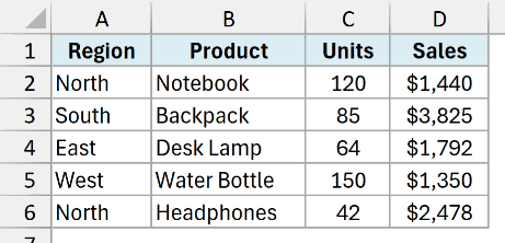
It is slightly narrower and less thick than Calibri (which was the old default font), but it still looks clean and professional.
This allows you to fit more text in a cell without sacrificing the readability.
The same line of text is about 4% shorter in Aptos Narrow than in Calibri.
The digits take exactly the same space as in Calibri, though, so switching to Aptos Narrow won’t make your numbers narrower.
Aptos Narrow also has a taller x-height, which means lowercase letters look bigger at the same point size.
Aptos was designed by Steve Matteson to replace Calibri as Microsoft’s default Office font. Aptos Narrow is the condensed version made for Excel.
Microsoft 365 switched Excel’s default to Aptos Narrow in 2023, with an 11 pt body size.
To be honest, I initially did not like the Aptos Narrow font in Excel, but slowly, I’ve gotten used to it, and now I actually started liking it.
It’s a great font for text as well as numbers.
Aptos is an Office cloud font, so Office downloads it when needed. It isn’t a Windows system font.
Someone using an older Excel version that can’t download Aptos will see a substitute font when they open your file.
Microsoft also offers the Aptos fonts as a free download.
Calibri (The Old Default Choice)
Calibri was the default font in Excel and the other Office apps from Office 2007 until Microsoft 365 moved to Aptos in 2023. Excel’s new default is Aptos Narrow.
If you’re using Excel 2021 or older, Calibri is still the default.
Its modern, clean lines make it easy to read on screens. Here is how a small sales table looks in Calibri.
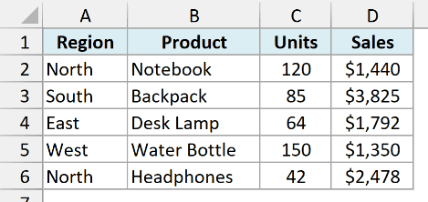
Calibri is a sans-serif font, which means it doesn’t have the small lines at the ends of characters found in serif fonts.
This helps in maintaining clarity and legibility.
The default size is typically 11 points, which provides good readability without being too large.
If you’re working on general data entry or casual reports, Calibri is a reliable choice.
I feel Calibri also gives your Excel worksheets a clean and professional look. It’s the best font in Excel for numbers.
A font size of 10-12 points is ideal for regular text, while larger sizes are better for headings.
Be cautious with stylizations like bold and italic. While they can emphasize important points, overusing them can clutter your spreadsheet and reduce readability.
If you want Calibri, or any font from this list, to be your default for new workbooks, see how to change the default font in Excel.
Verdana (Easy to Read in Excel Reports)
Verdana was designed with screen readability in mind. Here is how a small sales table looks in Verdana.
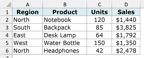
Its larger x-height and wider letter spacing make it one of the clearest fonts for digital use.
This sans-serif font ensures that your text remains legible even at smaller sizes, making it ideal for detailed spreadsheets.
Using Verdana helps maintain a consistent and professional look.
Whether you’re viewing your spreadsheet on a computer or a printed sheet, Verdana’s clarity is hard to beat.
You can see that Verdana is a bigger font than the rest and is good for text, but it may not be as good for numbers (especially if you have a lot of them).
The same text takes about 25% more width in Verdana than in Calibri.
Verdana also has the tallest lowercase letters of the fonts in this list, which helps explain why it looks bigger.
Its digits do have equal widths, so they can line up. The drawback for a crowded sheet is the amount of space Verdana takes up.
Outside of Microsoft Excel, Verdana is my favorite font for all applications, whether Microsoft Word or Outlook/Gmail.
Arial (The Safest Font for Shared Excel Files)
Arial is a go-to font for many due to its versatility. It’s a sans-serif font, known for its crisp and clean appearance. Here is a small sales table in Arial.
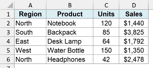
This legibility makes it suitable for various types of documents, from simple lists to detailed reports.
Arial is widely used not only in Excel but also in other formats, which ensures consistency and familiarity across different media.
It’s installed on both Windows and Mac, which makes it the safest pick for files you share with people on different computers.
Also read: How to Make Cells Bigger in Excel?
Segoe UI (Good for Excel Dashboards)
Segoe UI, designed for Microsoft, ensures high readability on screens. Here is how a small sales table looks in Segoe UI.
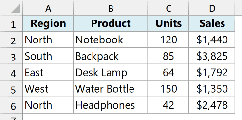
This makes it an excellent choice for Excel spreadsheets that will be viewed mostly on monitors or digital devices.
The font’s smooth curves and even spacing enhance readability, making data easier to digest.
Whether you’re creating dashboards or detailed spreadsheets, Segoe UI’s clarity will help your information stand out.
Segoe UI is the font Windows itself uses for menus and dialogs, and it comes with Windows.
If someone opens your workbook on a computer without Segoe UI, they’ll see a substitute font.
Times New Roman (For Formal Documents)
Times New Roman is one of the most recognizable serif fonts, originally designed for print. Here is a small sales table in Times New Roman.
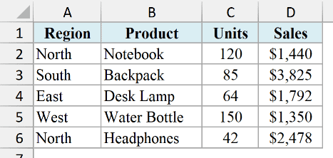
It was originally designed for The Times newspaper. Its traditional look brings an element of professionalism to your documents.
The serif details help guide the reader’s eye across the text, improving readability.
Even though Times New Roman is more common in word processing, it still holds its own in Excel.
It’s a good choice for formal documents or spreadsheets that require a touch of classic elegance.
Helvetica (Only on a Mac)
Helvetica is widely praised for its simplicity and clarity. Often used in various professional settings, this sans-serif font offers a clean and modern appearance.
Helvetica’s neutral design makes it suitable for almost any type of document, ensuring that your information is clear and accessible.
Its usage extends beyond Excel, making it a popular choice in graphic design, advertising, and signage.
Helvetica’s straightforward nature keeps your spreadsheet looking clean and professional.
Helvetica comes with macOS, but it isn’t installed on Windows. Windows substitutes Arial when an Excel cell is set to Helvetica.
So if you’re on Windows, just pick Arial. Mac users can use Helvetica, but anyone opening that file on Windows will see Arial.
Arial was designed to match Helvetica’s character widths, which is why this swap doesn’t break layouts.
Consolas (Best for Codes and IDs)
Consolas is useful when you need to read product codes or invoice IDs character by character. Here is a small sales table with product codes set in Consolas.
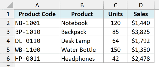
It’s a monospaced font, which means every character takes up the same width. It’s easy to tell 0 from O and 1 from l.
That makes it a good choice for product codes, IDs, and invoice numbers.
Consolas comes with Windows and Office, so you don’t need a separate font download.
Consolas is wide, though, so it isn’t a good body font for a whole sheet. Use it for the columns where reading each character matters.
Best Font for Numbers in Excel
For a column of sales amounts such as 111.11 and 999.99, each digit needs the same width. Here are the same amounts in Calibri next to Georgia.
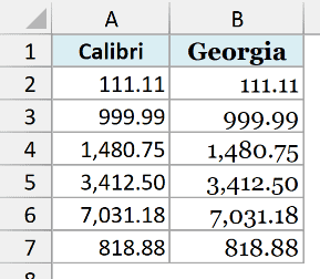
In Calibri, a 1 takes up exactly as much space as a 9. When you right-align the amounts and show the same number of decimal places, the decimal points stay aligned.
All the fonts in this list keep digits the same width. On Windows, Helvetica shows as Arial, which does too.
Equal-width digits don’t mean the whole font is monospaced. Calibri gives its digits equal widths, while Consolas gives every character the same width.
Georgia and Candara can make a column of numbers look uneven because their digits have different widths.
They also use old-style figures, where 3, 5, 7, and 9 drop below the baseline (the line other digits sit on), so the numbers look uneven vertically.
Comic Sans MS also has digits with different widths, with a narrower 1 that can throw off the alignment.
When working with financial models in Excel, consistency and clarity are key. It’s better to stick with a default font such as Aptos Narrow or Calibri.
Avoid decorative fonts like Comic Sans MS, which can be distracting and hard to read.
While I don’t prefer using Comic Sans, I have been told that many people with dyslexia prefer using it as it makes it easier to read. Other Dyslexic friendly fonts include OpenDyslexic.
In this article, I covered the best Excel fonts you can use in your day-to-day work.
I hope you found this article helpful.
Other Excel articles you may also like:
- How to Find the Version of Excel You Have?
- How to Filter Cells with Bold Font Formatting in Excel
- How to Underline in Excel?
- Best Shortcuts to Fill Color in Excel (Basic & Advanced)
- 7 Best Excel Books to Level Up Your Excel Skills
- Give your Data a Makeover!! Learn All about Excel Data Formatting
- AutoFit Columns and Rows in Excel to Fit Text Automatically

Hello,
I use Opendys and luciole as fonts.
Opendys is for dyslexics like me.
Luciole makes the text easier to read.
i was using verdana before.
Thanks for the suggestion Miaousse. I have Opendys and some other dyslexia friendly fonts in the article.