
A Heat Map in Excel is a visual representation that quickly shows you a comparative view of a dataset.
For example, in the dataset below, I can easily spot which are the months when the sales were low (highlighted in red) as compared with other months.
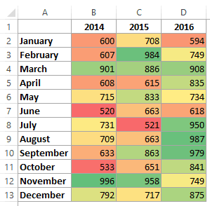
In the above dataset, the colors are assigned based on the value in the cell. The color scale is Green to Yellow to Red with high values getting the green color and low values getting the red color.
Creating a Heat Map in Excel
While you can create a heat map in Excel by manually color coding the cells. However, you will have to redo it when the values changes.
Instead of the manual work, you can use conditional formatting to highlight cells based on the value. This way, in case you change the values in the cells, the color/format of the cell would automatically update the heat map based on the pre-specified rules in conditional formatting.
In this tutorial, you’ll learn how to:
- Quickly create a heat map in Excel using conditional formatting.
- Create a dynamic heat map in Excel.
- Create a heat map in Excel Pivot Tables.
Let’s get started!
Creating a Heat Map in Excel Using Conditional Formatting
If you have a dataset in Excel, you can manually highlight data points and create a heat map.
However, that would be a static heat map as the color would not change when you alter the value in a cell.
Hence, conditional formatting is the right way to go as it makes the color in a cell change when you change the value in it.
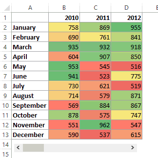
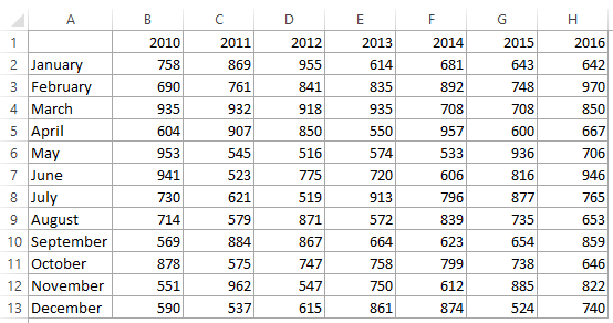
Suppose you have a dataset as shown below:
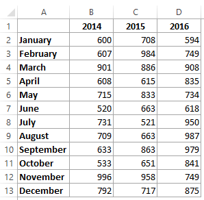
Here are the steps to create a heat map using this data:
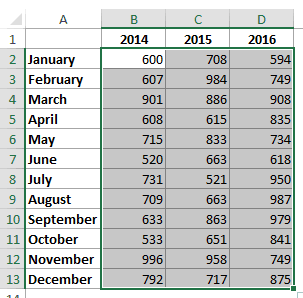
- Select the dataset. In this example, it would be B2:D13.

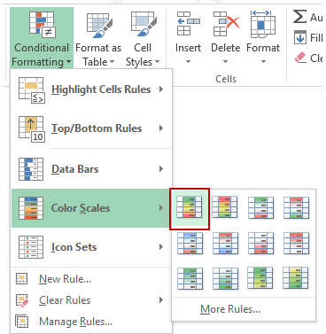
- Go to Home –> Conditional Formatting –> Color Scales. It shows various color combinations that can be used to highlight the data. The most common color scale is the first one where cells with high values are highlighted in green and low in red. Note that as you hover the mouse over these color scales, you can see the live preview in the data set.


This will give you a heat map as shown below:
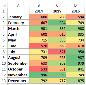
By default, Excel assigns red color to the lowest value and the green color to the highest value, and all the remaining values get a color based on the value. So there is a gradient with different shades of the three colors based on the value.
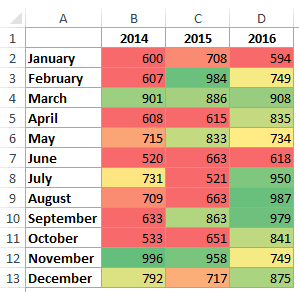
Now, what if don’t want a gradient and only want to show red, yellow, and green. For example, you want to highlight all the values less than say 700 in red, irrespective of the value. So 500 and 650 both gets the same red color since it’s less than 700.
To do this:
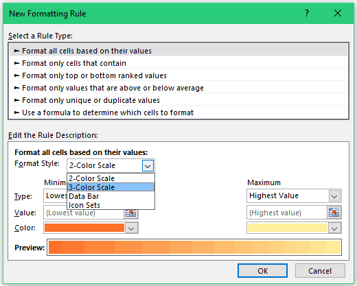
- Go to Home –> Conditional Formatting –> Color Scales –> More Options.

- In the New Formatting Rule dialog box, select ‘3-Color scale’ from the Format Style drop down.

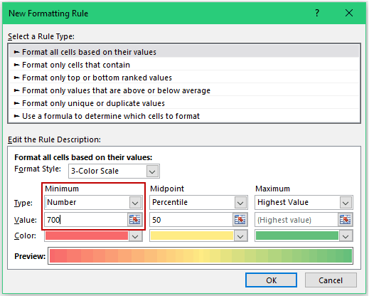
- Now you can specify the minimum, midpoint, and the maximum value and assign the color to it. Since we want to highlight all the cells with a value below 700 in red, change the type to Number and value to 700.

- Click OK.

Now you will get the result as shown below. Note that all the values below 700 get the same shade of red color.
A Word of Caution: While conditional formatting is a wonderful tool, unfortunately, it’s volatile. This means that whenever there is any change in the worksheet, conditional formatting gets recalculated. While the impact may be negligible on small data sets, it can lead to a slow Excel workbook when working with large data sets.
Also read: How to Create QR Codes in Excel (QR Code Generator)
Creating a Dynamic Heat Map in Excel
Since conditional formatting is dependent on the value in a cell, as soon as you change the value, conditional formatting recalculates and changes.
This makes it possible to make a dynamic heat map.
Let’s look at two examples of creating heat maps using interactive controls in Excel.
Example 1: Heat Map using Scroll Bar
Here is an example where the heat map changes as soon as you use the scroll bar to change the year.
This type of dynamic heat maps can be used in dashboards where you have space constraints but still want the user to access the entire data set.
Click here to download the Heat Map template
How to create this dynamic heat map?
Here is the complete data set that is used to create this dynamic heat map.
Here are the steps:
- In a new sheet (or in the same sheet), enter the month names (simply copy paste it from the original data).
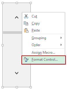
- Go to Developer –> Controls –> Insert –> Scroll Bar. Now click anywhere in the worksheet, and it will insert a scroll bar. (click here if you can’t find the developer tab).

- Right-click on the scroll bar and click on Format Control.

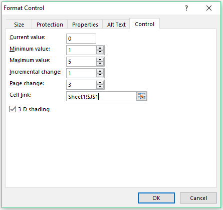
- In the Format Control dialog box, make the following changes:
- Minimum Value: 1
- Maximum Value 5
- Cell Link: Sheet1!$J$1 (You can click on the icon in the right and then manually select the cell you want to link to the scroll bar).

- Click OK.
- In cell B1, enter the formula: =INDEX(Sheet1!$B$1:$H$13,ROW(),Sheet1!$J$1+COLUMNS(Sheet2!$B$1:B1)-1)
- Resize and place the scroll bar at the bottom of the data set.

Now when you change the scroll bar, the value in Sheet1!$J$1 would change, and since the formulas are linked to this cell, it would update to show the correct values.
Also, since conditional formatting is volatile, as soon as the value changes, it gets updated as well.
Watch Video – Dynamic Heat Map in Excel
Example 2: Creating a Dynamic Heat Map in Excel using Radio Buttons
Here is another example where you can change the heat map by making a radio button selection:
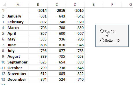
In this example, you can highlight top/bottom 10 values based on the radio/option button selection.
Click here to download the Heat Map template
Creating a Heat Map in Excel Pivot Table
Conditional formatting in Pivot Tables works the same way as with any normal data.
But there is something important you need to know.
Let me take an example and show you.
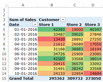
Suppose you have a pivot table as shown below:

To create a heat map in this Excel Pivot Table:
- Select the cells (B5:D14).
- Go to Home –> Conditional Formatting –> Color Scales and select the color scale that you want to apply.

This would instantly create the heat map in the pivot table.
The problem with this method is that if you add new data in the backend and refresh this Pivot Table, the conditional formatting would not be applied to the new data.
For example, as I added new data in the back end, adjusted the source data and refreshed the Pivot Table, you can see that conditional formatting is not applied to it.
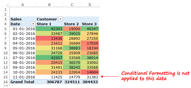
This happens as we applied the conditional formatting to cells B5:D14 only.
If you want this heat map to be dynamic such that it updates when new data is added, here are steps:
- Select the cells (B5:D14).
- Go to Home –> Conditional Formatting –> Color Scales and select the color scale that you want to apply.
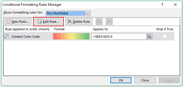
- Again go to Home –> Conditional Formatting –> Manage rules.

- In the Conditional Formatting Rules Manager, click on the Edit button.

- In the Edit Formatting Rule dialog box, select the third option: All cells showing ‘Sales’ values for ‘Date’ and ‘Customer’.

Now the conditional formatting would update when you change the backend data.
Note: Conditional formatting goes away if you change the row/column fields. For example, if you remove Date field and apply it again, conditional formatting would be lost.
You May Also Like the Following Excel Tutorials:


This isn’t a map dude. It’s just conditional formatting.
Hello,
Very helpful, that you very much! What If I want to remove the numbers from the Heat Map cells and plot only the colors?
Right click / format cells / change type to custom and put in ;;;
Hello,
I am trying to build a Risk Heat map in excel, i am struggling indeed, is there any tutorial you have on Risk Heat map in excel
Oh, Noran :/
Thanks for the post. I didn’t realize that Excel had built in heatmap capabilities, very smart!
Can someone explain this section of pivot table heat maps to me? It seems as if it is missing steps…
“In the Edit Formatting Rule dialog box, select the third option: All cells showing ‘Sales’ values for ‘Date’ and ‘Customer’.”
Very useful. Thanks
qwqe
If columns in the table represent different entities like apple, milk, car, pollution (in first diagram of this webpage) which has different scale as well as units. How can excel be employed to develop their heat map with respect to months? How can Colors obtained be averaged out ? Like April has green, yellow, red for 2015,2016,2017. These averaged to yellow color. Reply sooner. Thank you
Hi. Thank you for this nice info. It was really helpful.
I just want to add one thing.
I’ve just tried not to show values in each cell.
This has to be ONLY 3 of ; to type in the custom number field.
NOT 4 of ;;;;
I just wanted to help whoever may be stuck with it.
I want to use a heat map to indicate the status of an item. Example: In Progress = green, Not Started = yellow, Escalated = red, Completed = green. how would I do that?
Lovely !!!
https://uploads.disquscdn.com/images/d4eb9769aad6bfbf22921d15542fb464507b5769236e38d40358fbee7d376328.png
Good guide on creating a heatmap using excel! Coincidentally, I have used the similar logic you mentioned in your guide for creating the heatmap in the warehousing context. The excel tool shows the fast moving pallets versus slow moving pallets.
https://warehouseblueprint.com/warehouse-heatmap/
Very useful ! 🙂
HI, thanks for the heat map info. How do I show this heat map data per interval in an image of my choosing, namely a picture of a brain and the values per second at each of 4 head locations, and then play the file of thousands of intervals (seconds) as a movie?
Hey Sumit, Many thanks for your awesome work
Hey Sumit, Many thanks for your awesome work
Hi Sumit, do you know a better way to change long formulas in conditional formatting? Using the arrow keys to scroll to the right or left in the tiny box generates extra code referring to the cells which are selected in the worksheet. I know click and hold while hovering over the egdes of the box works, but it’s very time consuming.
Hello Wim.. Here is what I do. When you click in the box where you have the formula, press the F2 key. Now when you use the arrow keys, it will not generate that extra cell references.
Hi Sumit, do you know a better way to change long formulas in conditional formatting? Using the arrow keys to scroll to the right or left in the tiny box generates extra code referring to the cells which are selected in the worksheet. I know click and hold while hovering over the egdes of the box works, but it’s very time consuming.
Nice template
Glad you liked it 🙂